Casa Camper Berlin
Embodying Camper's ethos of creativity and innovation
Building on Fernando Amat’s Original Design, This Renovation Project Adds Sustainability, Flexibility, And Visual Appeal
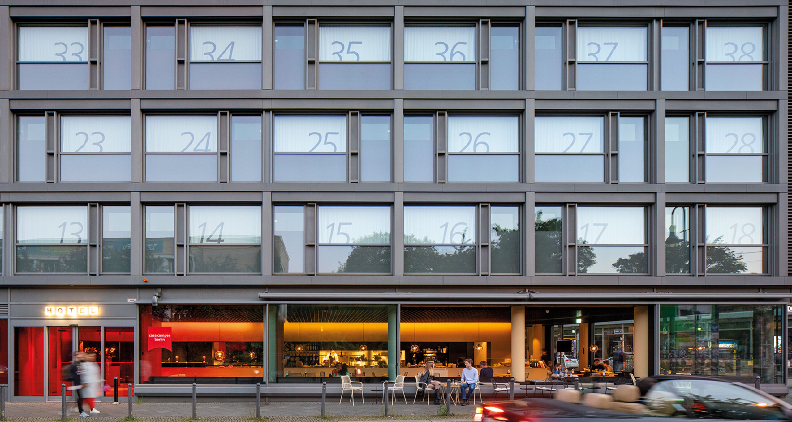
The Casa Camper Hotel in Berlin, created by the footwear brand Camper, underwent a renovation after 12 years since its opening in 2009.
GRAS Reynés Arquitectos and the German architect Laura V. Rave led the update, focusing on rooms and a new snack bar, which offers panoramic views of the city.
Additionally, in collaboration with the Dutch studio MVRDV, a new concept was designed for a lobby, café and retail, highlighting a space that merges the three programs with a chromatic gradient. The design, called Café Chameleon, emphasizes flexibility and sustainability in the use of materials and functions.
Program
Hotel, retail and bar-restaurant
Location
Berlin, DE
Size
900 m²
Client
Year
2021
Architecture
GRAS Reynés Arquitectos + Laura V. Rave + MVRDV
Team
Guillermo Reynes, Marianna Dionysopoulou, Filip Szafalowicz / Laura V. Rave / José Ignacio Velasco Martin, Carl Jarneving, Boris Maas, Alicja Pawlak, Mathias Pudelko
Engineering
IB Brandes
PROYECTO CONTRACT CASA VIVA
Read MORE25GRAMOS
Read MOREARCHITECTURAL DIGEST SPAIN
Read MOREARQUITECTURA&DISEÑO
Read MOREAZURE MAGAZINE
Read MOREMETALOCUS
Read MOREDIARIO DESIGN
Read MOREARCHDAILY
Read MOREFLOORNATURE ARCHITECTURE
Read MOREON DISEÑO
Read MOREFASHION UNITED
Read MOREVÍA CONSTRUCCIÓN
Read MOREDIALNET
Read MORECAMPER
Read MORENEO2
Read MOREMETAL MAGAZINE
Read MORESLOCUM MAGAZINE
Read MORECC MAGAZINE
Read MOREHIGHXTAR
Read MOREPOCKET DESIGN
Read MOREABITARE - CORRIERE DELLA SERA
Read MOREWORLD ARCHITECTURE
Read MOREARCHSTORY
Read MOREQIEZ DE
Read MOREMAD WHITE
Read MOREFORGEMIND
Read MOREGOURMETWELTEN
Read MOREES VIVIR
Read MOREMEINE STADT BERLÍN
Read MORE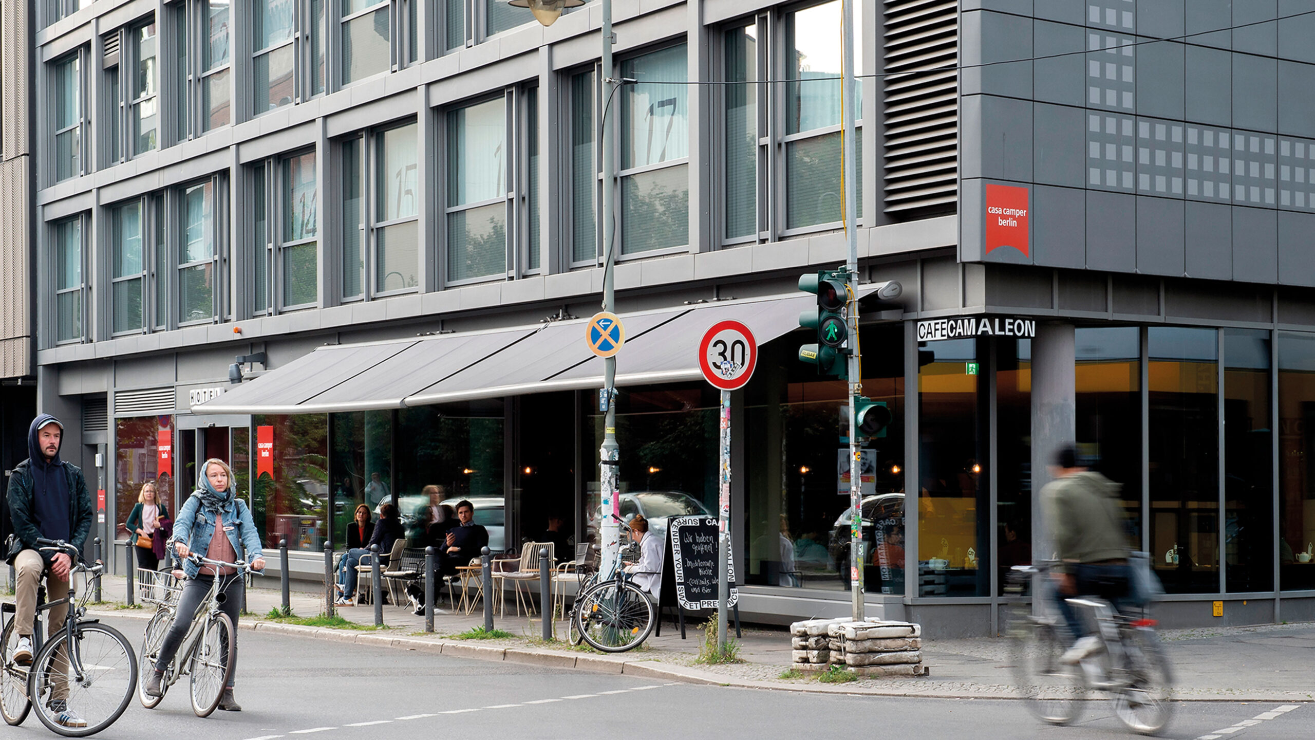
Casa Camper Hotel Renovation: Refurbishment And Revitalization
The Casa Camper hotel in Berlin was the second hotel developed by the world-famous Mallorcan footwear brand Camper. The hotel design continued with the original strong concept developed in Barcelona by industrial designer Fernando Amat. After 12 years of the opening in 2009, the hotel needed an update and refreshment. GRAS Reynés Arquitectos was appointed for the task together with Berlin based architect Laura V. Rave.
Check it out vídeo
Renovation Of The Tentempié Area And Rooms
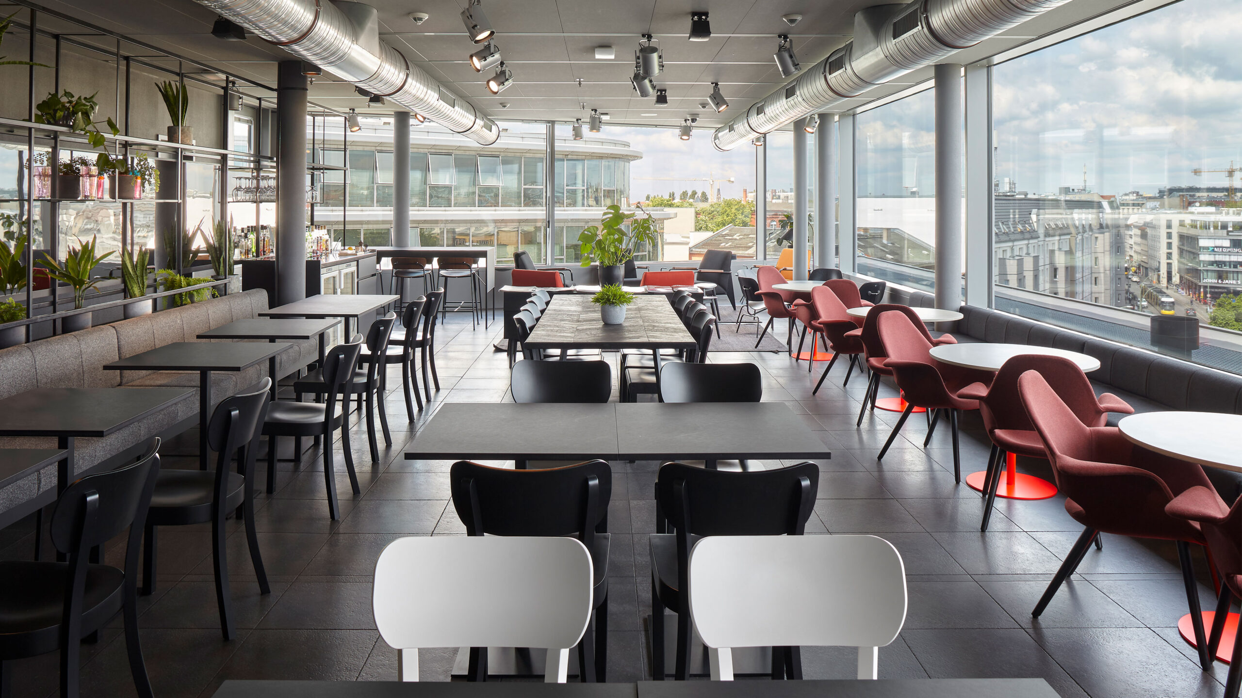
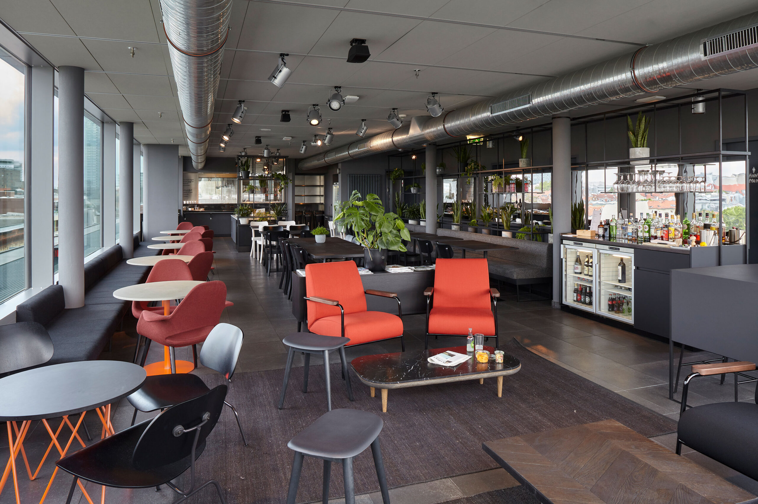
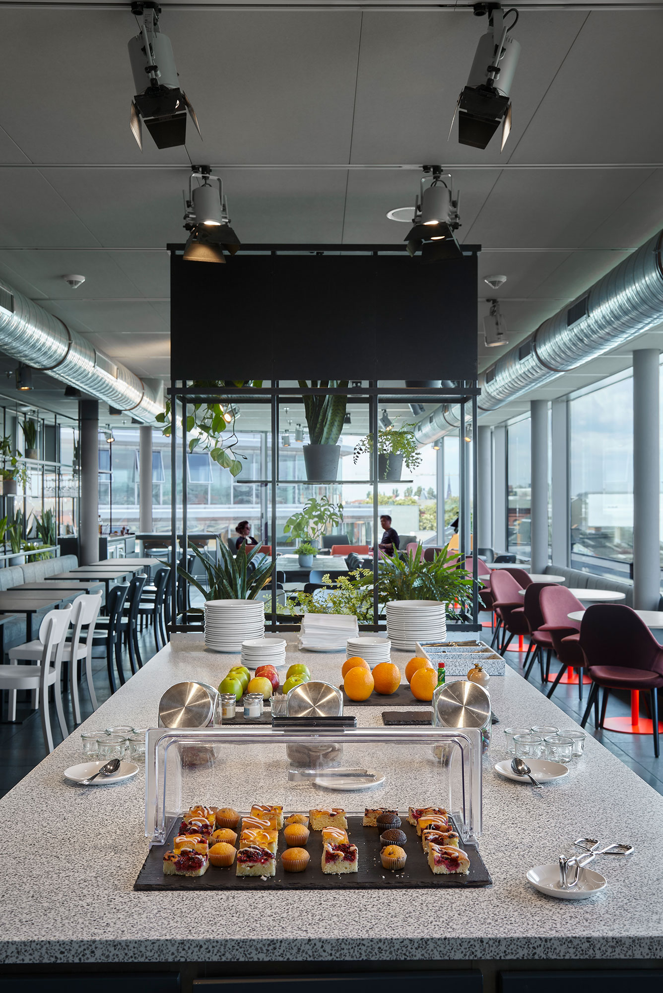
The process started with the renovation of the rooms and the top floor, the so called tentempié. A 24h only guest living room, where the guest can have drinks, food and a space to relax and meet.
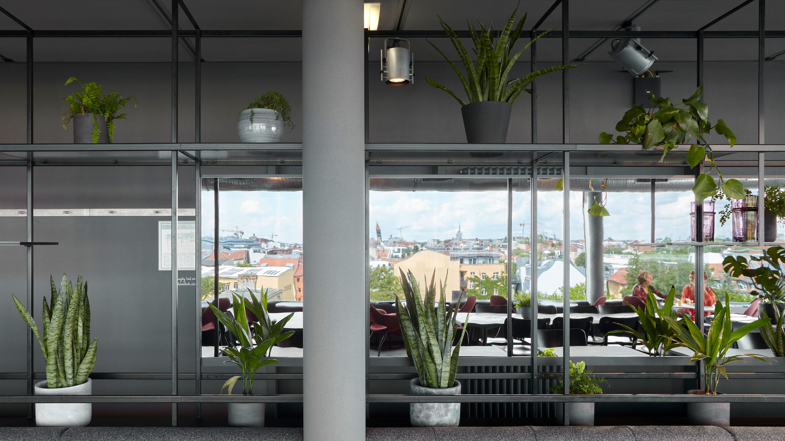
The rooms were renovated keeping intact the original concept developed by Fernando Amat, while the tentempié was completely transformed, turning the existing meeting rooms and dining areas into a big open space open to the magnificent views to the city.
A long-mirrored shelving protects the living area from the service rooms while reflecting, with a small distortion, the views to the city. The benches organized along the shelve and the facade provide enough lunch-breakfast sitting for all the guests, and the corner is left as a relaxed lounge area with sofas and armchairs.
Café Camaleón: Design And Functionality Fusion
For the last part of this renovation process, Camper wanted a new concept for a lobby, café, and retail showcase for Camper shoes that would better align with the brand’s strong design reputation.
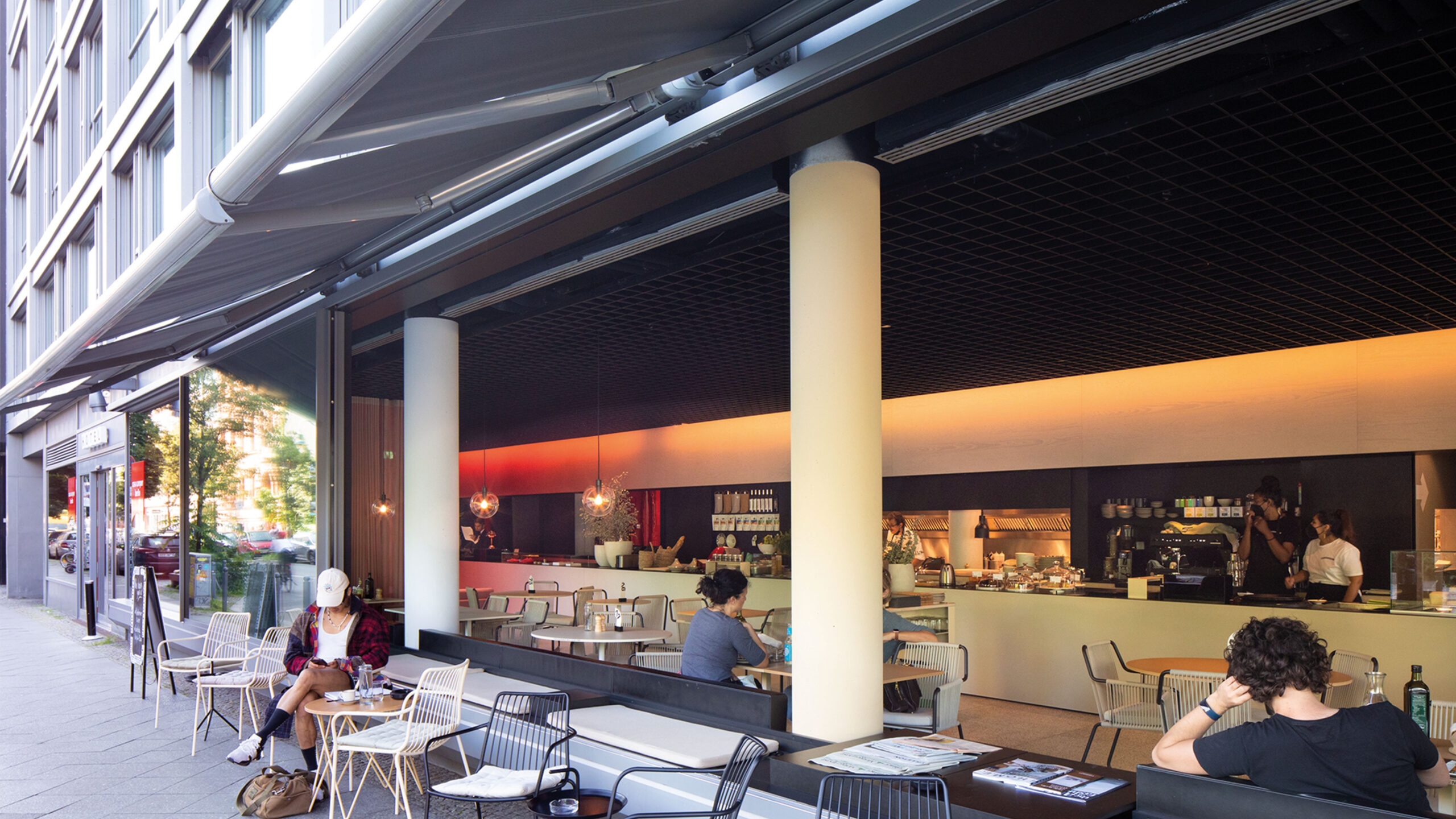
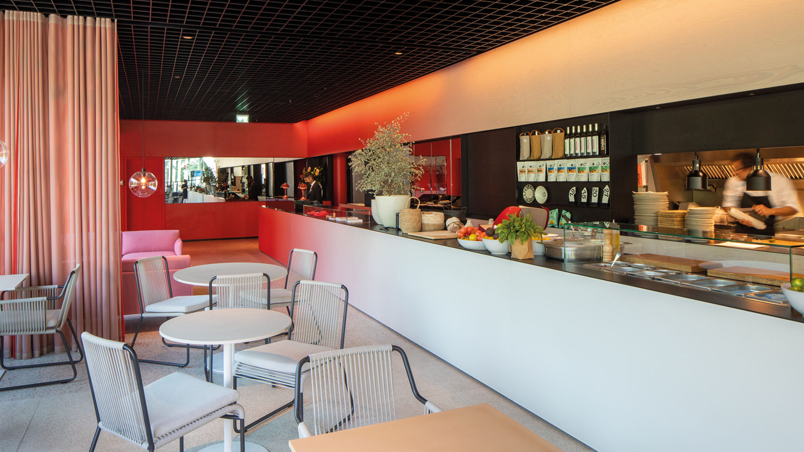
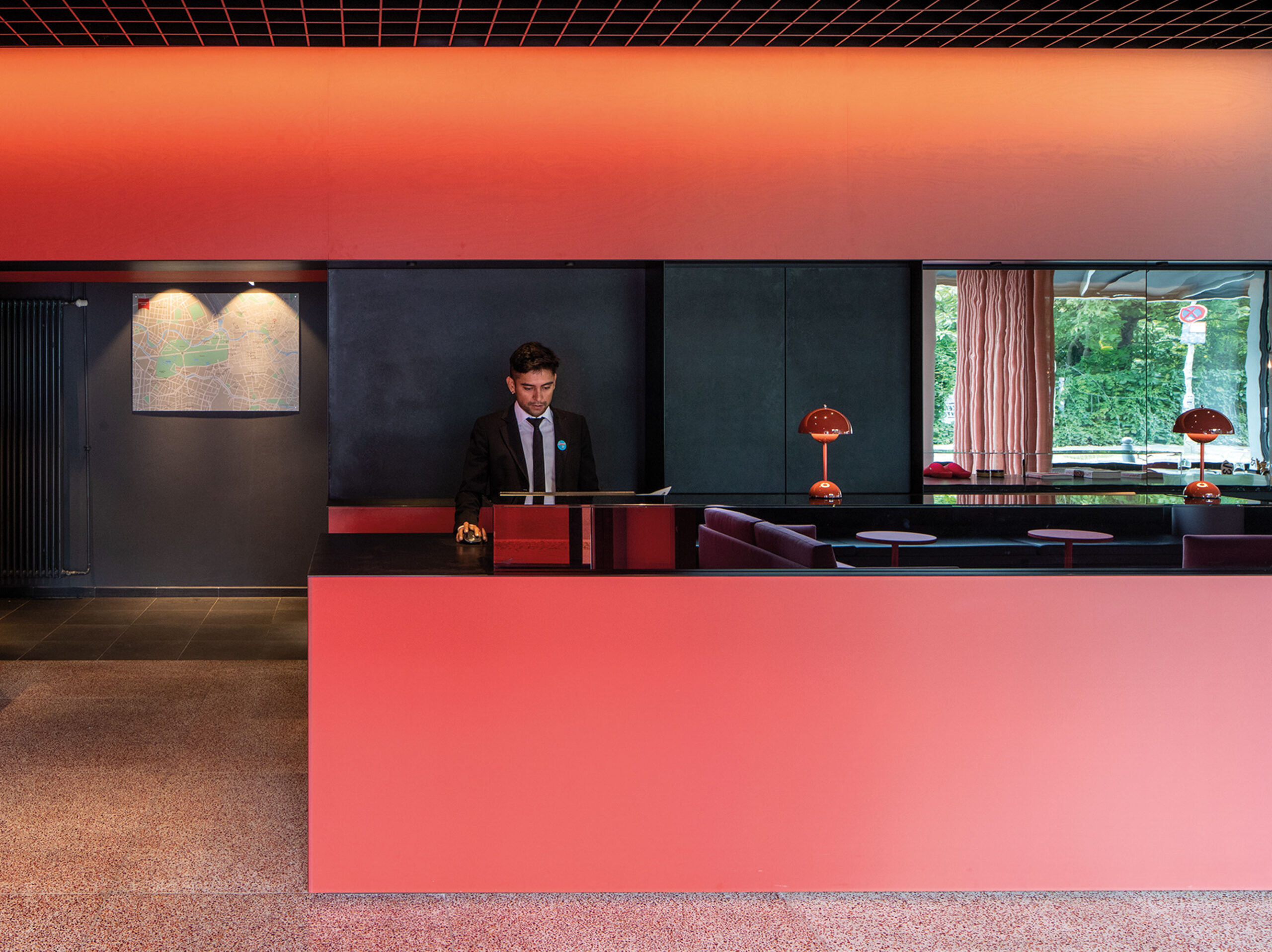
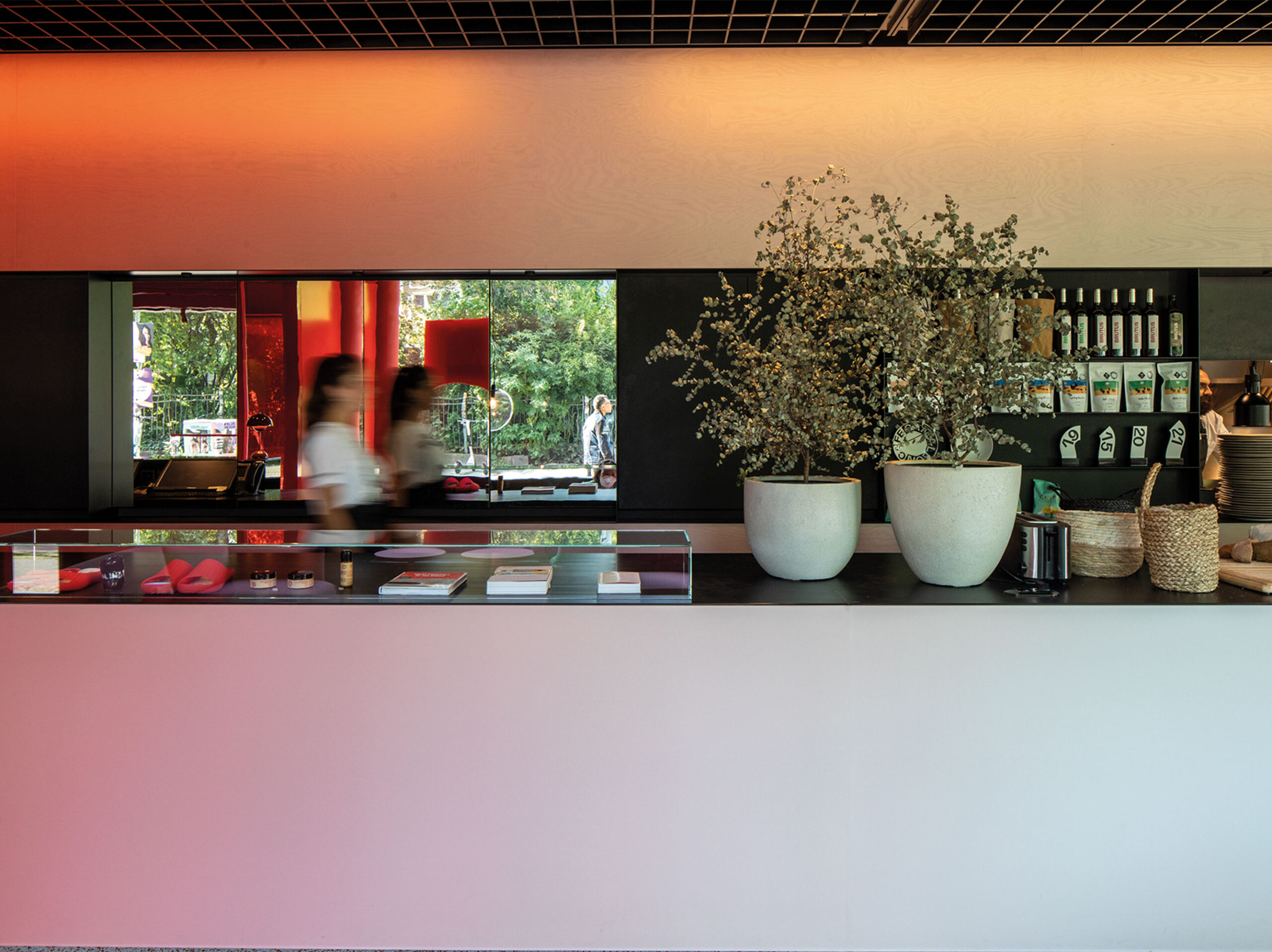
Occupying the ground floor, the interior design of Café Camaleón uses carefully selected material details to create a color gradient, which serves as a strong visual motif to organize the interior.
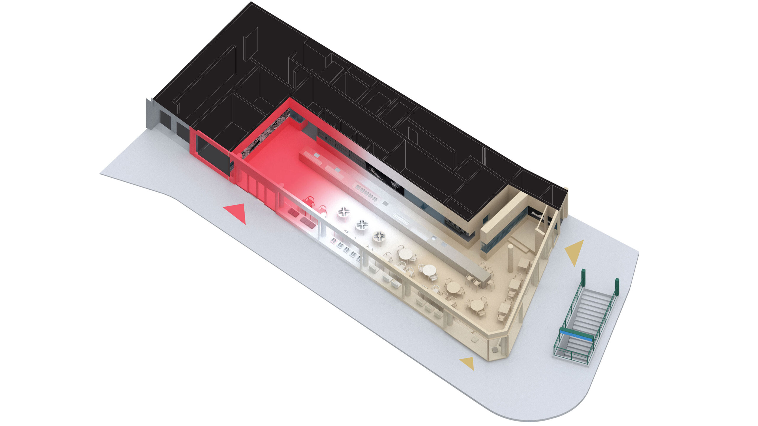
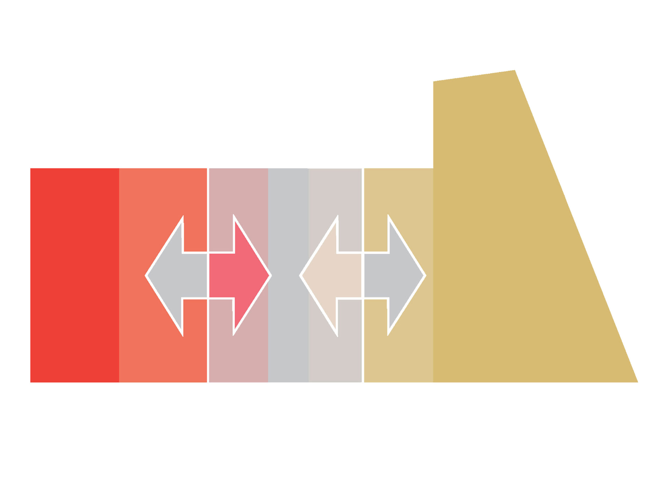
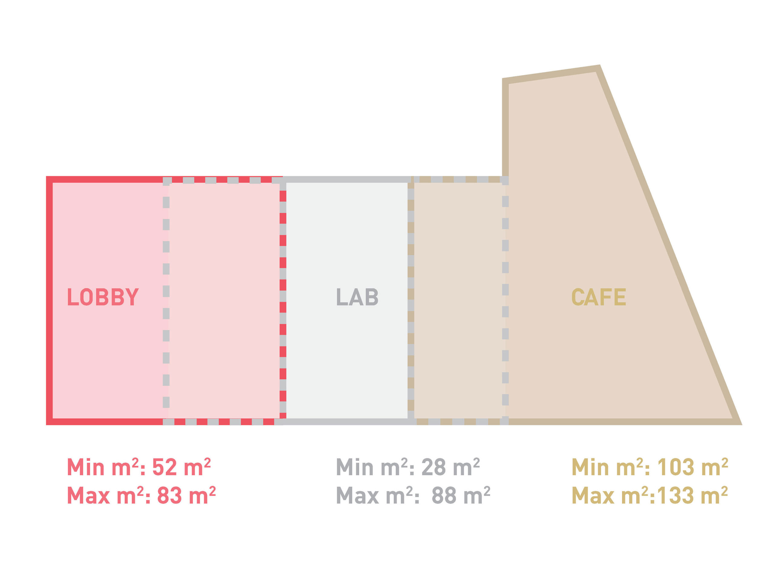
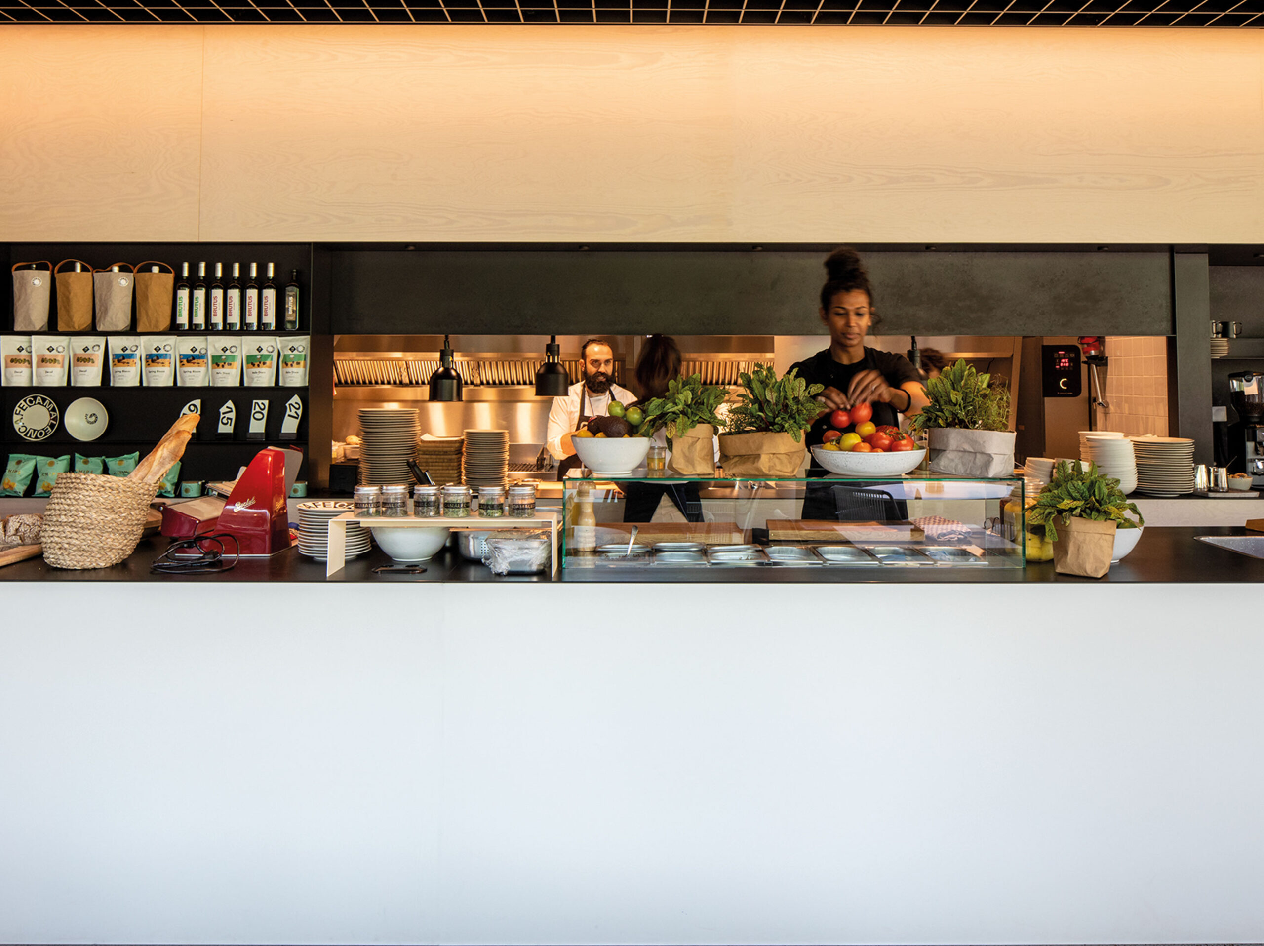
The occupancy patterns of the three programmes are very different, meaning they are unlikely to be busy at the same time. There was therefore an opportunity to combine all three programmes in a single room, creating a flexible space that could adapt throughout the day, as well as for future needs, taking advantage of synergies between the different functions. Though the three areas operate very differently, they all share one necessary element: a counter for interacting with customers. The main feature of the space is therefore a single, 18-metre-long counter serving all three functions.
Each function was given its own colour: red for the hotel lobby; white for the retail showcase, following the specifications for Camper Lab stores; and brown for the restaurant, inspired by the colour of German Milchkaffee.
To show the interaction between the different programs, the colours merge into each other, creating a colour gradient throughout the length of the space that is visible in the floors, walls, and counter. These vibrant colours were the inspiration for the project’s name, Camaleon, as the appearance of the space will be very different depending on one’s vantage point. Camaleon also references the brand’s first shoe from 1975, the Camaleón.
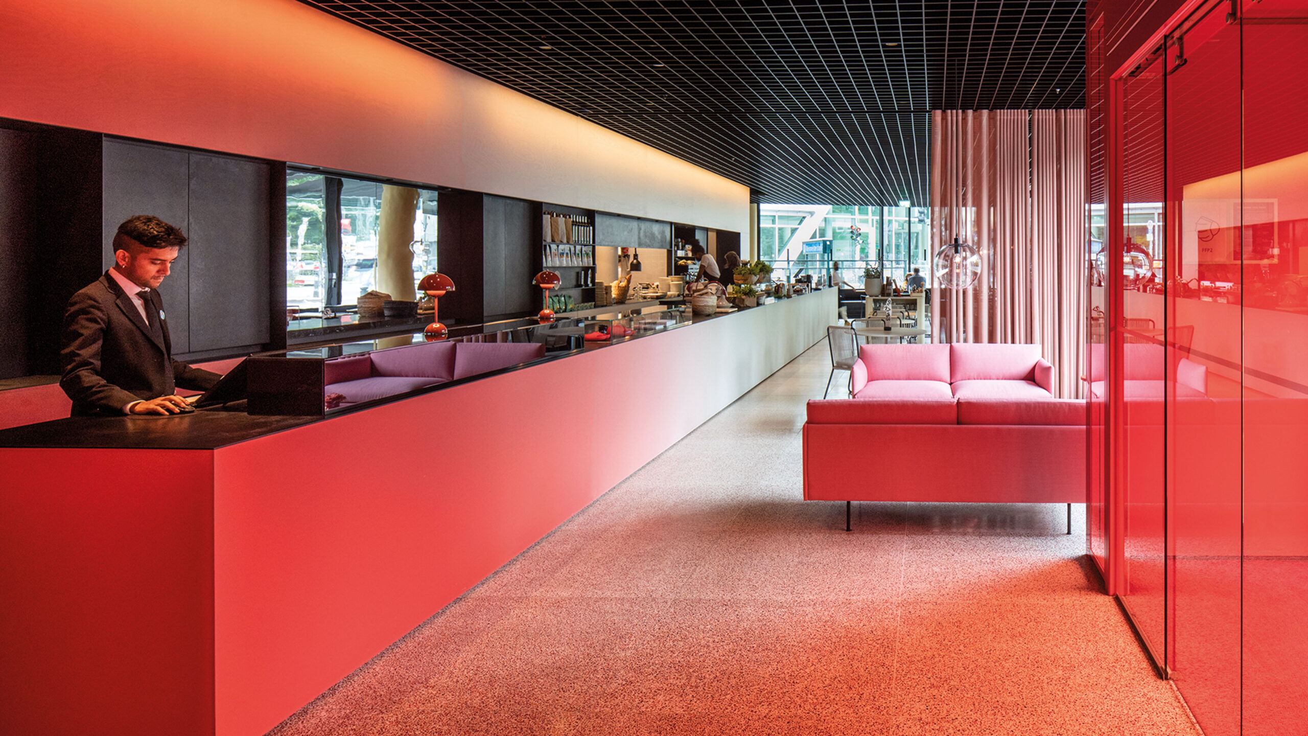
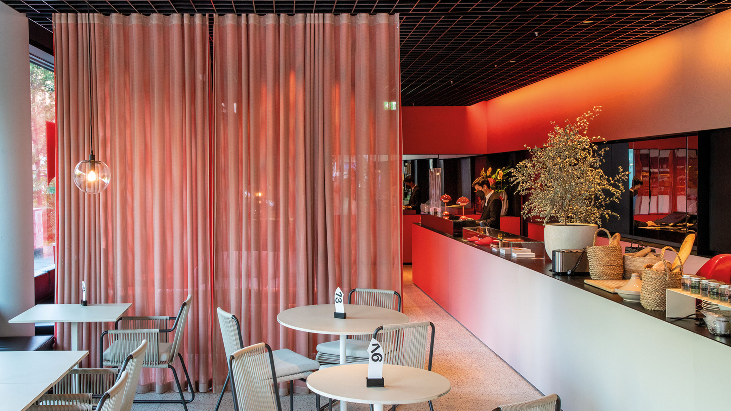
Outside, a 12-metre-long openable glass façade creates a clear, welcoming connection to the street. Inside, the colour gradient is achieved with different materials and in different manners: from resin colour panels in the counter to printed wood for the walls and cement-based floor tiles, mixed with different ratios of red, clear and brown recycled glass – making use of a traditional technique from Mallorca, Camper’s hometown.
