SON VALENTÍ
A Restored Estate in the Heart of Serra de Tramuntana
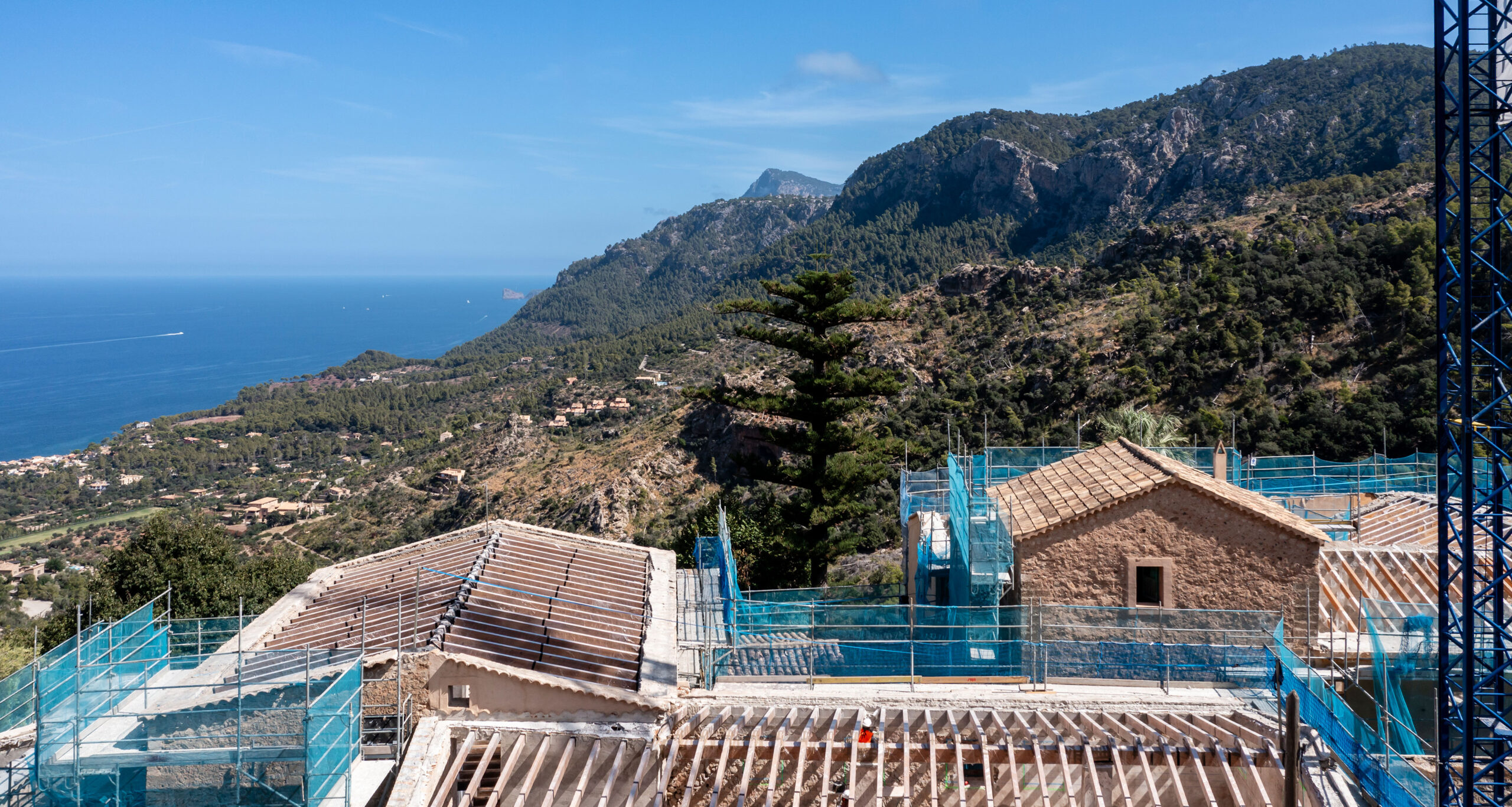
A Historic Possesió, Testimony to the Mallorcan Territory & Culture
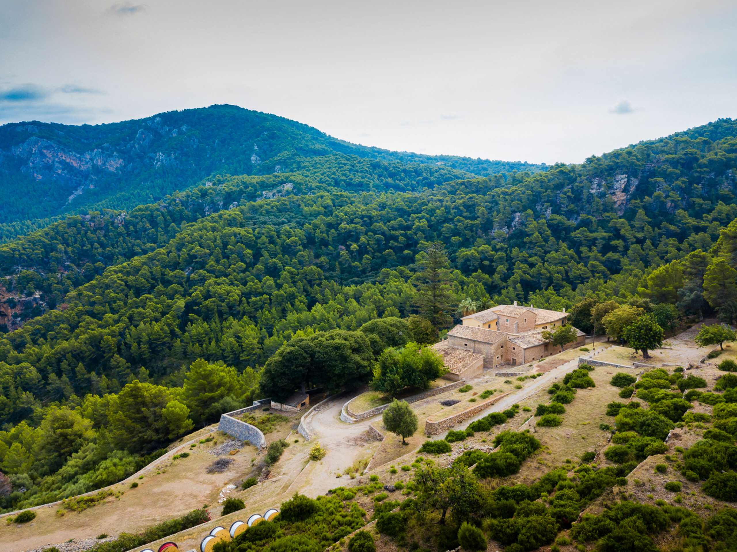
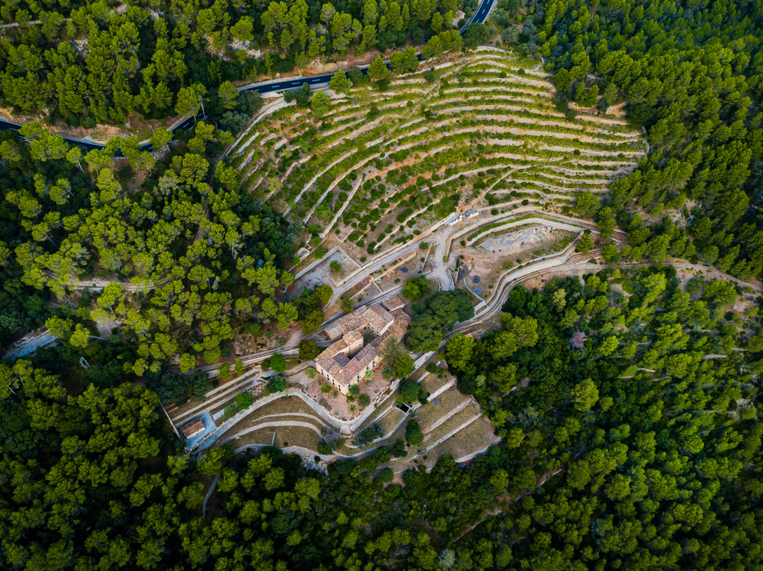
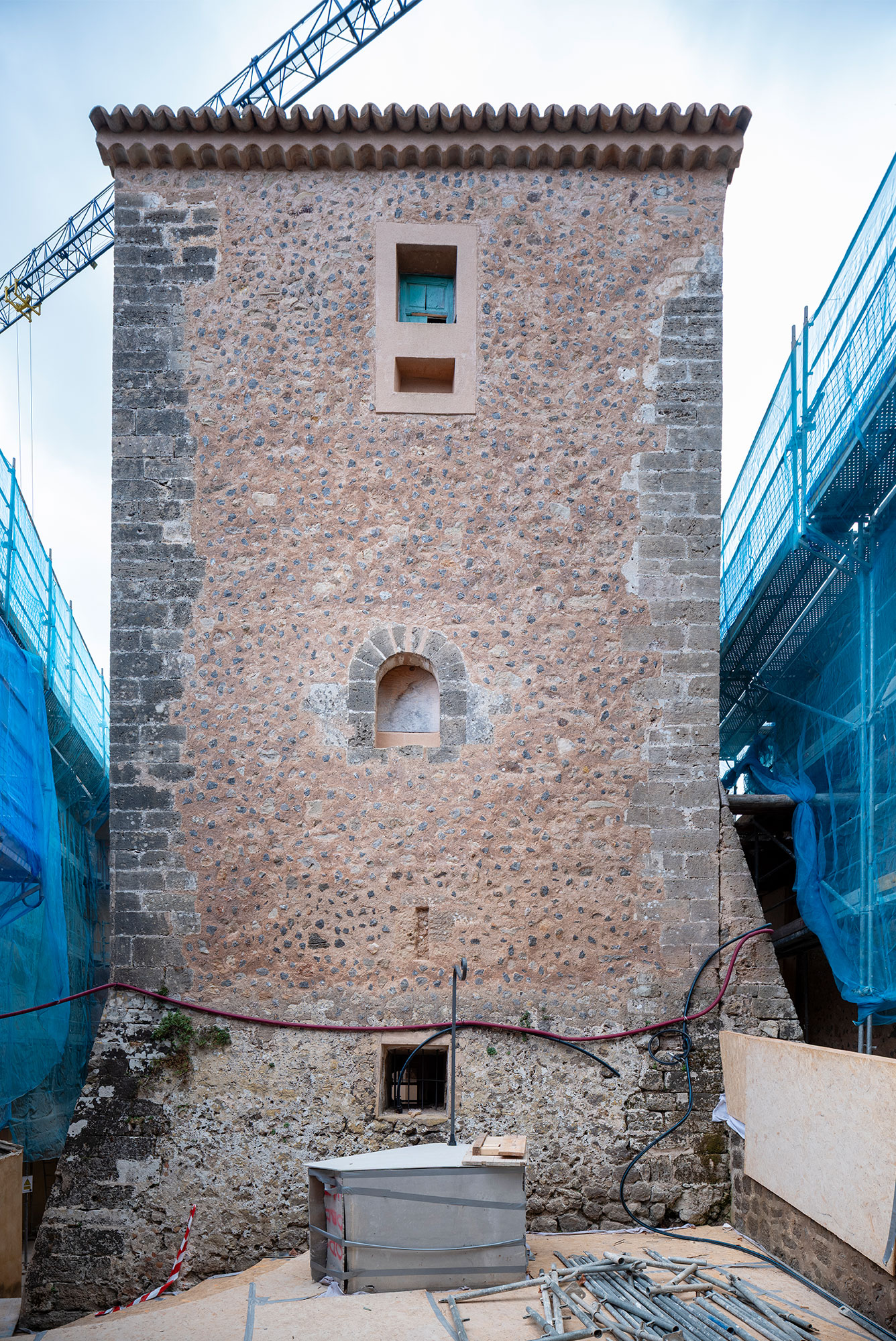
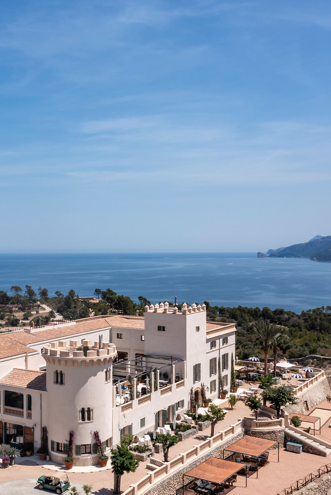
Nestled in the heart of Banyalbufar, within the protected landscape of the Serra de Tramuntana mountains, a UNESCO World Heritage Site, lies Son Valentí, a Mallorcan estate with documented origins dating back to the 16th century. Directly facing the Mediterranean, the estate occupies a territory shaped over centuries by agricultural work and coastal defense, where elements such as the defensive tower, documented in 1517, and the traditional oil mill remain as key pieces in the evolutionary sequence of the property.
More than an architectural ensemble, Son Valentí forms part of Mallorca’s protected heritage as a listed building (BIC). Its value goes beyond architecture: it stands as a living testimony to the Mallorcan rural way of life and to the cultural and historical identity of this stretch of the Tramuntana.
Program
Hotel
Location
Banyalbufar, Mallorca, ES
Size
2.650m²
Rooms
13
Client
Son Valentí Agricultura y Hotelería S.L.
Year
2025 – 2027
Architecture
GRAS Reynés Arquitectos
Team
Guillermo Reynés, Alejandro Domingo Leal, Elena Gil , Ricardo García, Laura Purlyte, Mayca Sanchez Carvajal, Zuzanna Cieslewicz
Structure
AMM Technical GroupAMM Technical Group
Engineering
EA Engineers Assesors
Landscape
Jardins de Tramuntana
Interior Design
GRAS Reynés Arquitectos
Archeology
Elvira González Gozalo
Construction
Ferratur
Restoration
Xicaranda
Photography
Tomeu Canyellas
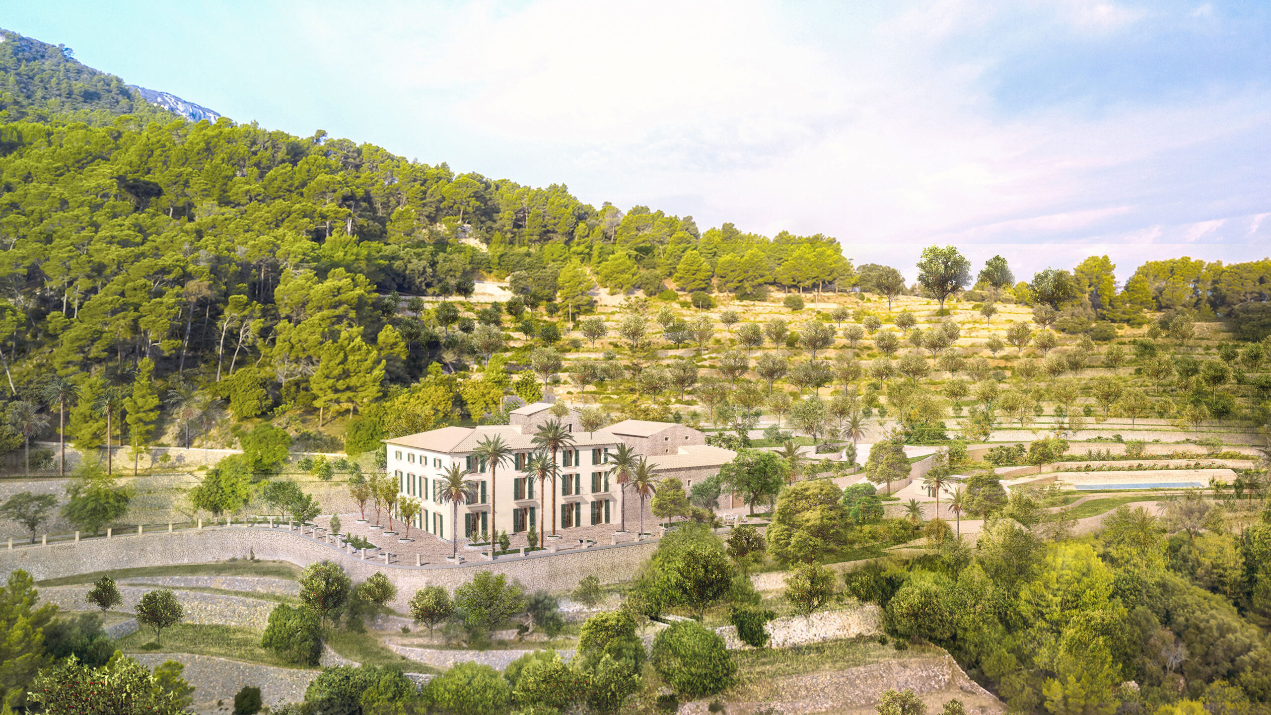
A Rigorous & Respectful Approach to Transforming a Historic Estate
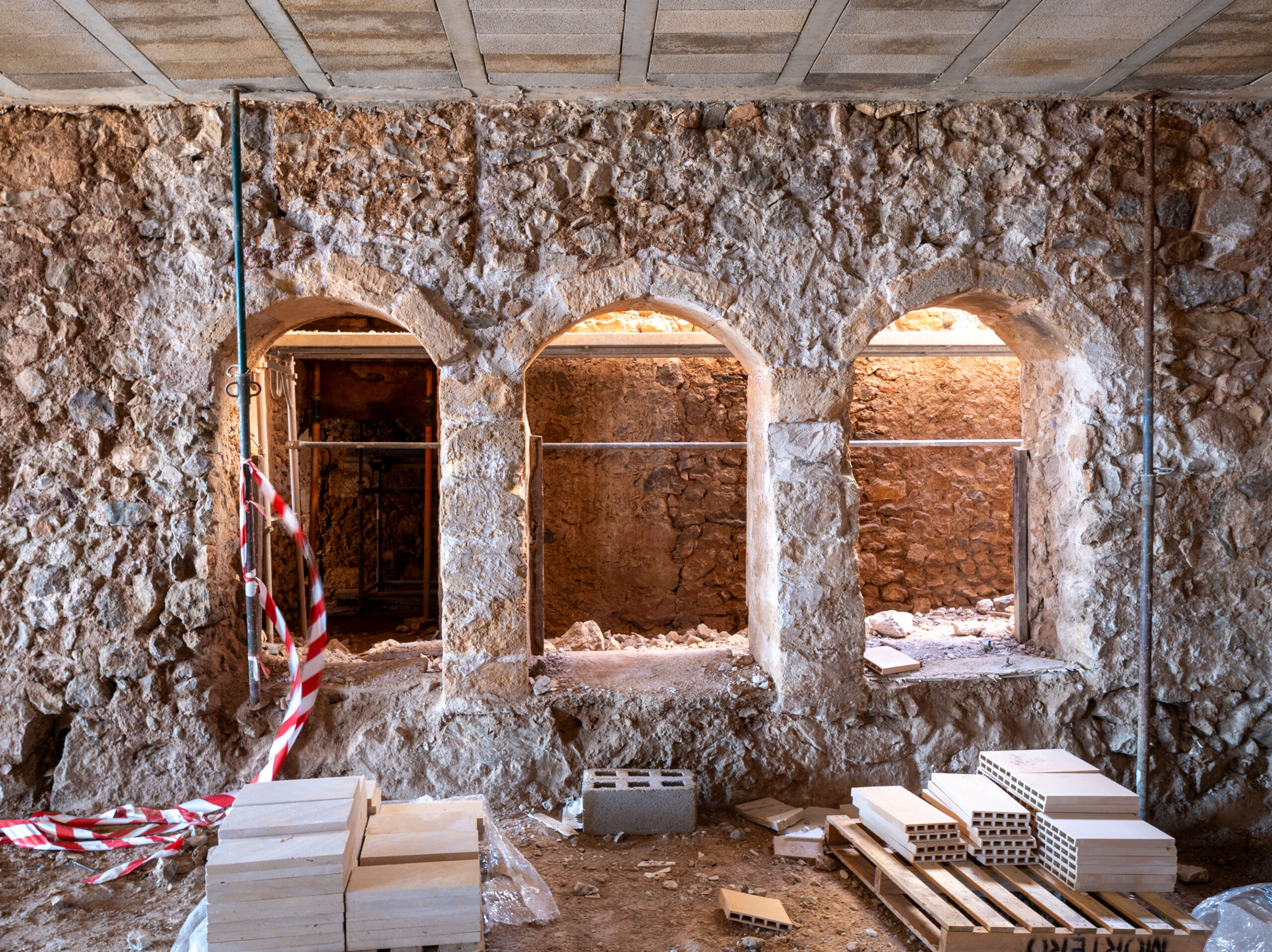
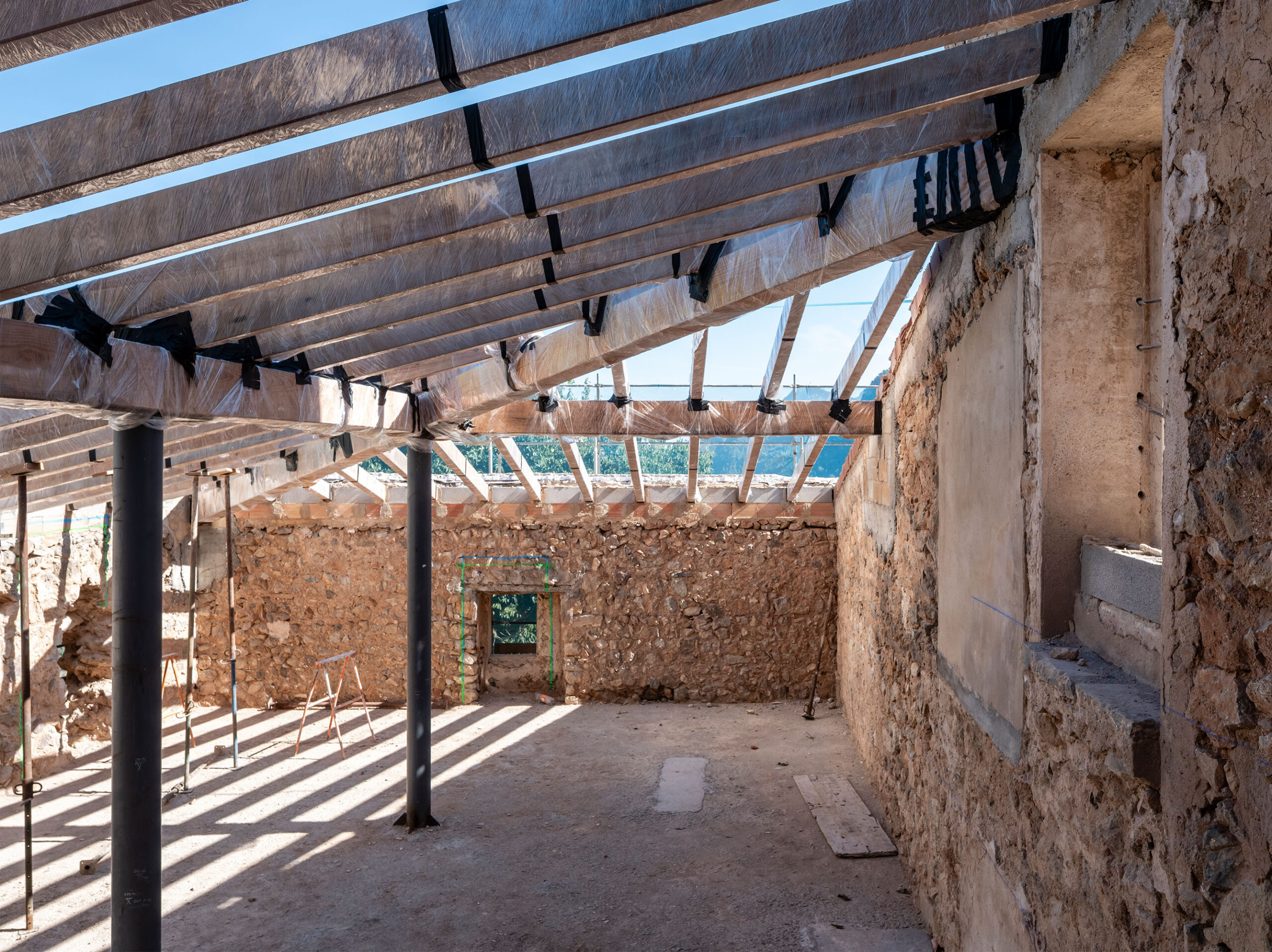
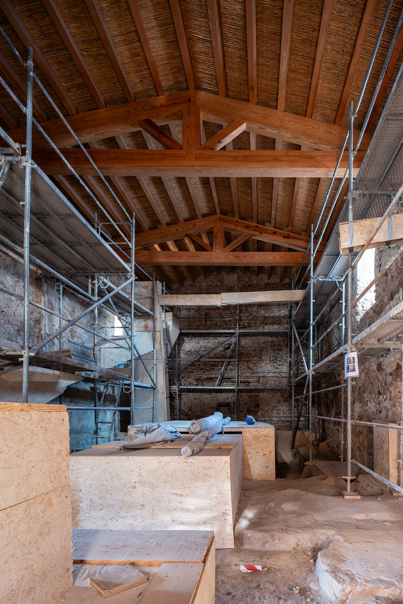
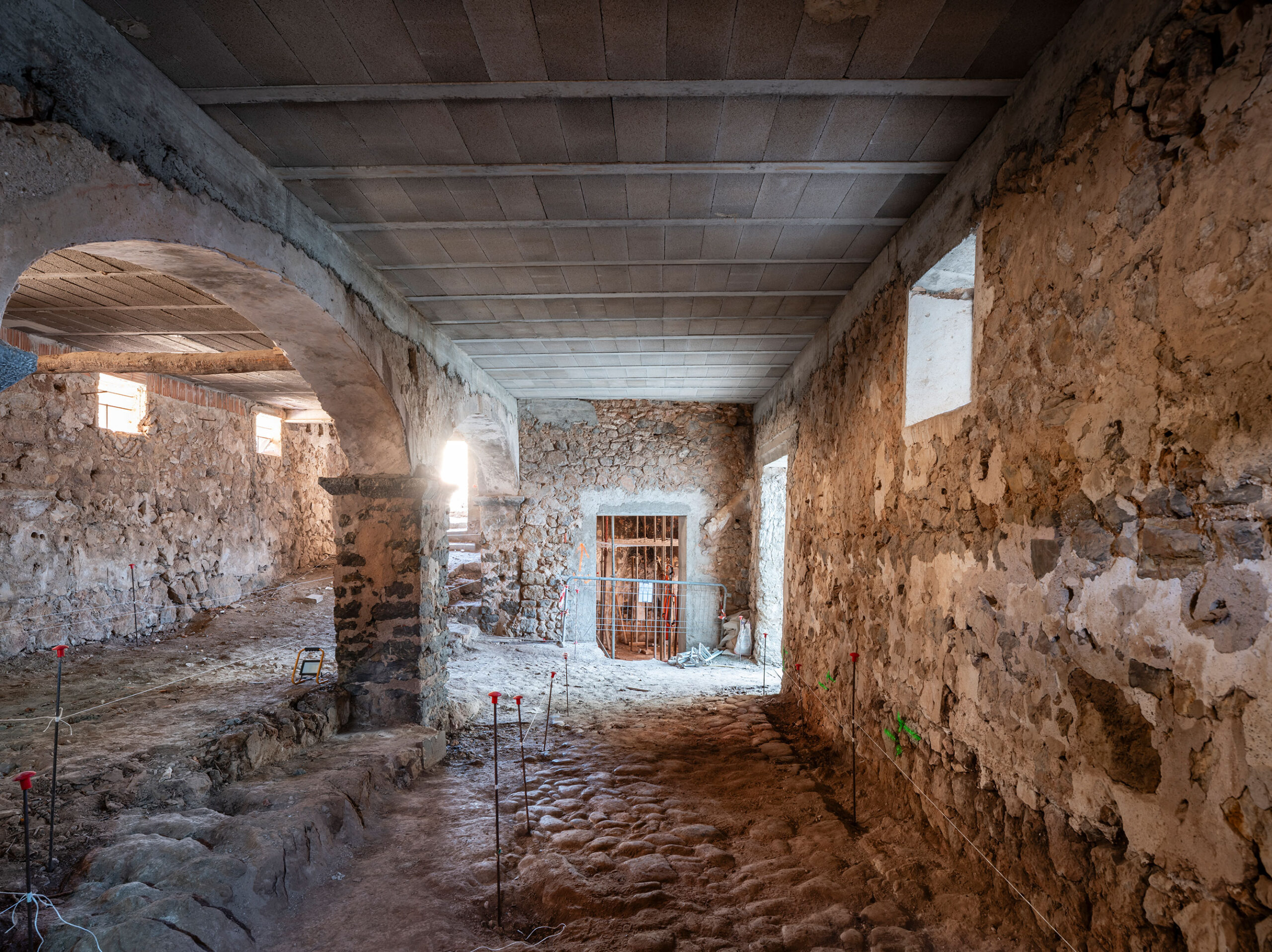
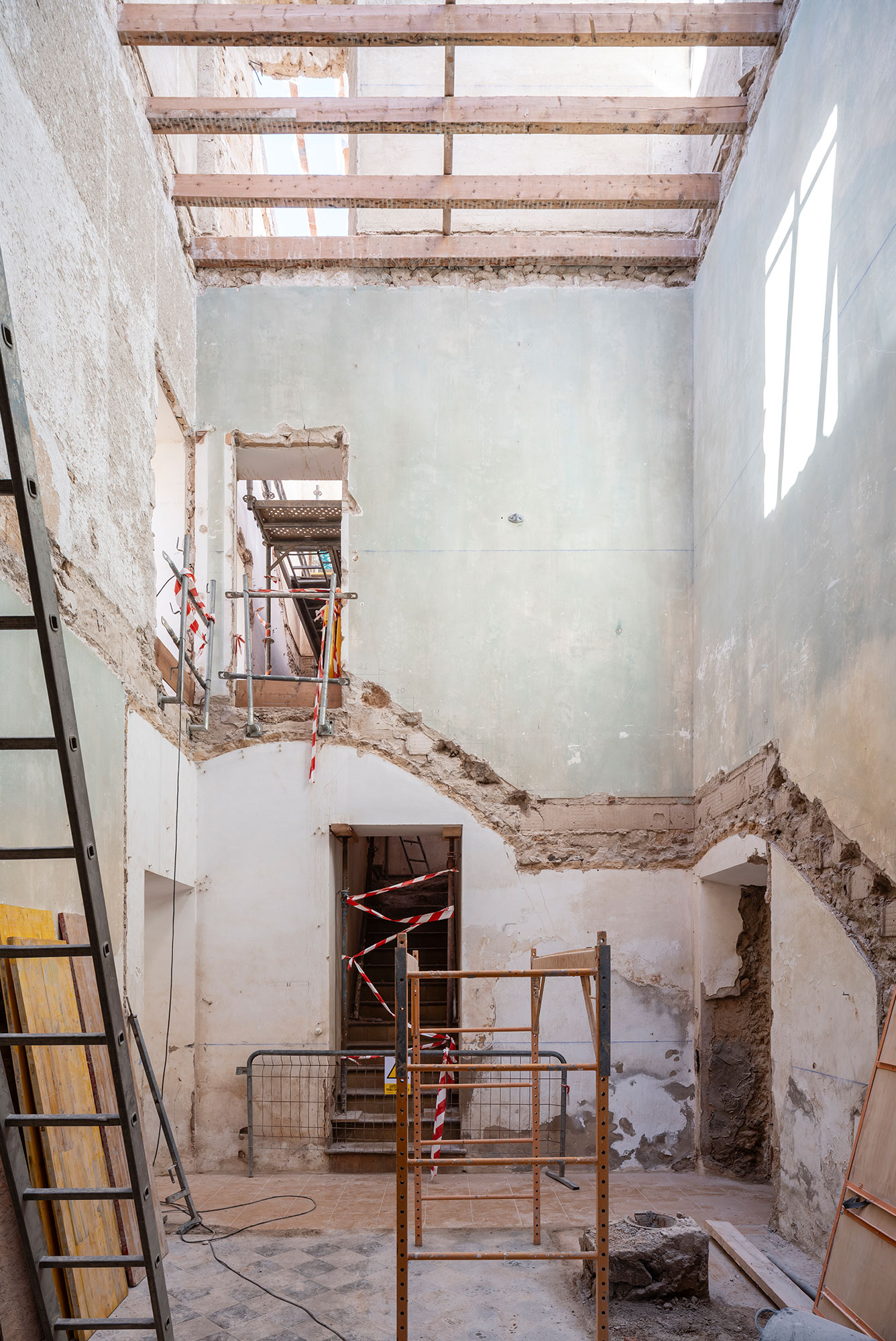
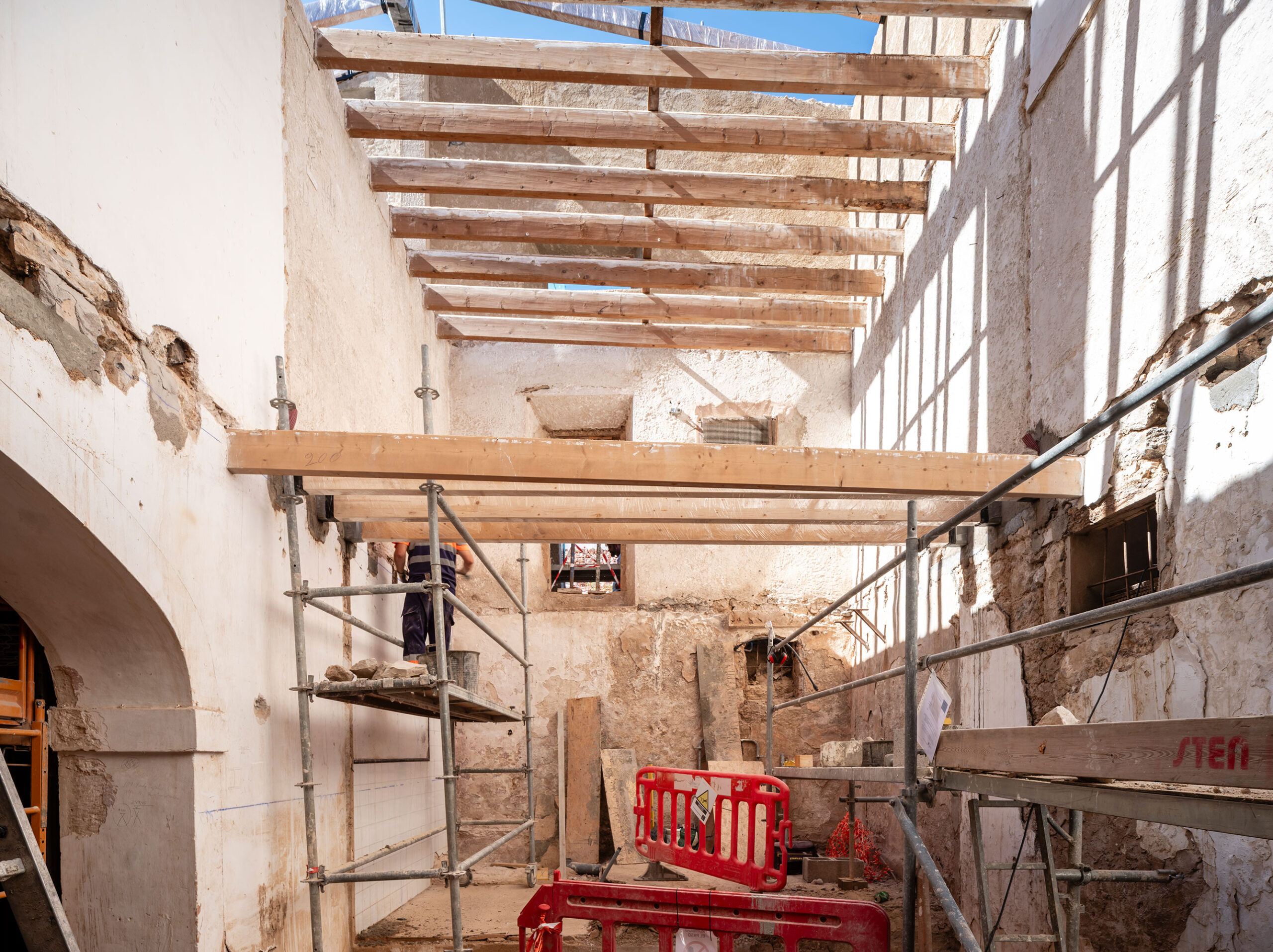
The project to transform Son Valentí into a 13-room rural hotel is conceived from a sensitive and rigorous approach. The intervention seeks to adapt the estate to its new use while preserving its essence, understood not as a frozen image but as a layered reality shaped over time. The commission was undertaken by GRAS Reynés Arquitectos in close collaboration with a multidisciplinary team of archaeologists, art historians and restoration specialists, ensuring a methodical and informed process.
The architectural strategy is based on preserving the historical and ethnological character of the estate, intervening through criteria of minimal transformation and reversibility, and incorporating contemporary use without compromising authenticity.
The Casa dels Senyors & the Casa dels Amos: A Connection Forged Through History
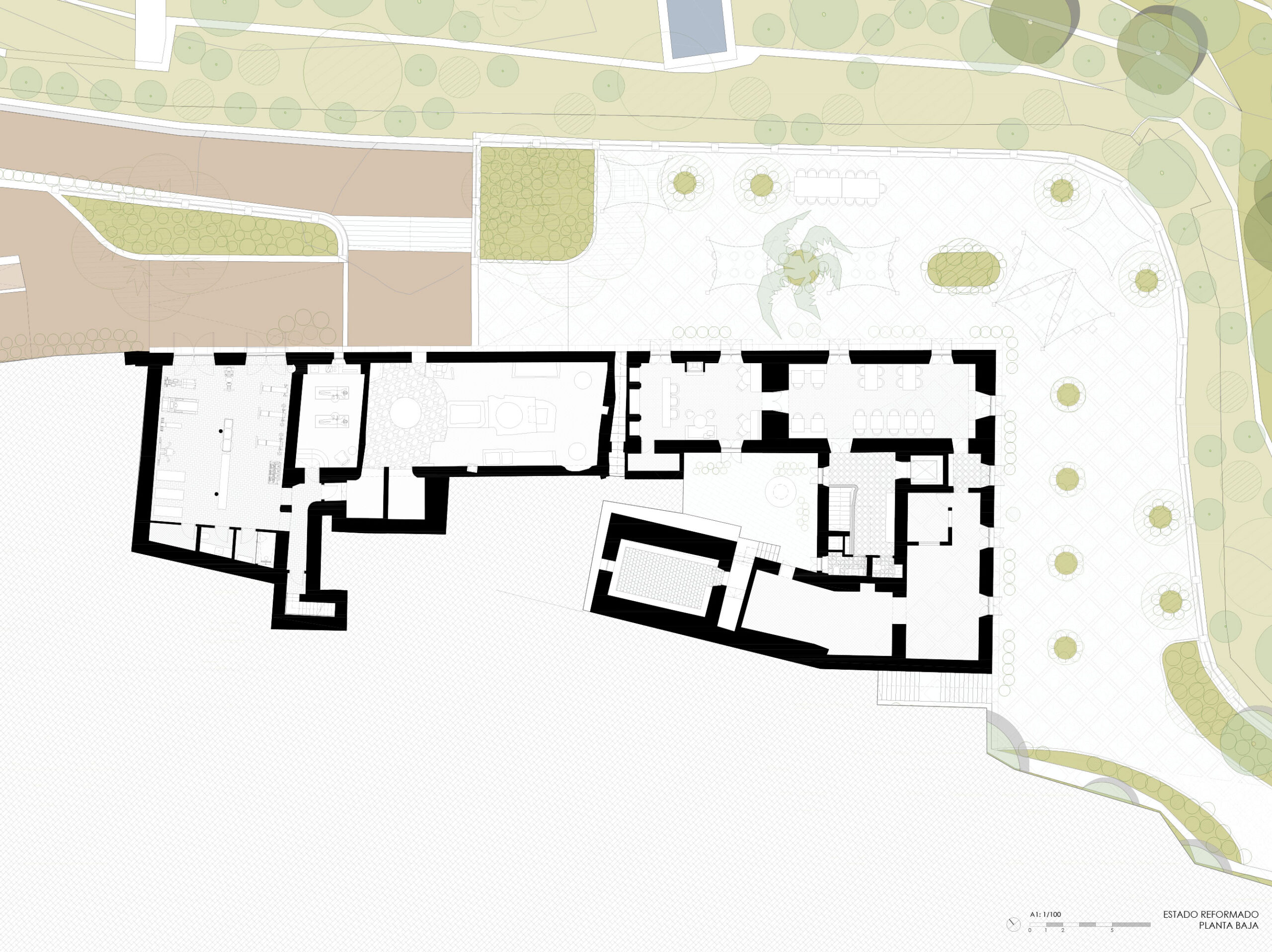
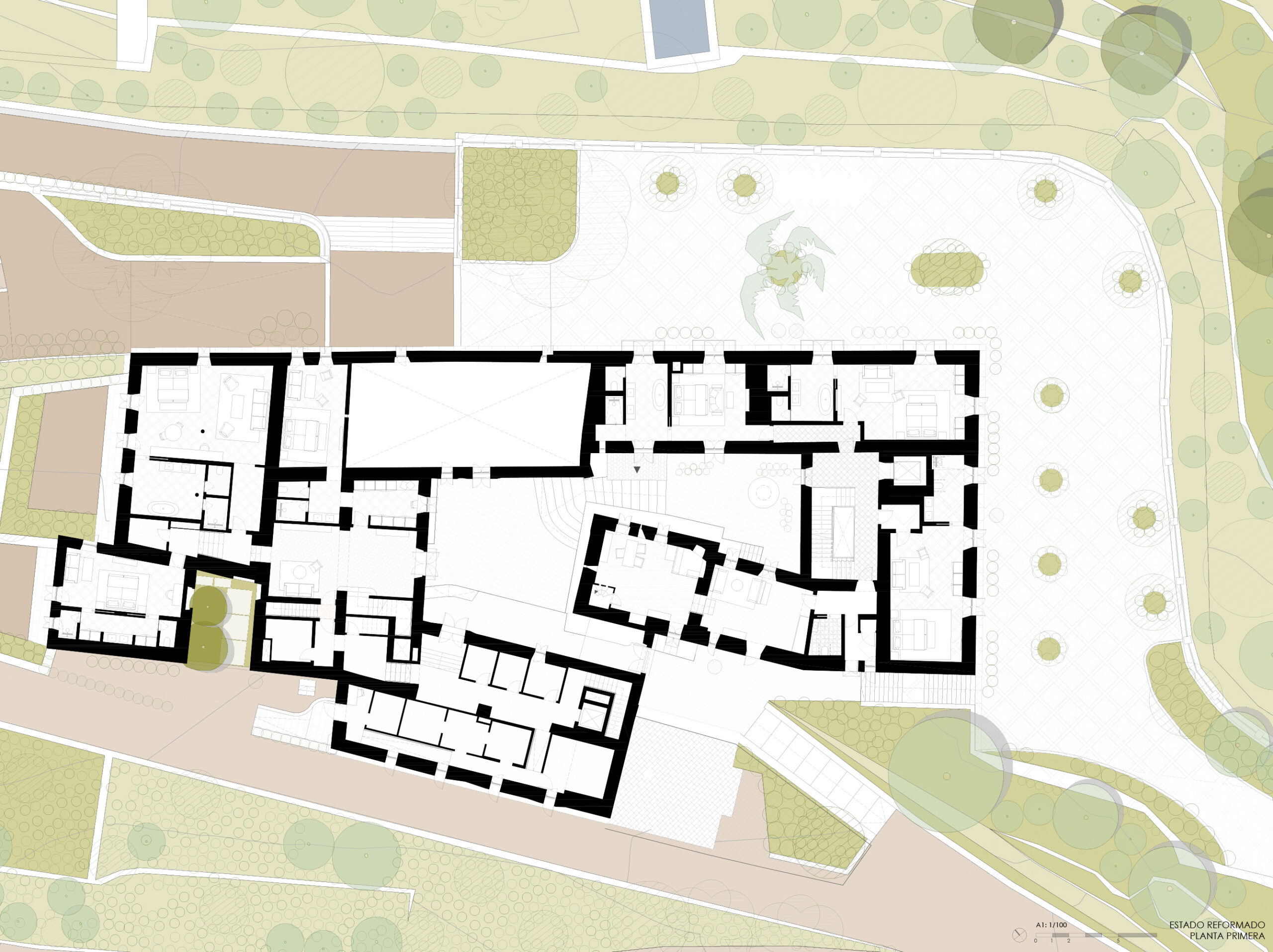
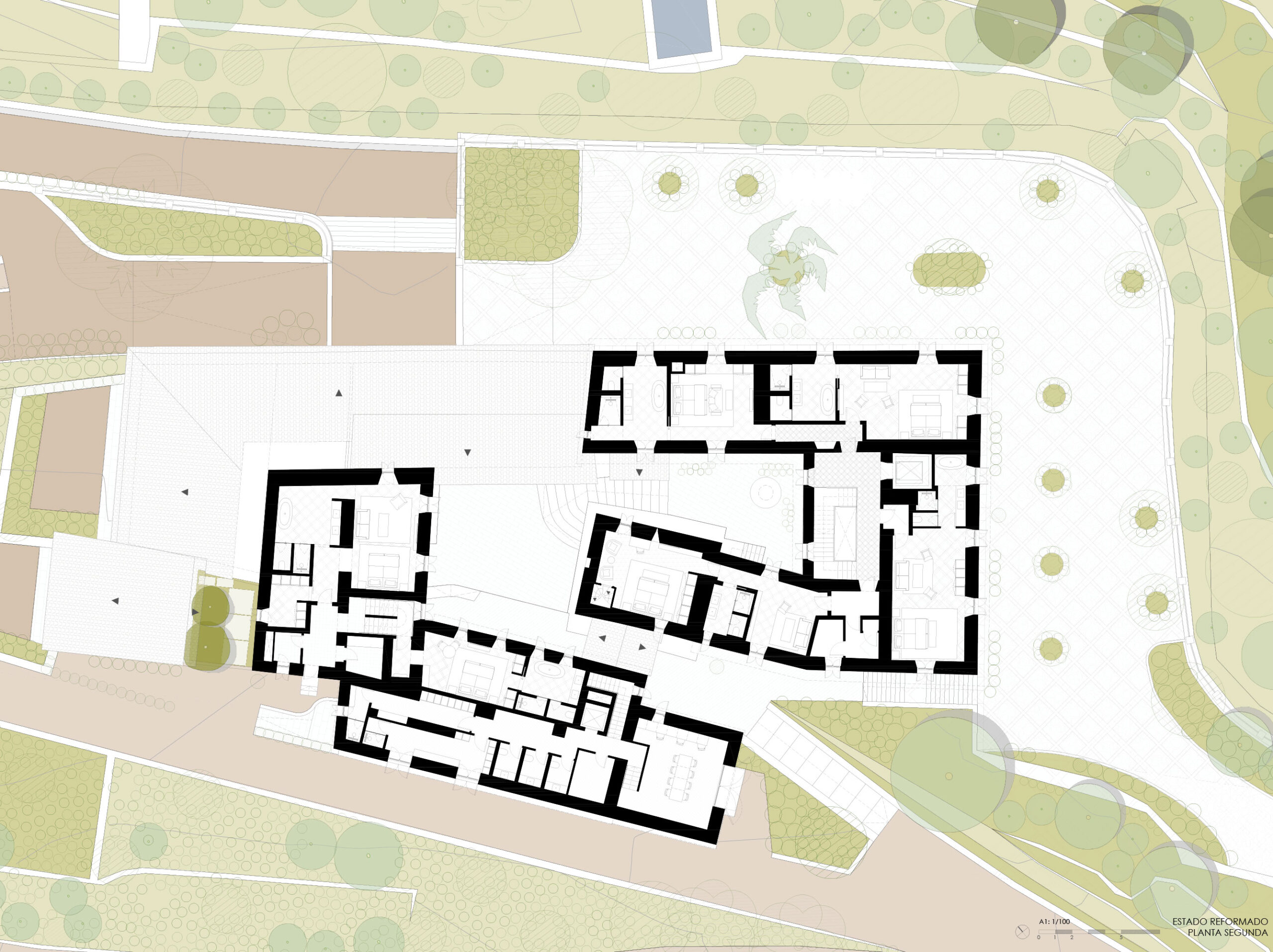
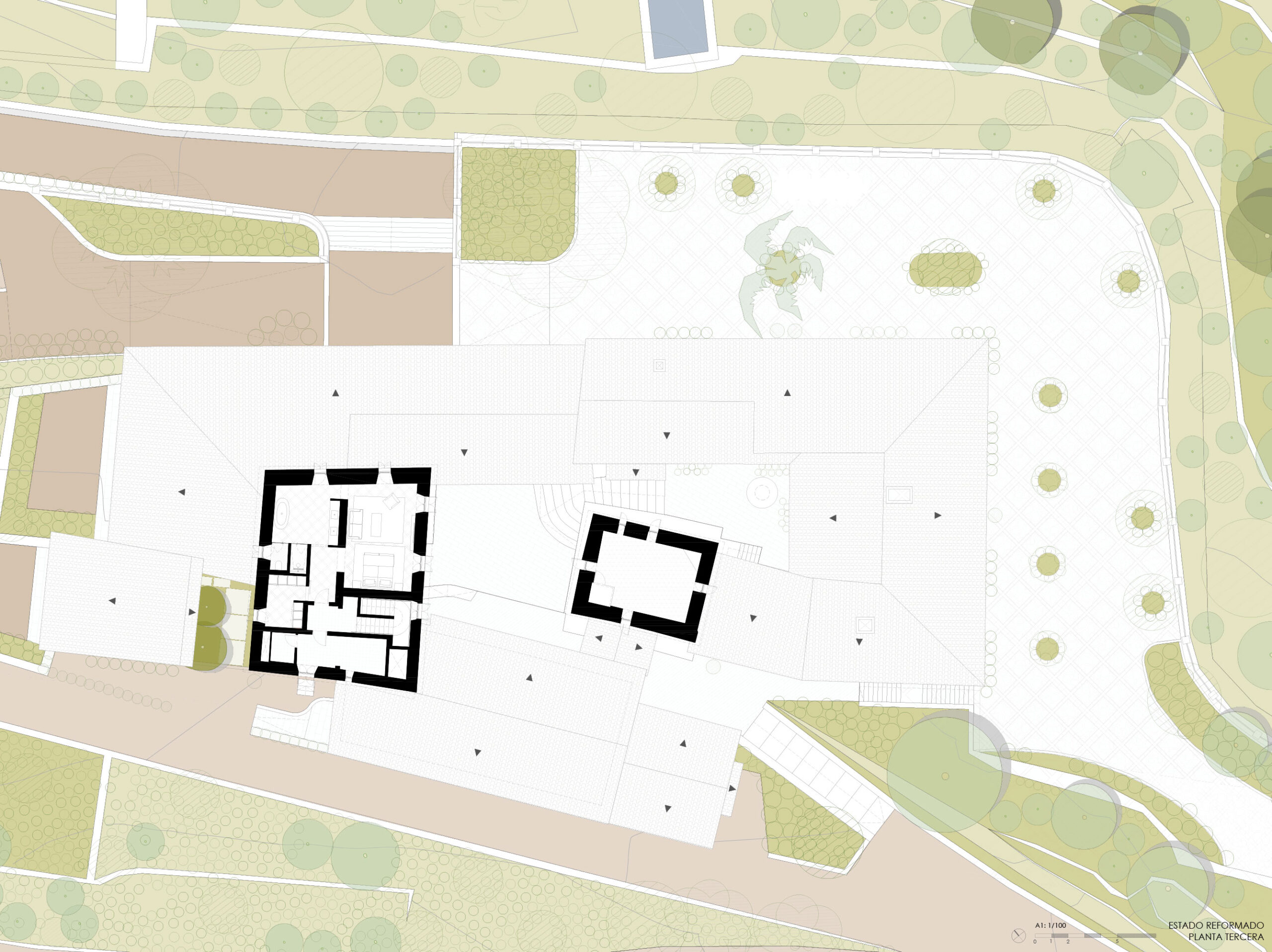
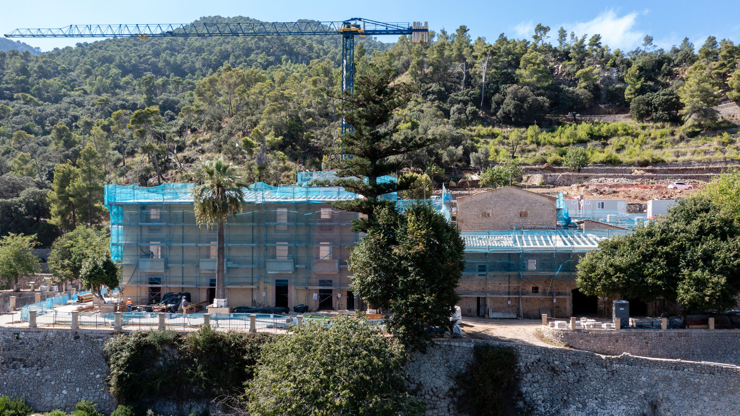
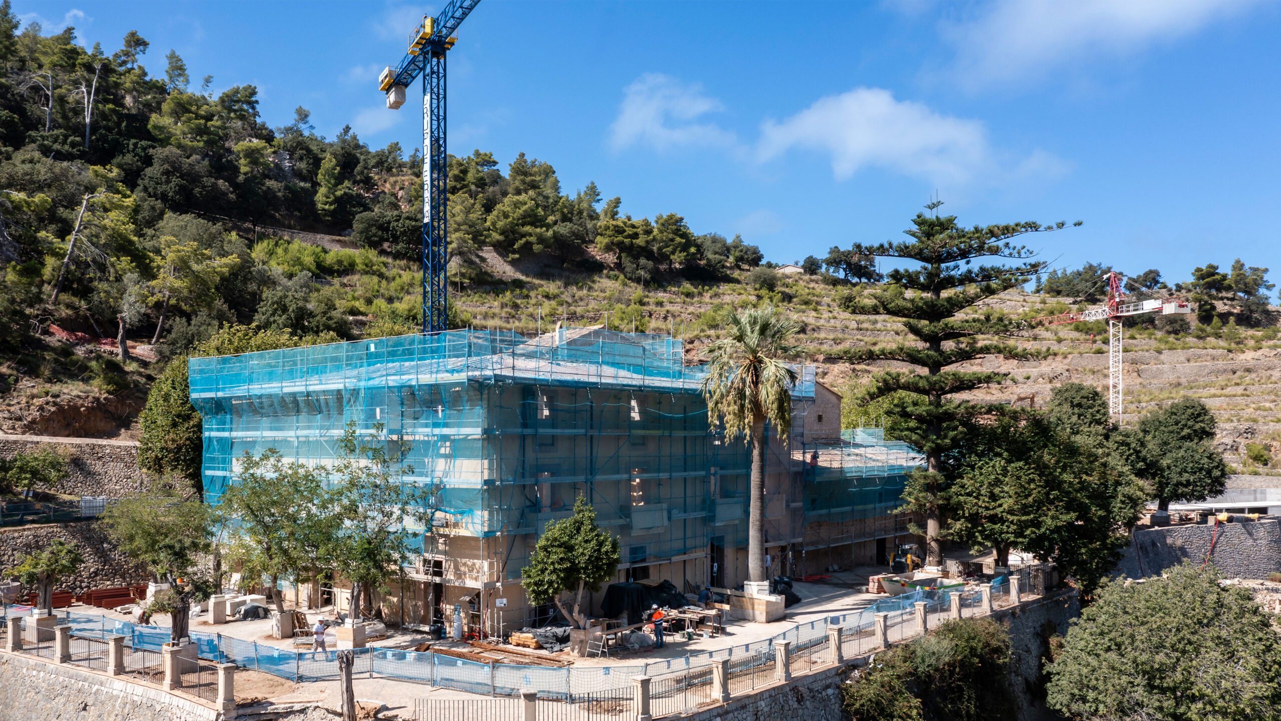
The program is organized around two main volumes: the Casa dels Senyors, the former owners’ residence, characterized by its ochre-rendered façades and a more formal architectural presence; and the Casa dels Amos, historically linked to service and agricultural activities, defined by its rustic character and exposed brick walls.
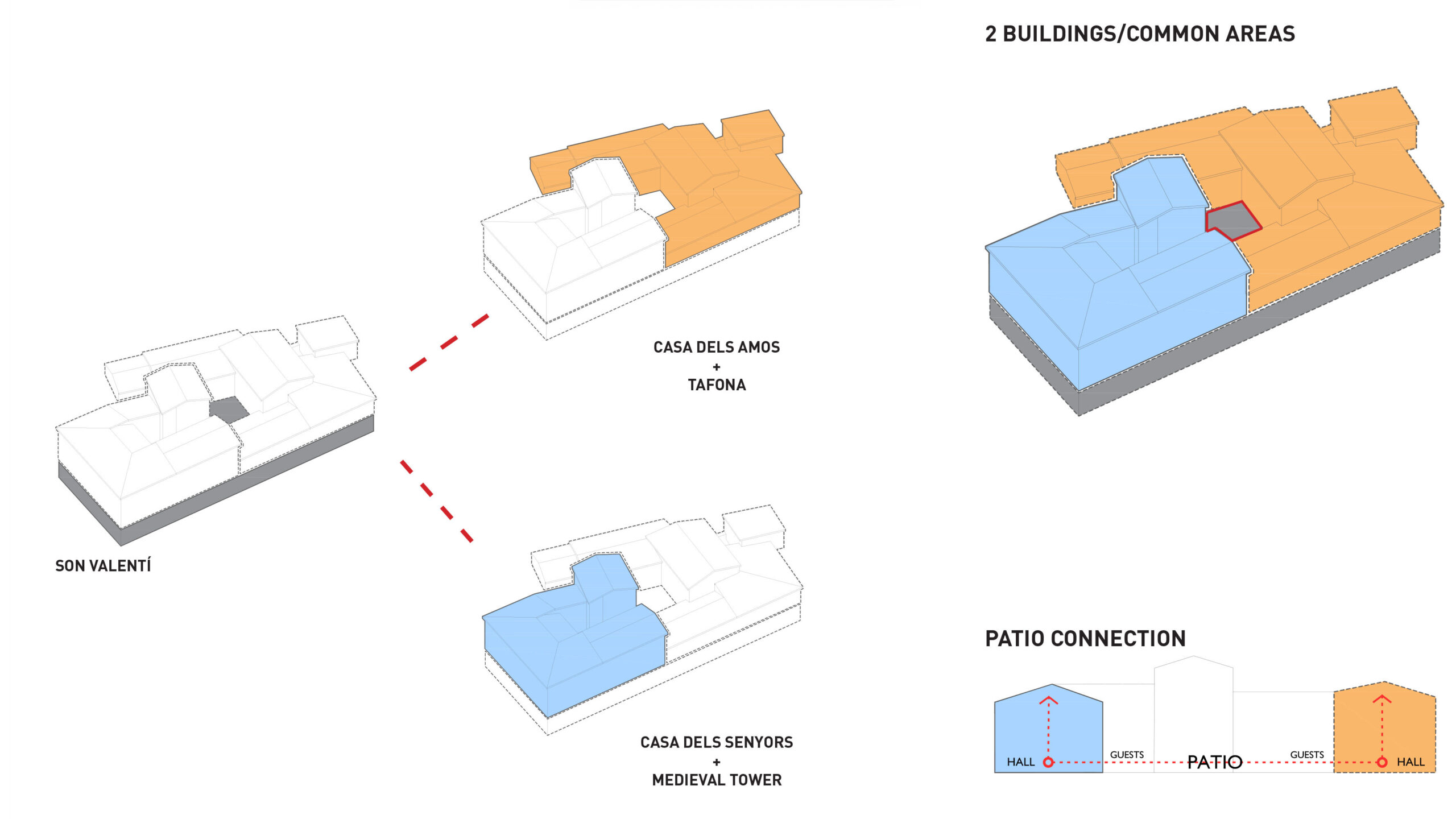
While both buildings preserve their independent accesses and volumes, they are visually connected through the landscape and the central courtyard, sharing a direct opening towards the sea and the northern coastline of the island.
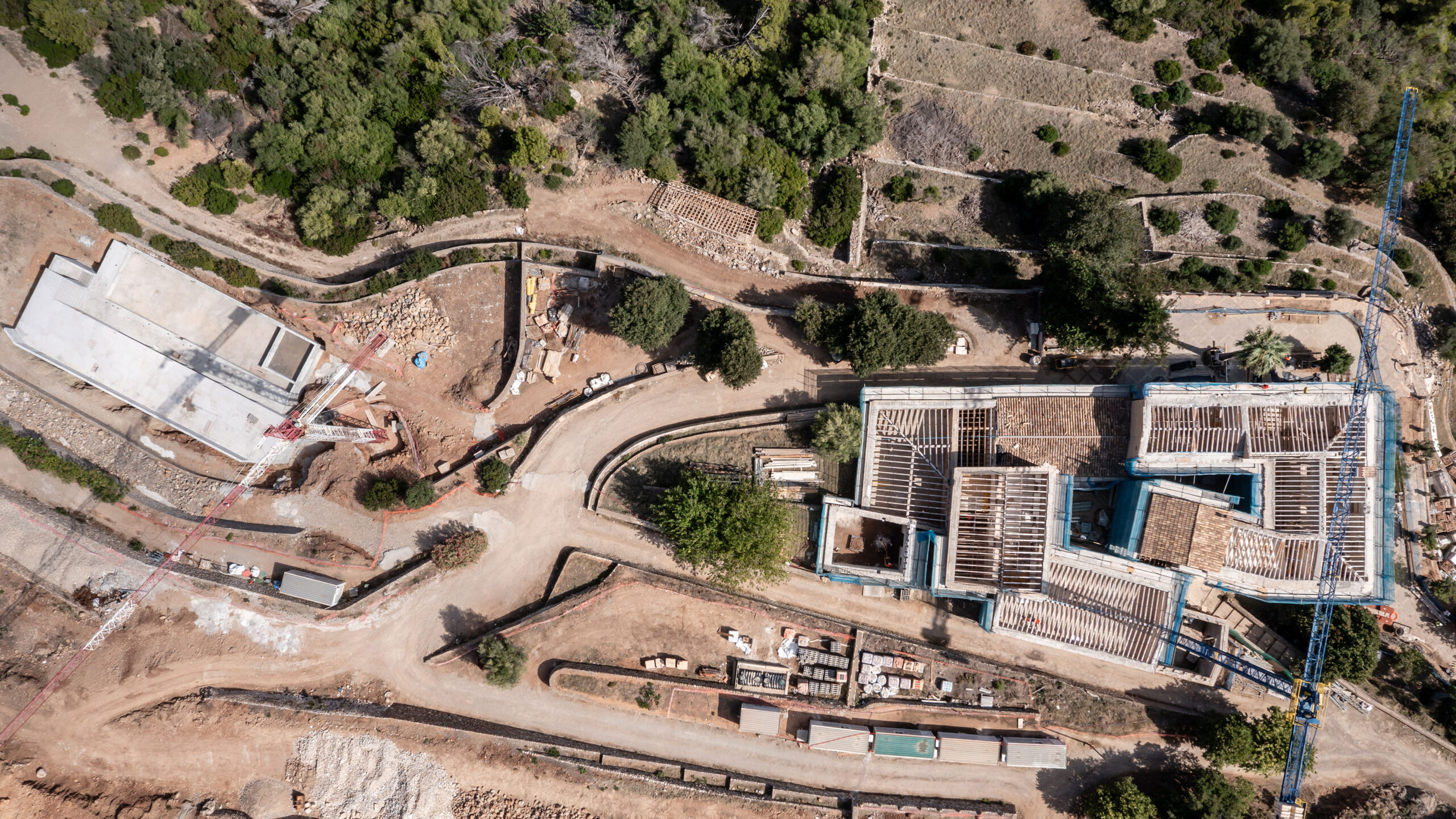
A Balanced Layout that Respects the Historical Hierarchy & Existing Materiality
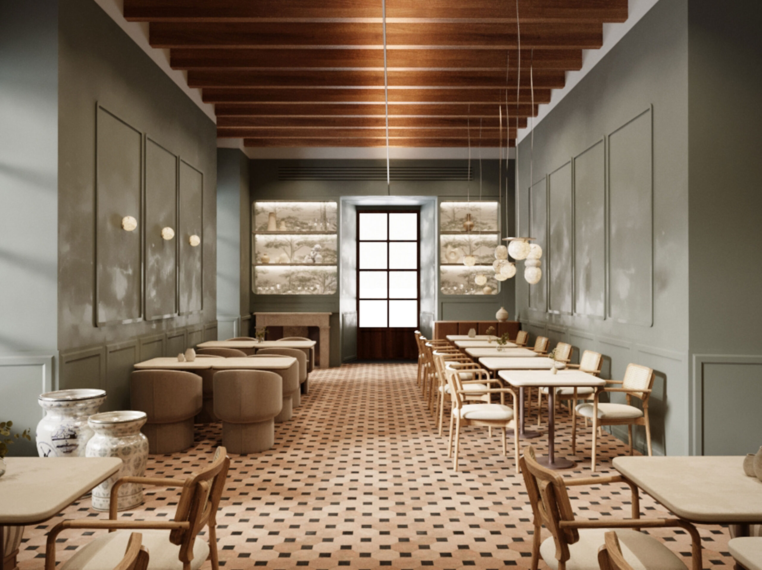
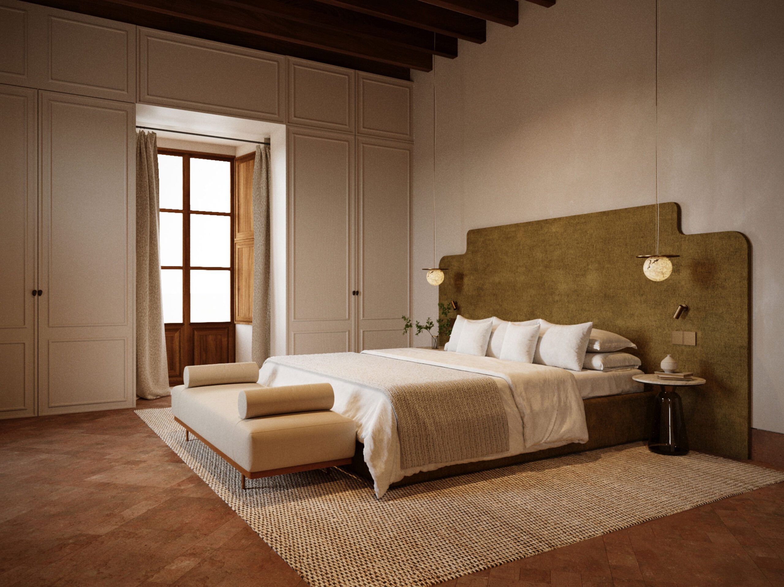
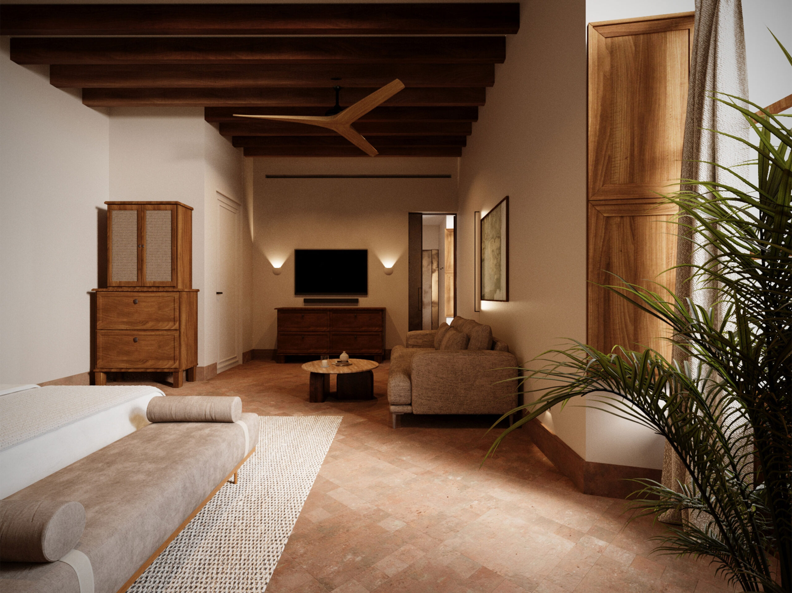
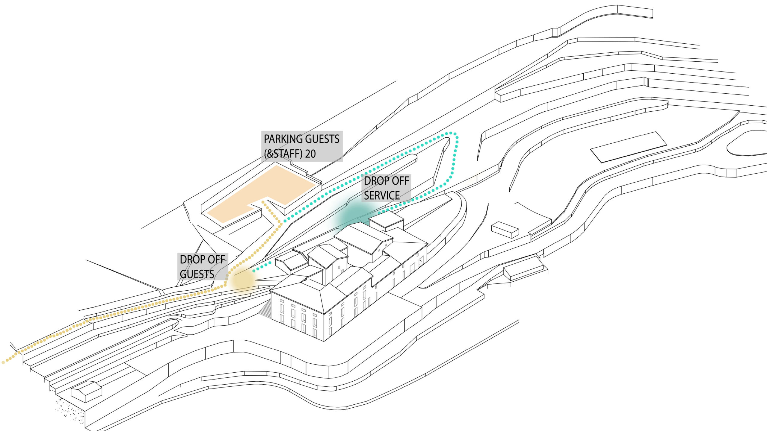
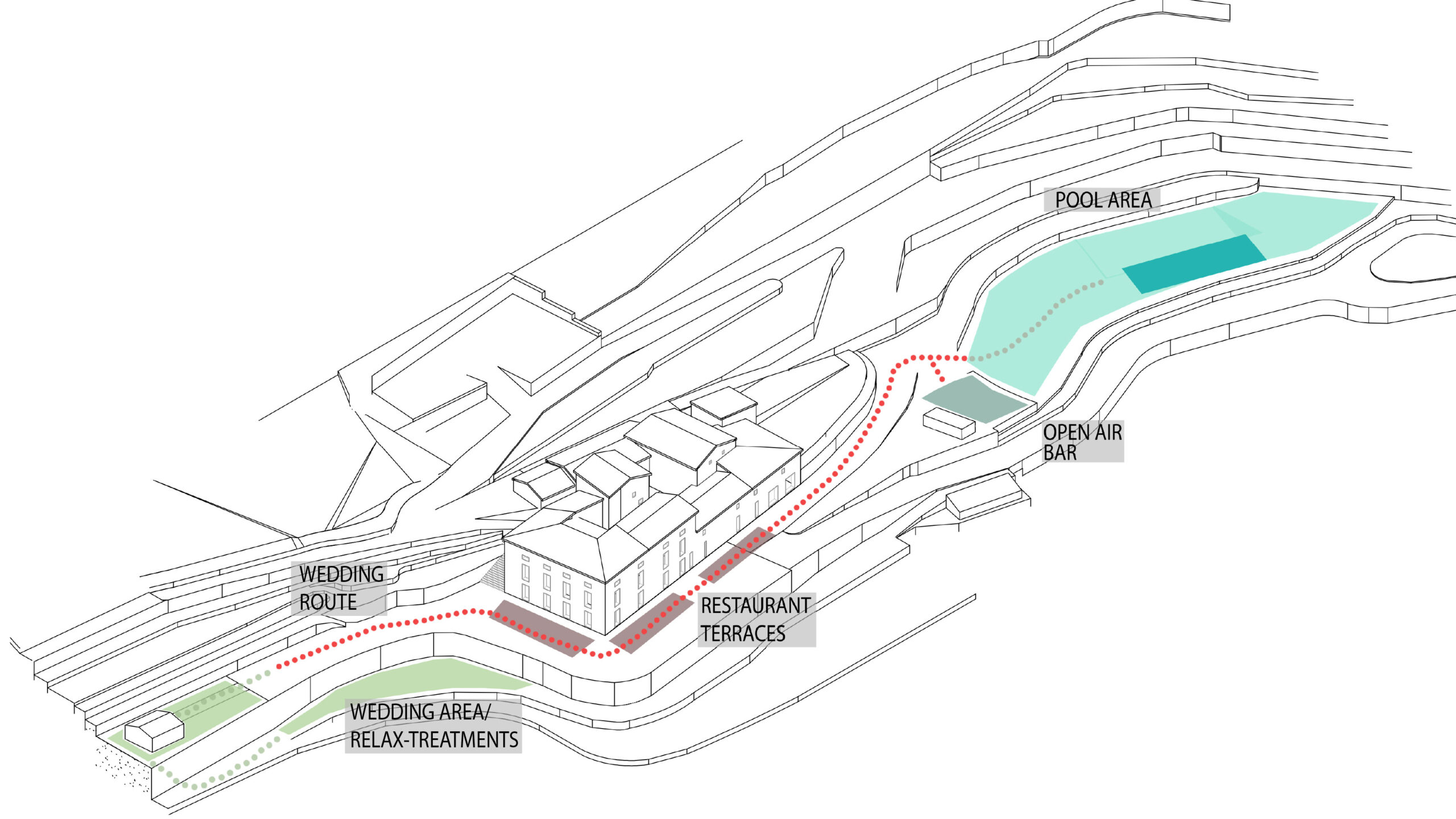
The public program is mainly located on the ground floor, accommodating reception, restaurant, kitchen, gym and treatment rooms, while guest rooms are arranged on the upper levels.
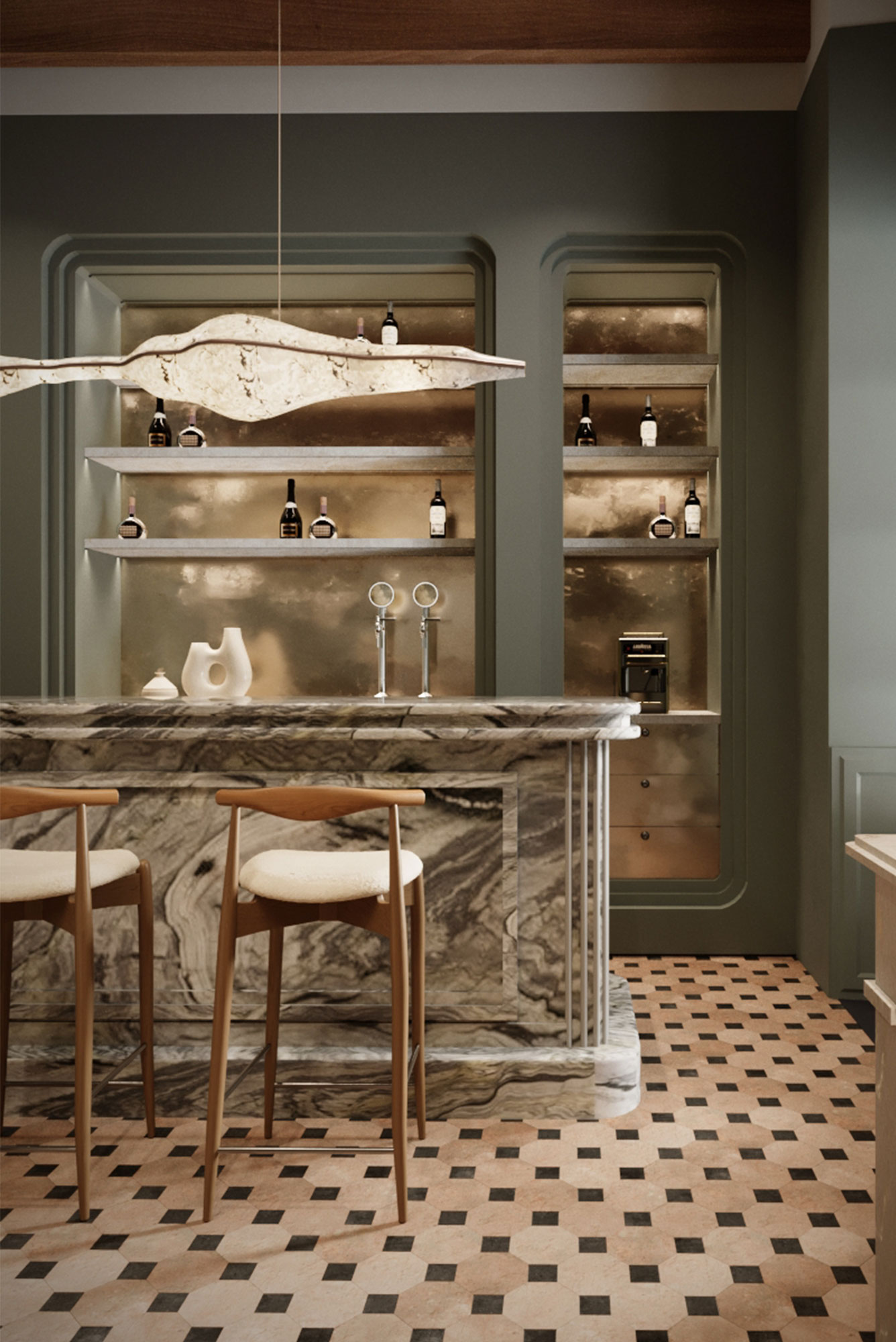
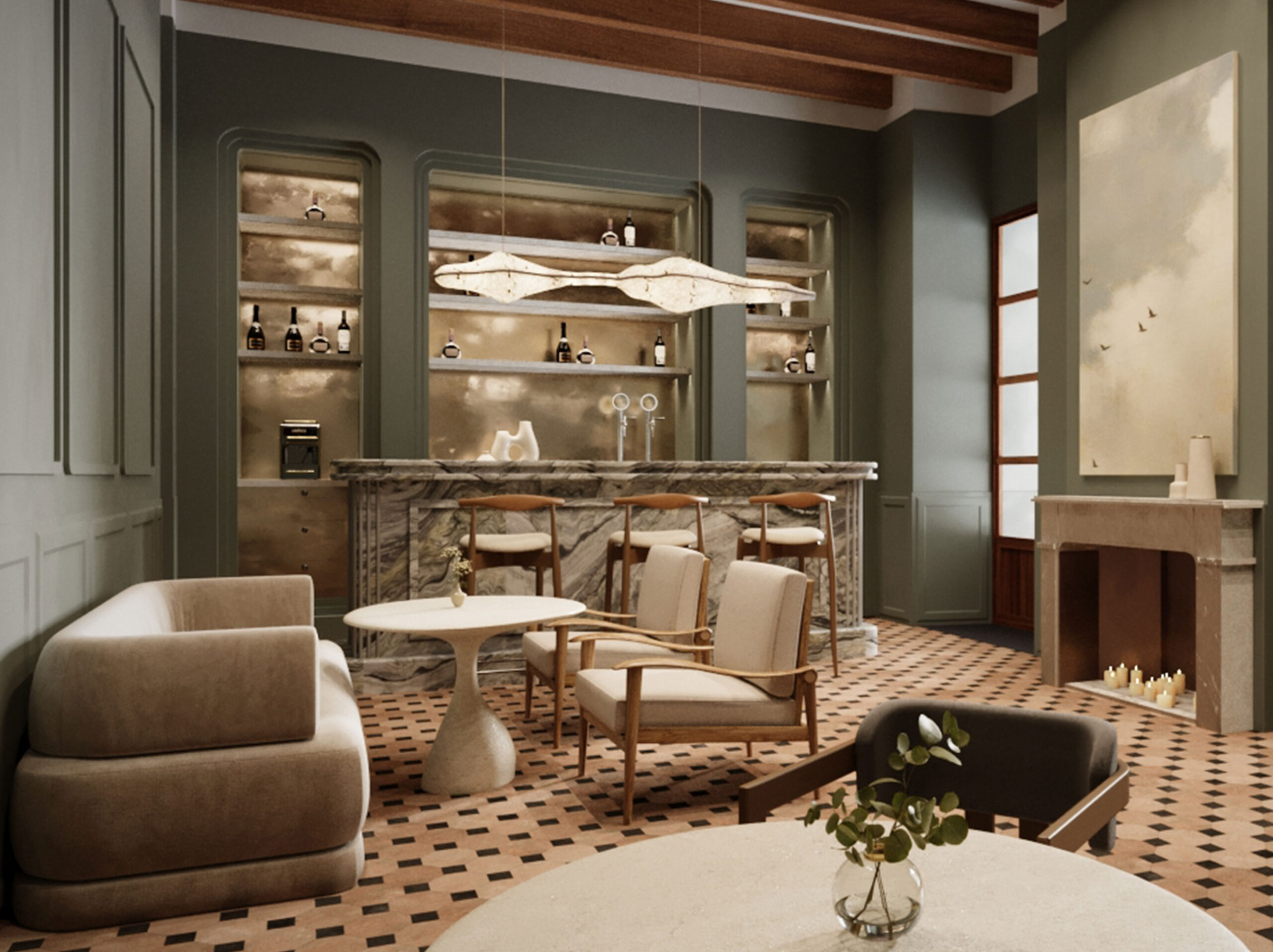
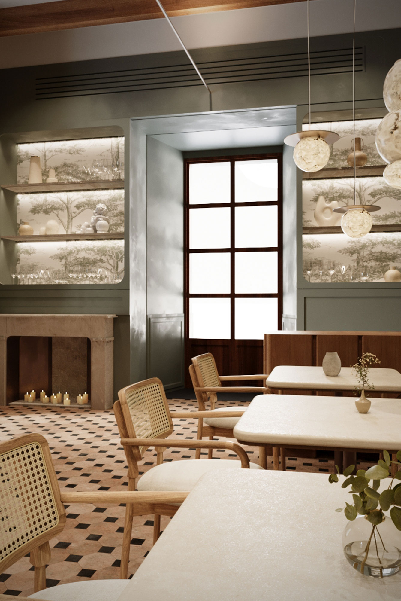
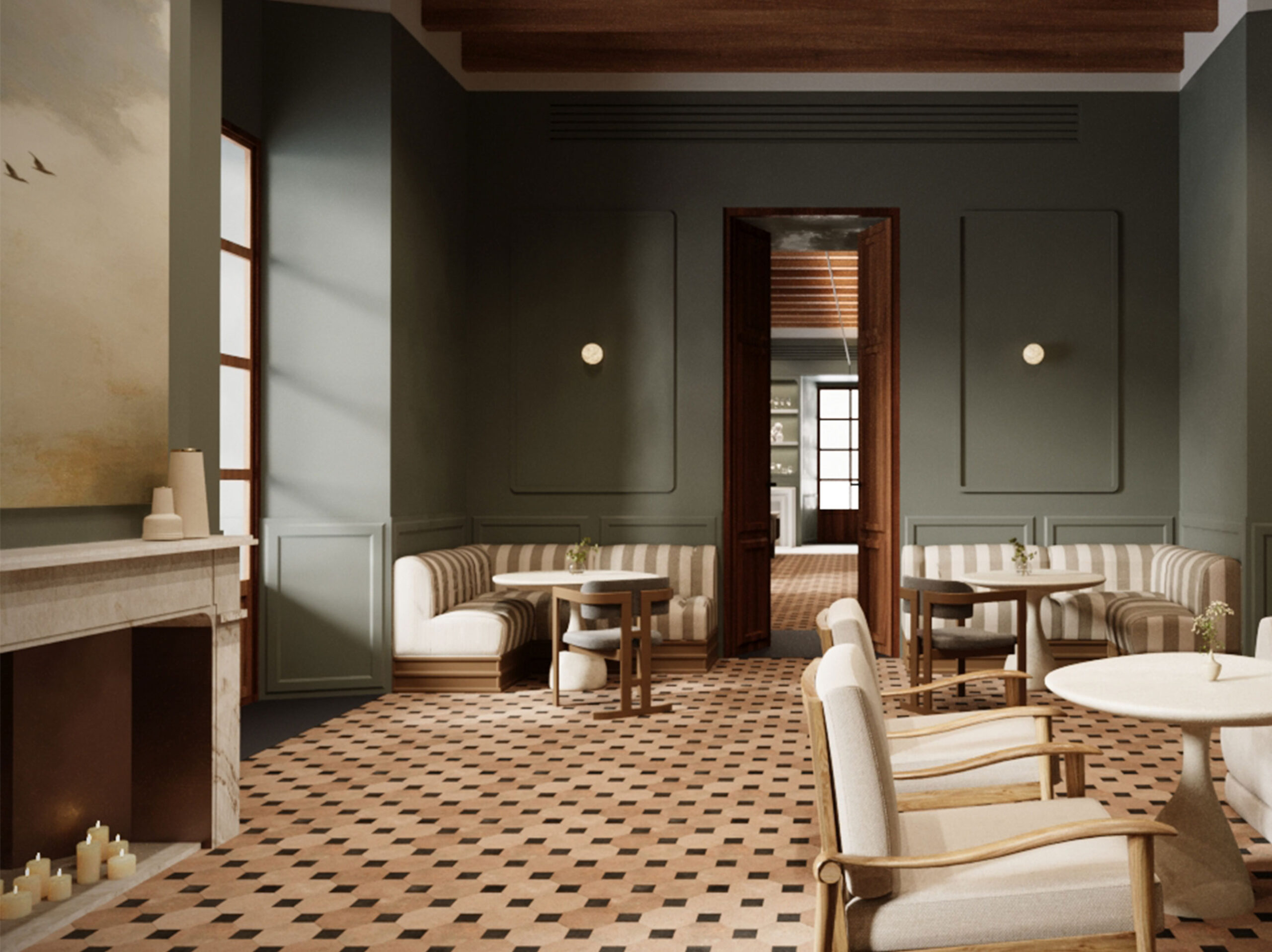
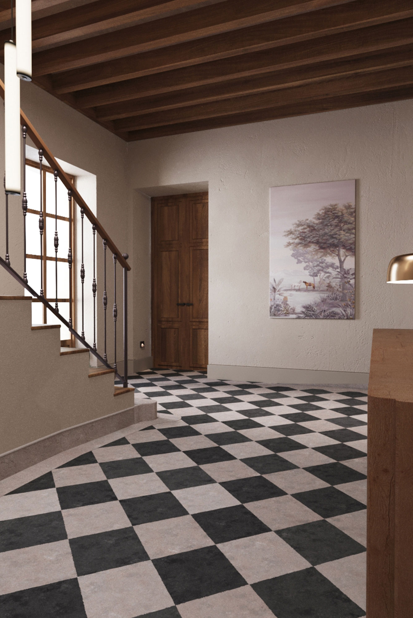
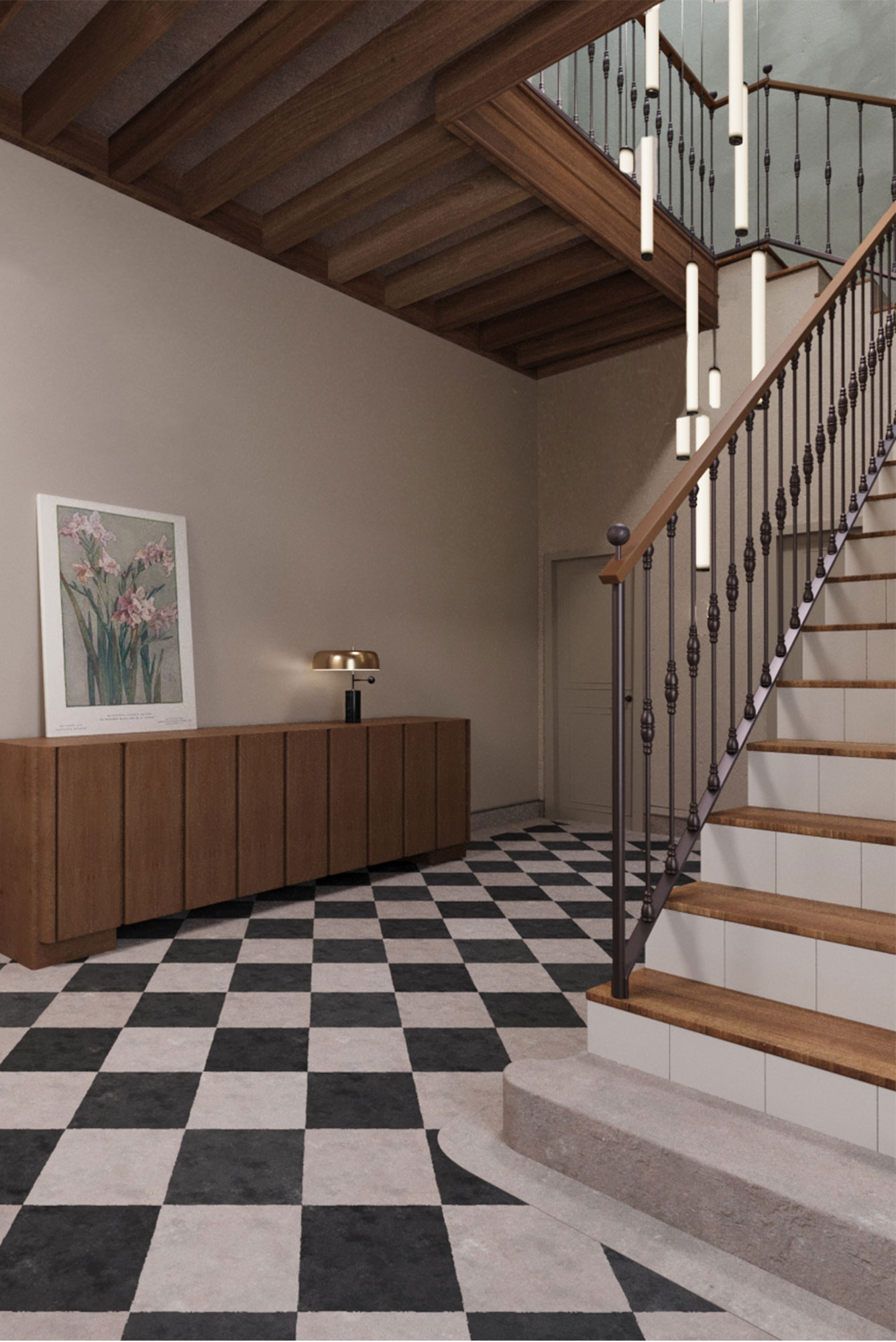
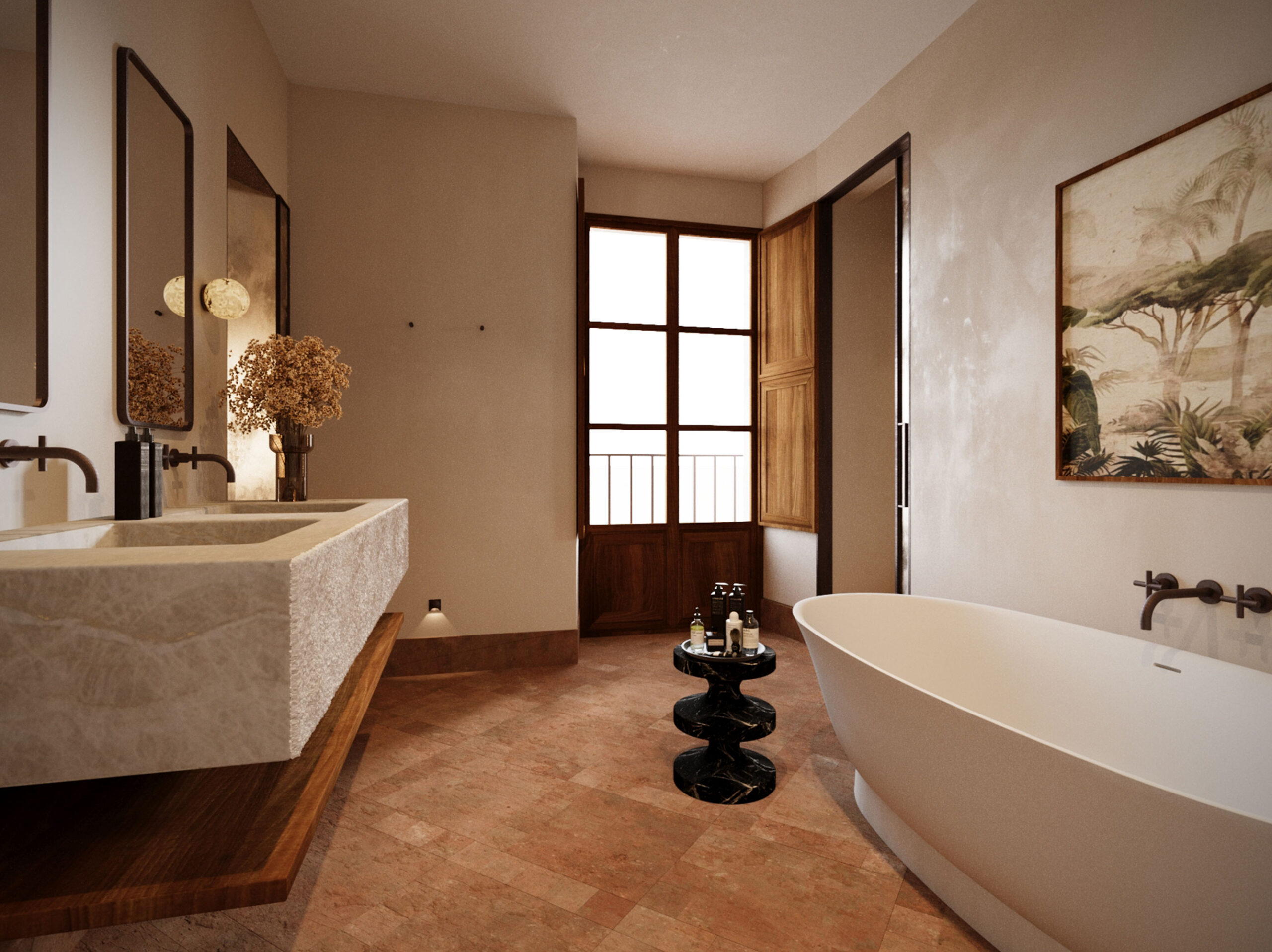
The interior design is sober and respectful of the context, allowing the architecture to speak for itself through the use of noble, traditional, and local materials such as marès stone, restored woodwork, hydraulic floors, and lime mortars.
Restoration of the Historic Hydraulic System as an Environmental Strategy
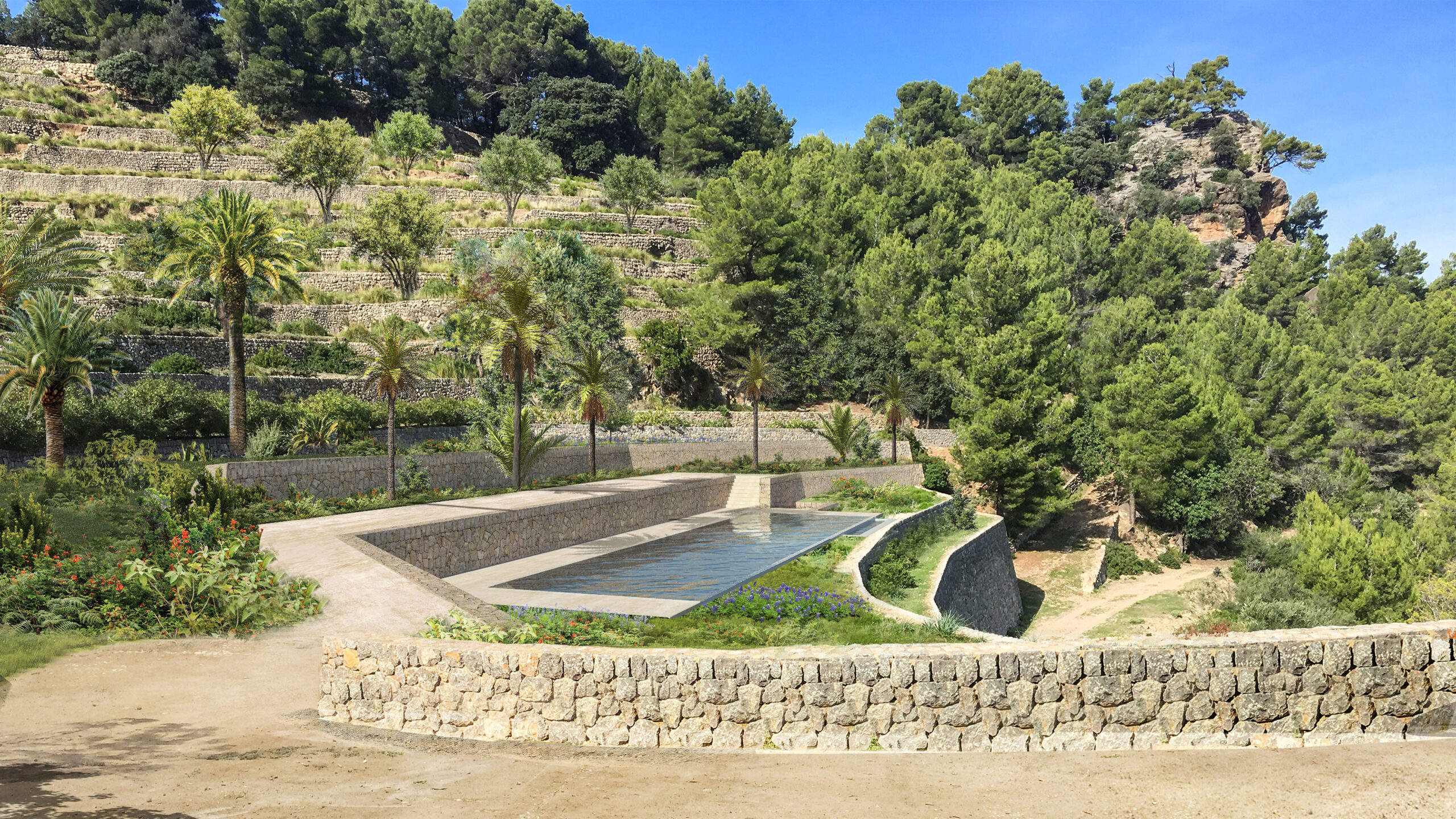
Historically conceived as a self-sufficient estate, Son Valentí incorporated a complex hydraulic system of cisterns, channels and water basins. This system has been carefully restored and reactivated as part of the project’s environmental strategy, maintaining the original logic of rainwater collection and storage for garden irrigation. In addition, the hotel integrates its own water purification system that will allow for its complete reuse, without generating waste.
Landscape Continuity & Architectural Memory
The landscape design of the central courtyard, gardens and terraces prioritizes native vegetation and respects the original layout of stone pavements, wells and traditional hydraulic elements. The result is a coherent and restrained intervention that understands architecture as a continuation of the territory: a contemporary refuge rooted in history, where built form, landscape and memory converge in quiet balance.
