GRAS Office
Redesigning a Neighbourhood, We Designed Our Office, Too
Our New Office In Gomila Mallorca Epitomize Transparency And Versatility Through Its Open, Flexible, And Colorful Design
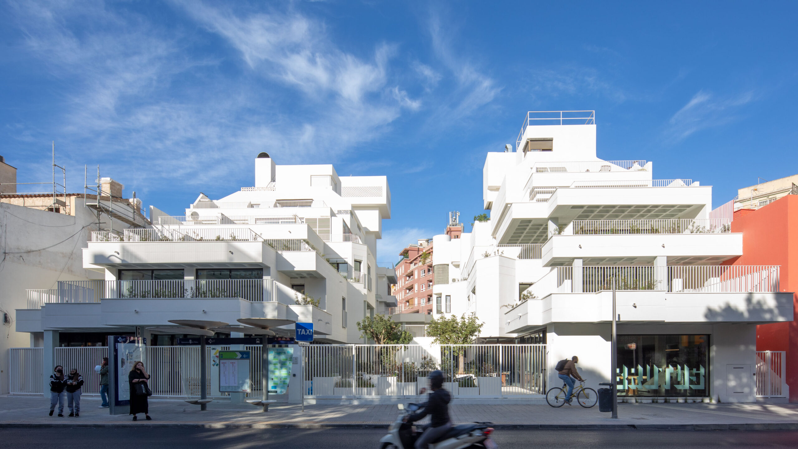
GRAS Reynés Arquitectos office recently moved to a new space inside the Gomila Mallorca project designed by GRAS and the Dutch studio MVRDV. The concept behind the new office design reflects the values of the Gomila project: the neighborhood is brought into the office.
Program
Interior architecture, interior design, commercial
Location
Plaza Gomila, Palma de Mallorca, ES
Size
400 m²
Year
2022
Architecture
GRAS Reynés Arquitectos
Team
Guillermo Reynés, Álvaro Pérez, Elena Gil, Xenia Dimoka, Alejandro Domingo, Zuzanna Cieslewicz, Klaudia Sandecka, Mikolaj Zajda
Engineering
EA Engineers Assesors
Collaborators
Lluminic, Yunke, Jardins de Tramuntana
Photography
Jose Taltavull, Imagen Subliminal (Miguel de Guzman + Rocío Romero)
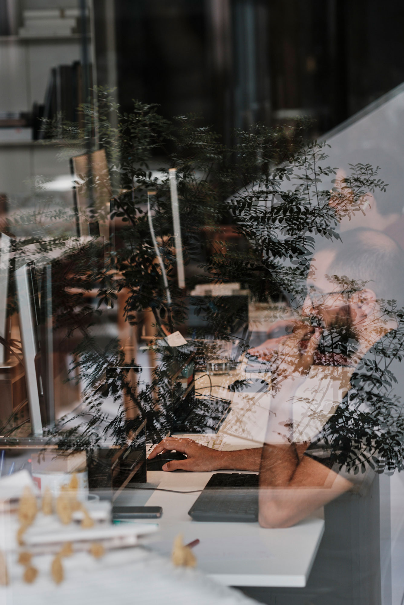
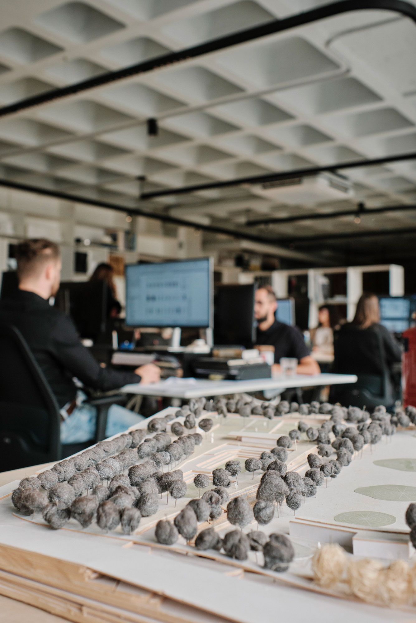
Space Design And Layout
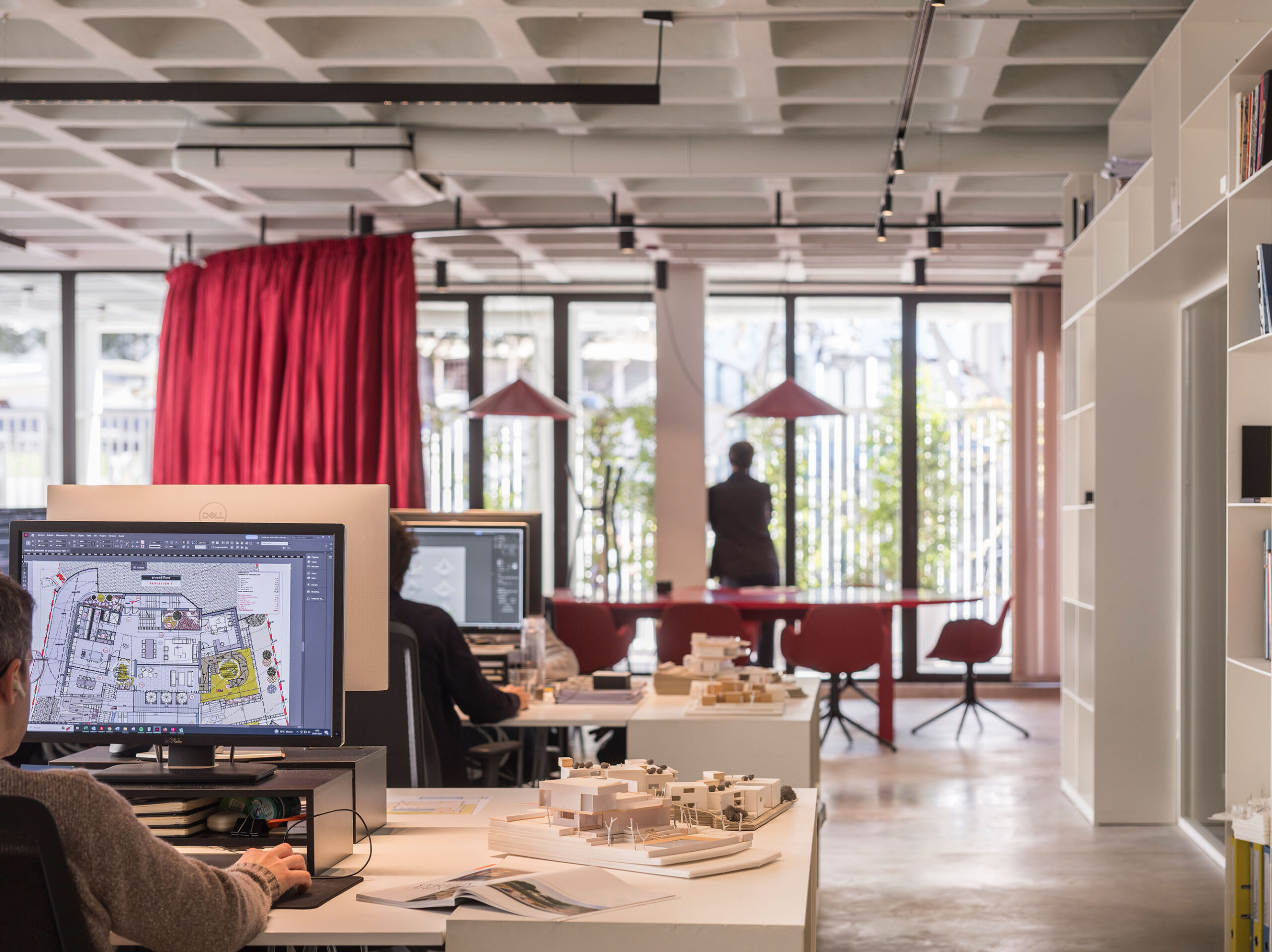
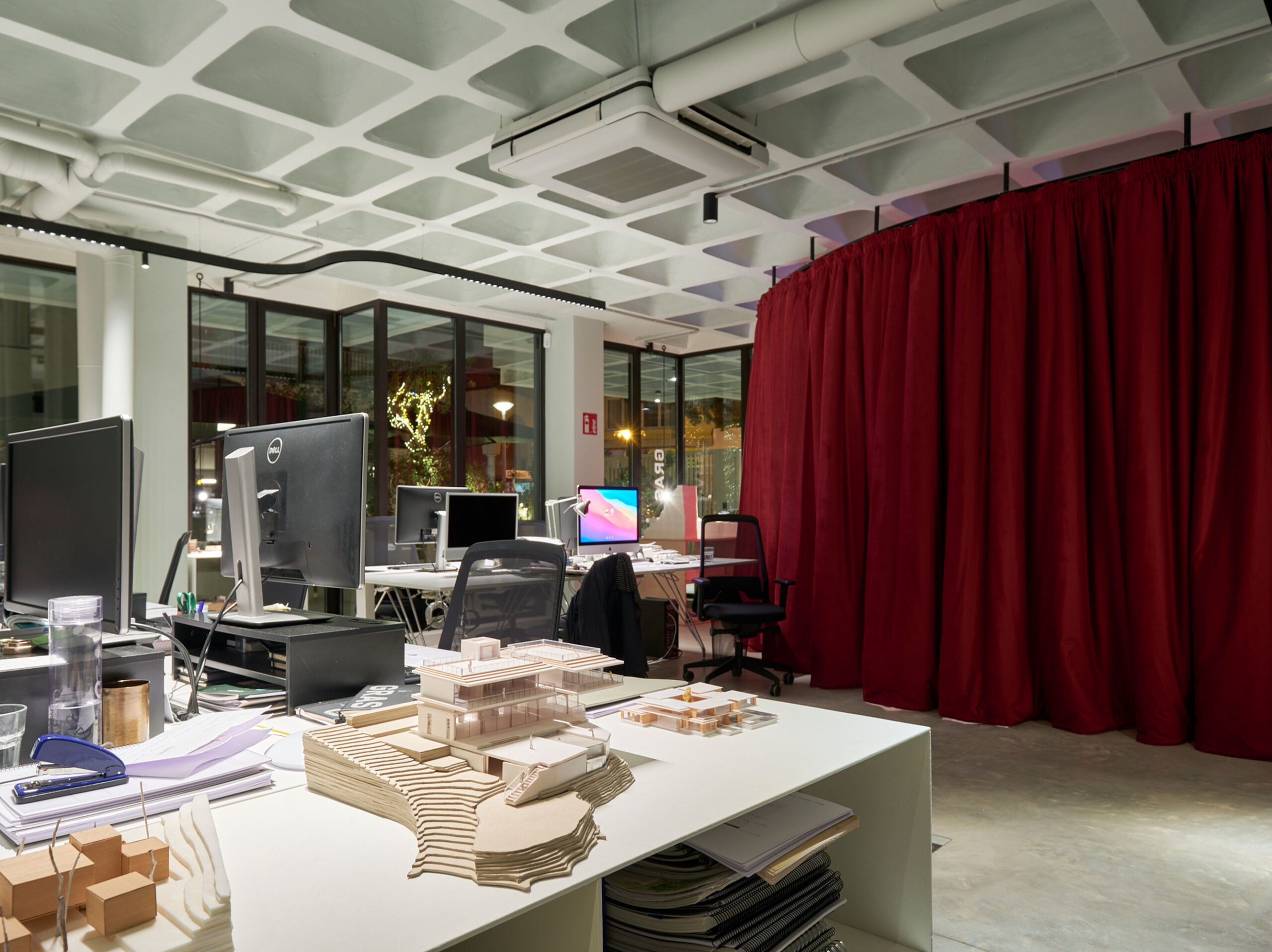
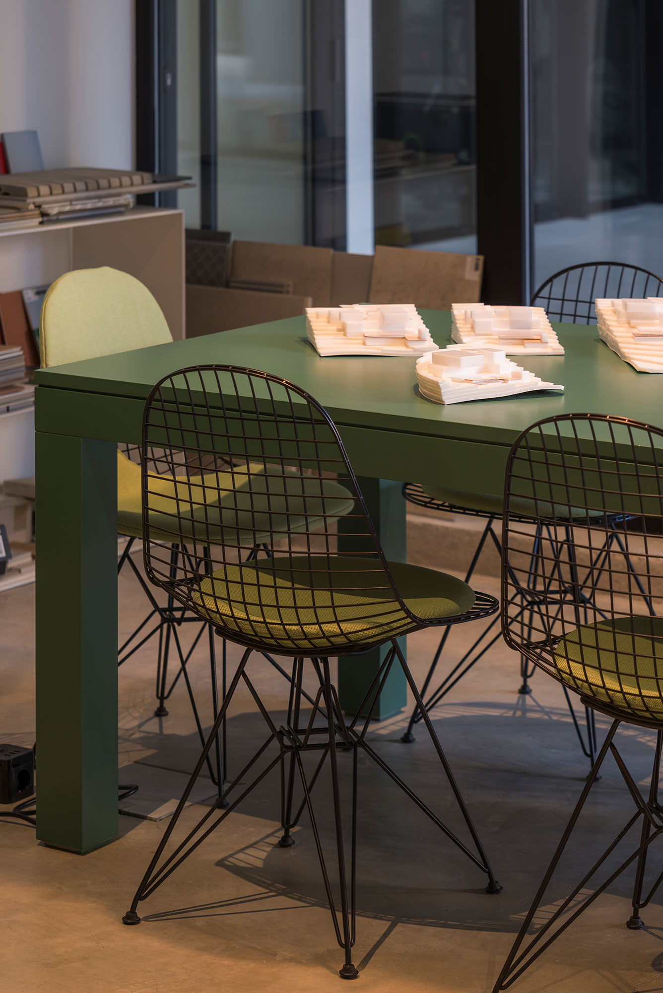
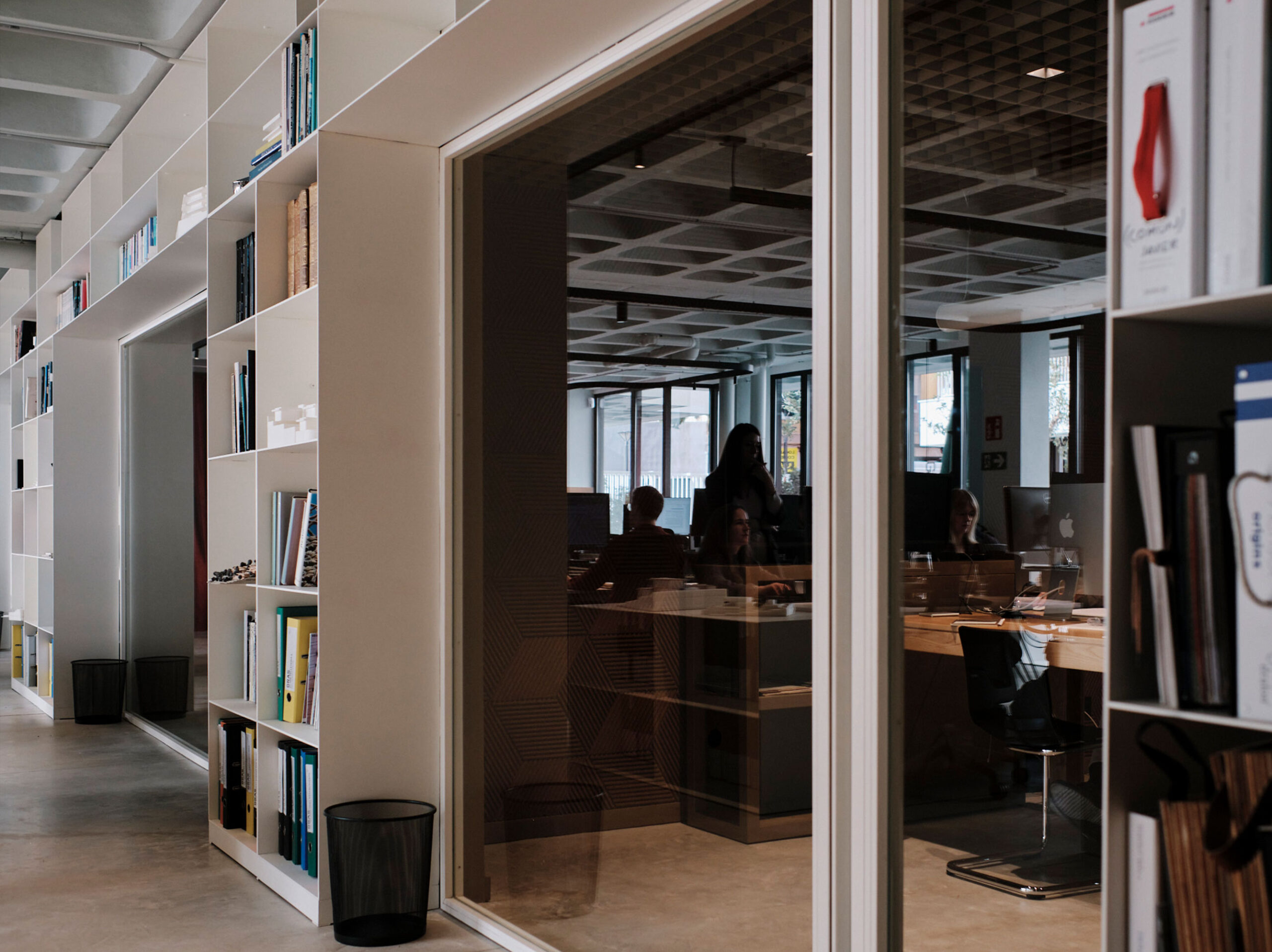
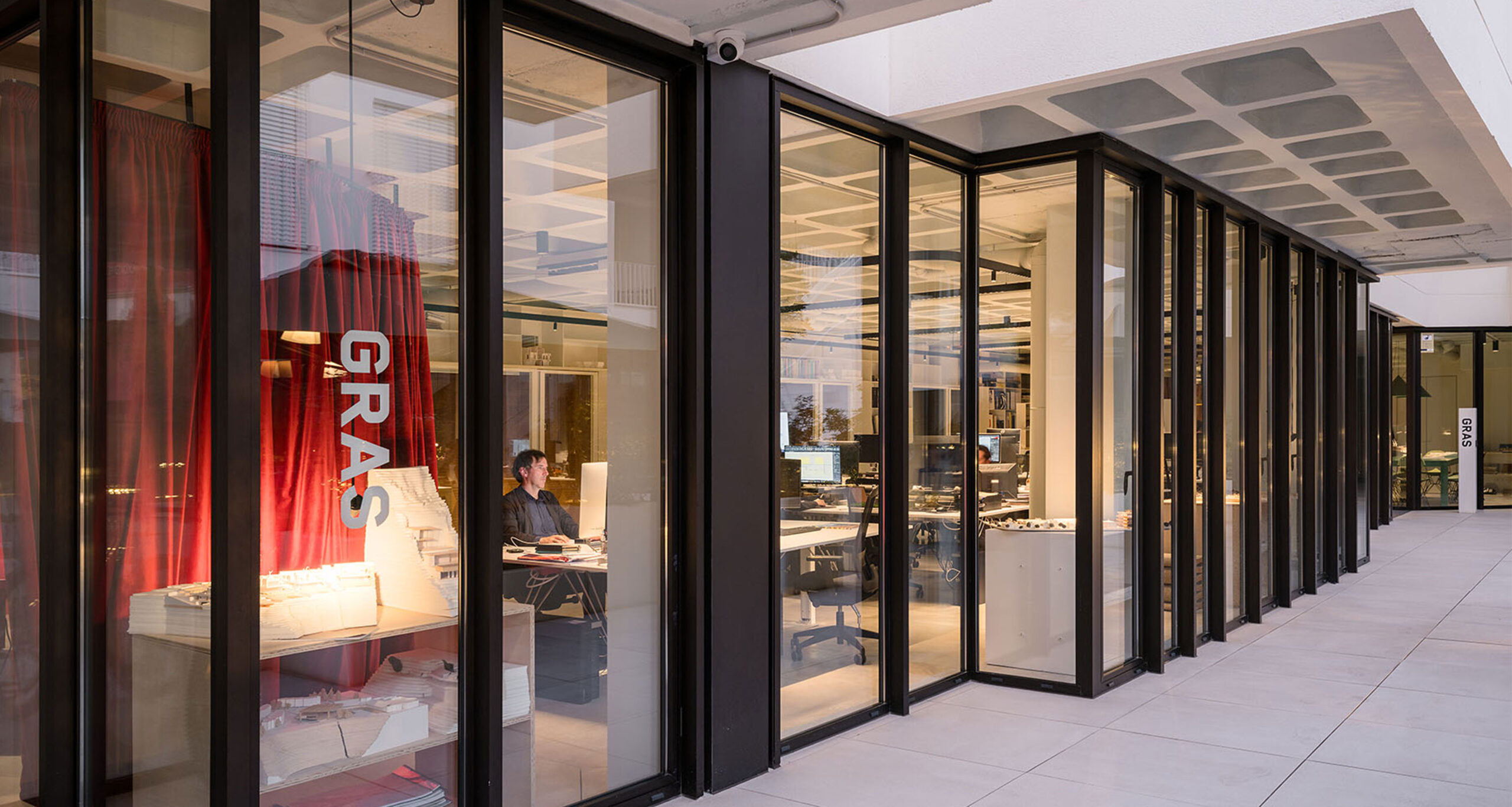
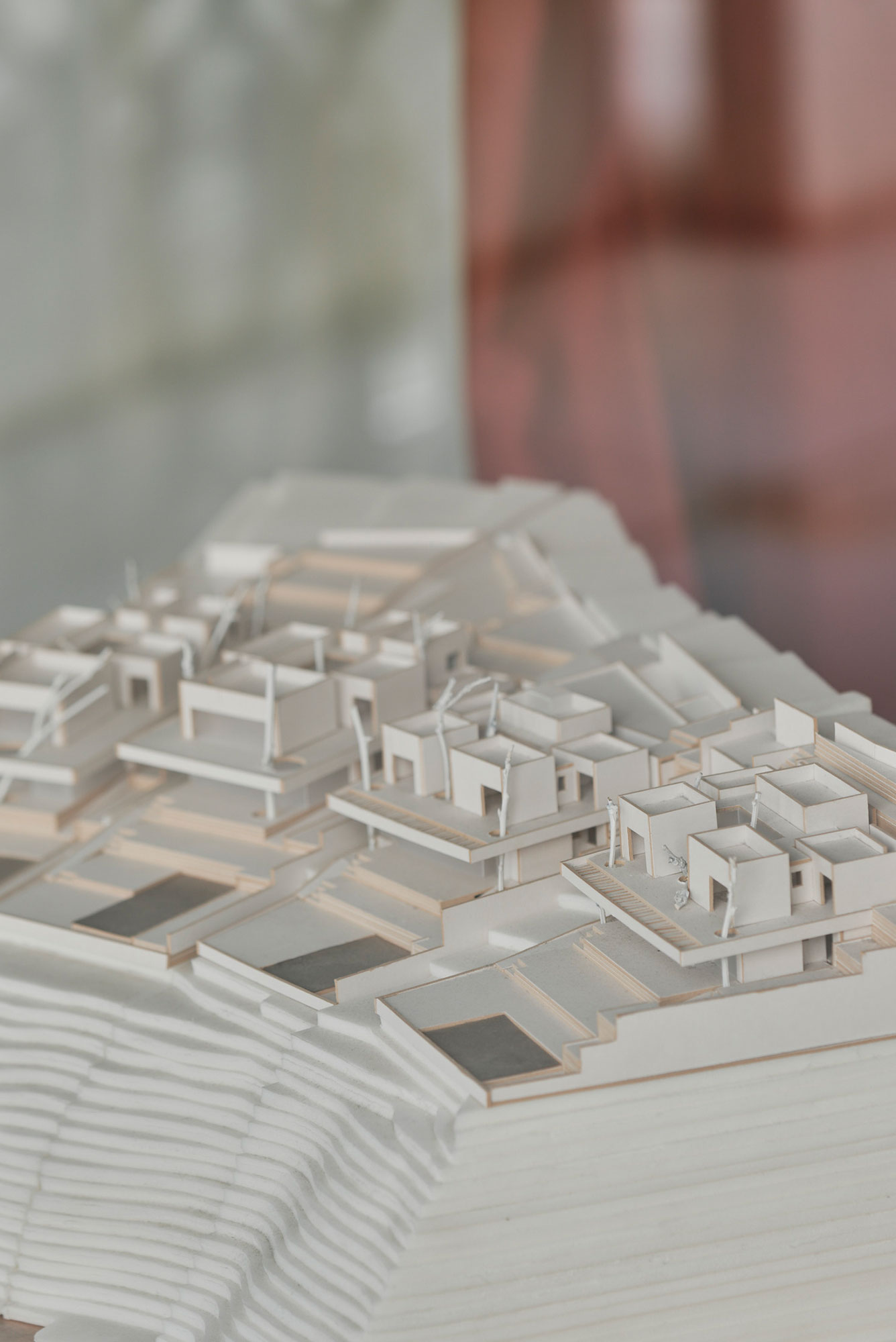
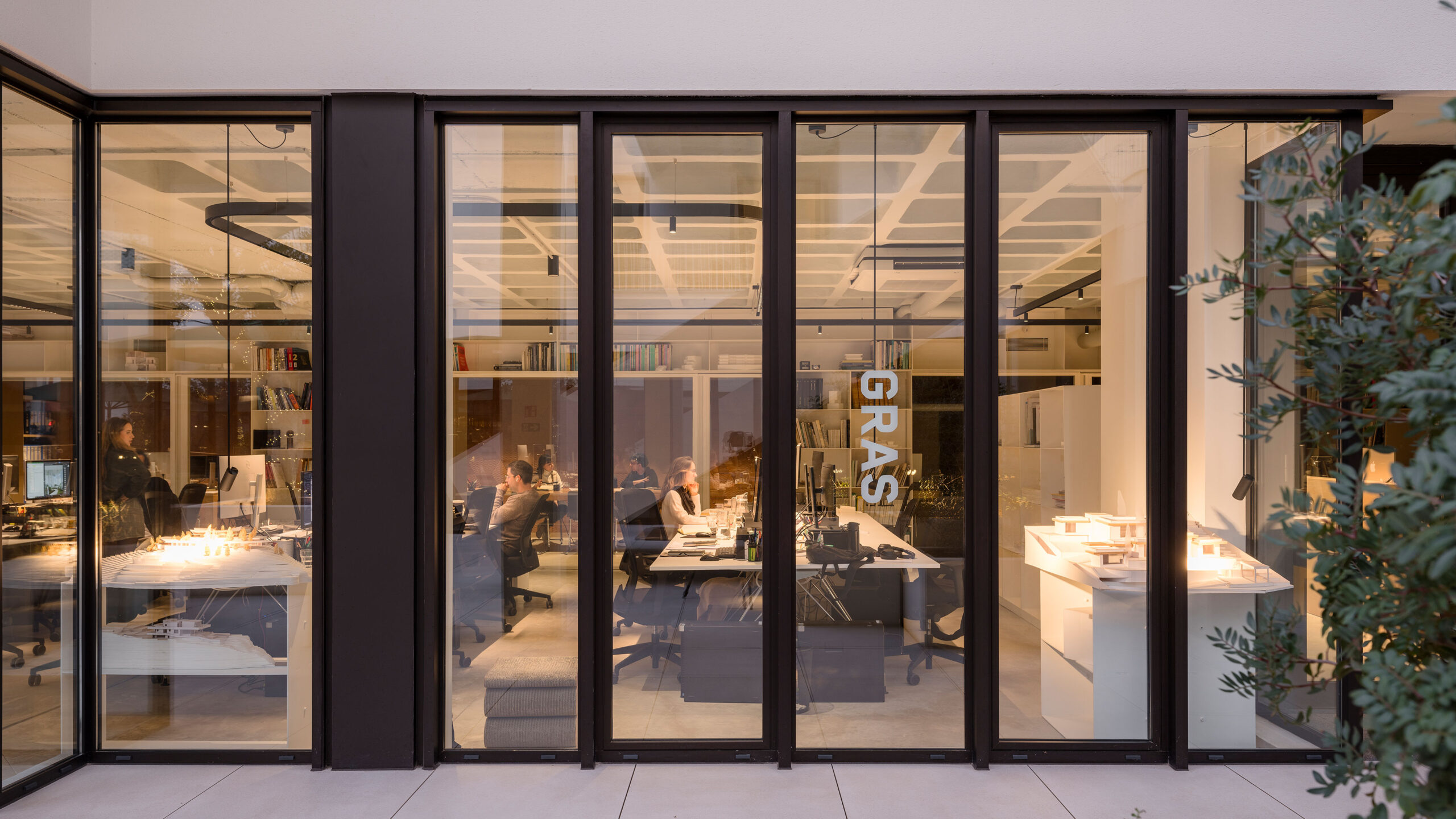
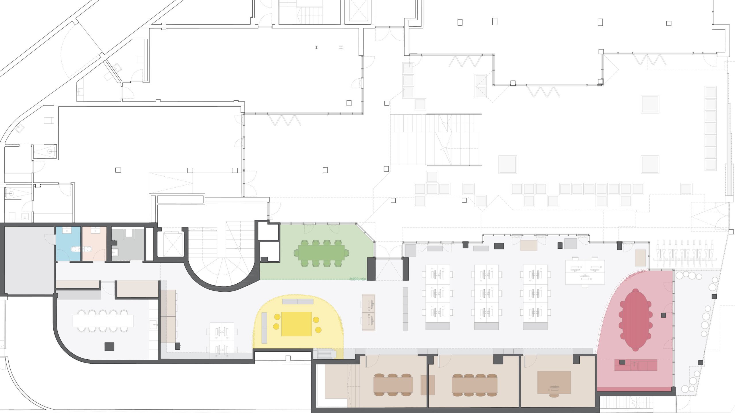
GRAS Office’s new space occupies the south ground floor wing of the Gomila Center, the heart of the complex. A full glazed façade opens up to the interior plaza and the street, so the office becomes a shop window to the city with an active display of the office’s works, especially the models.
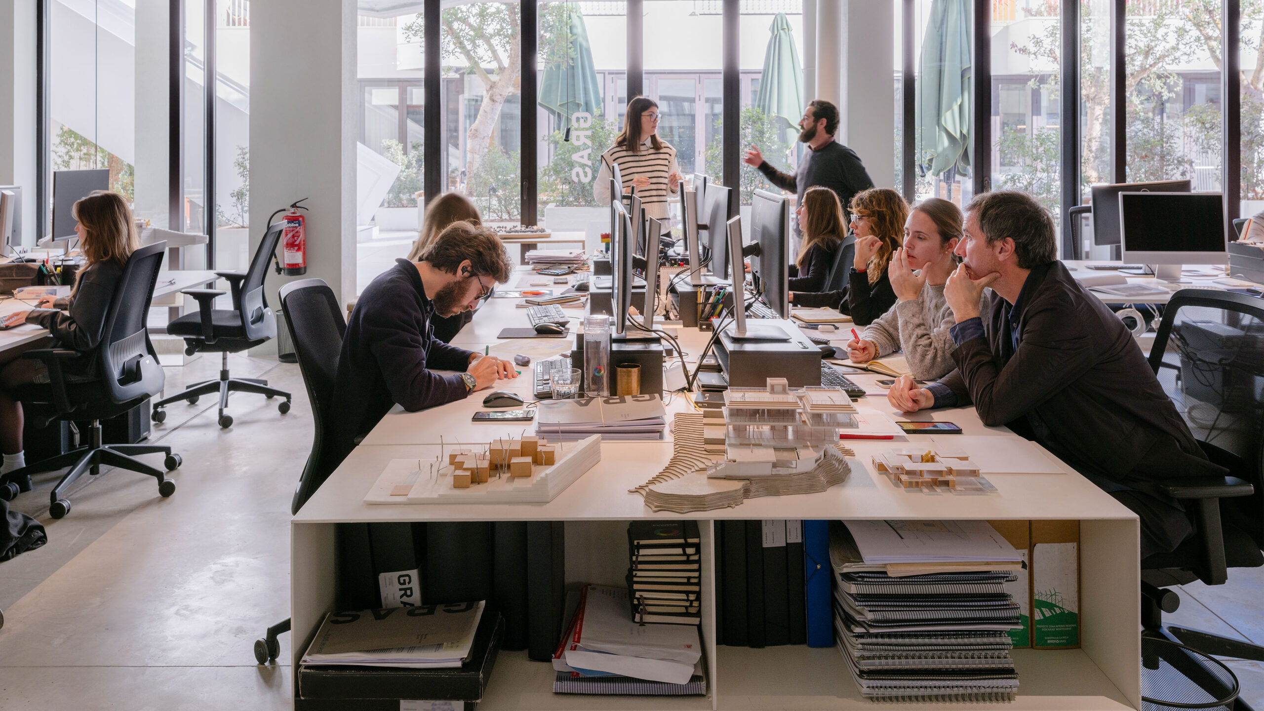
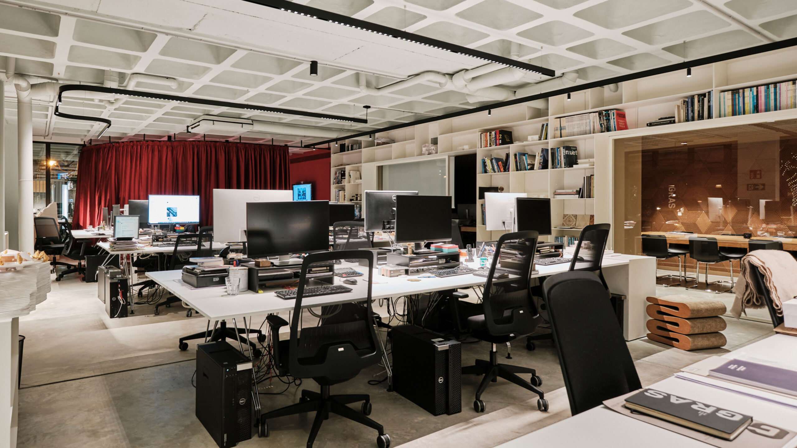
The studio sits in the white building; therefore, the design’s driving color is white in various shades. The office is designed as a long working open space, with an active shelf running along all the space. The shelf acts as bookcase, materials and model display, storage.
Functional Spaces: The GRAS Lounge
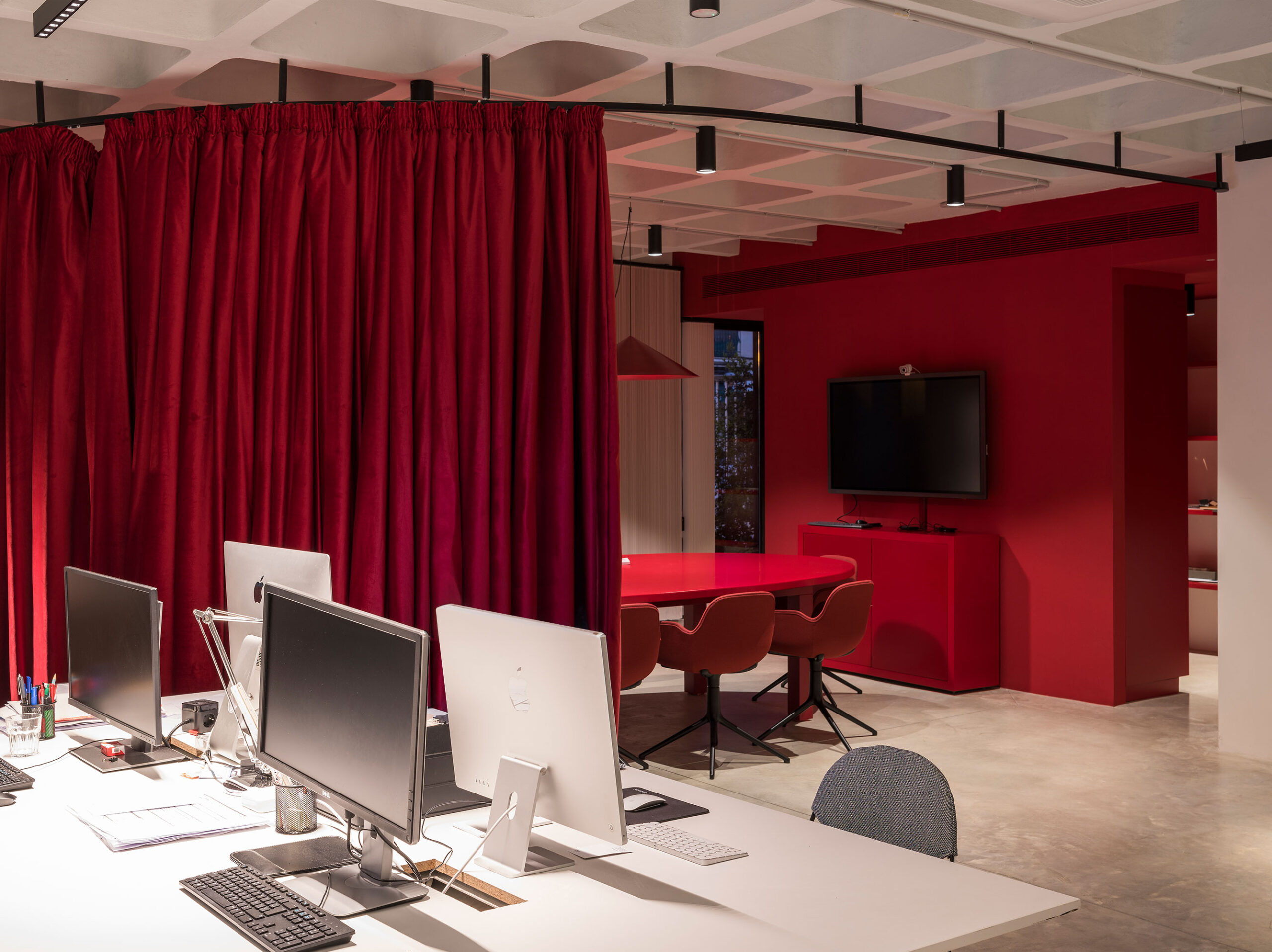
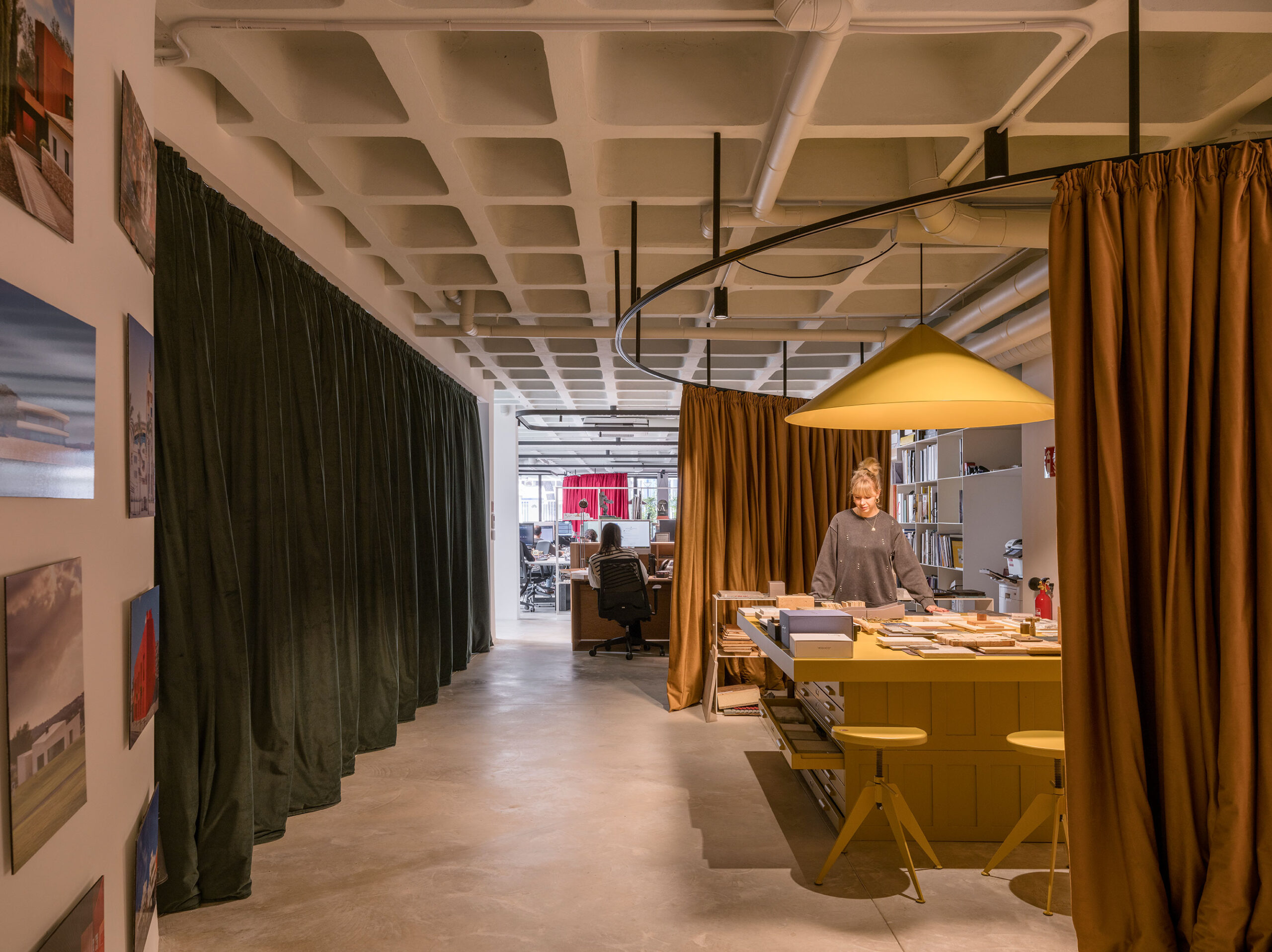
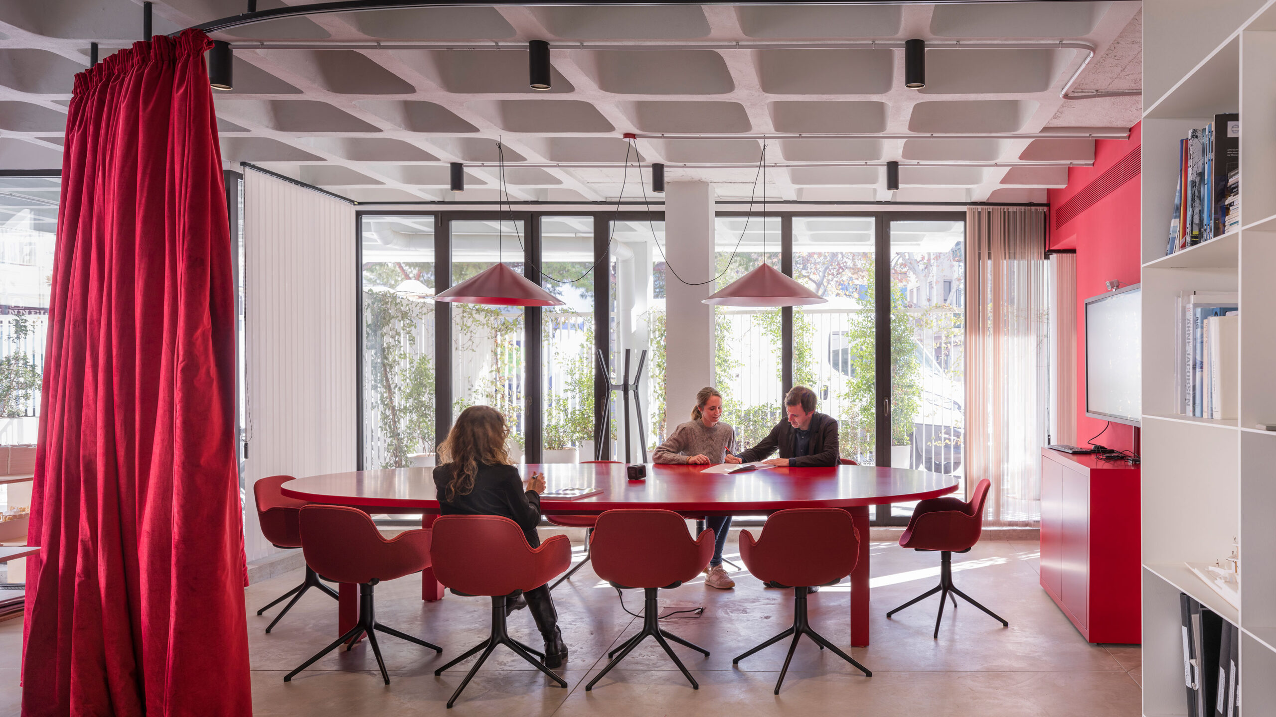
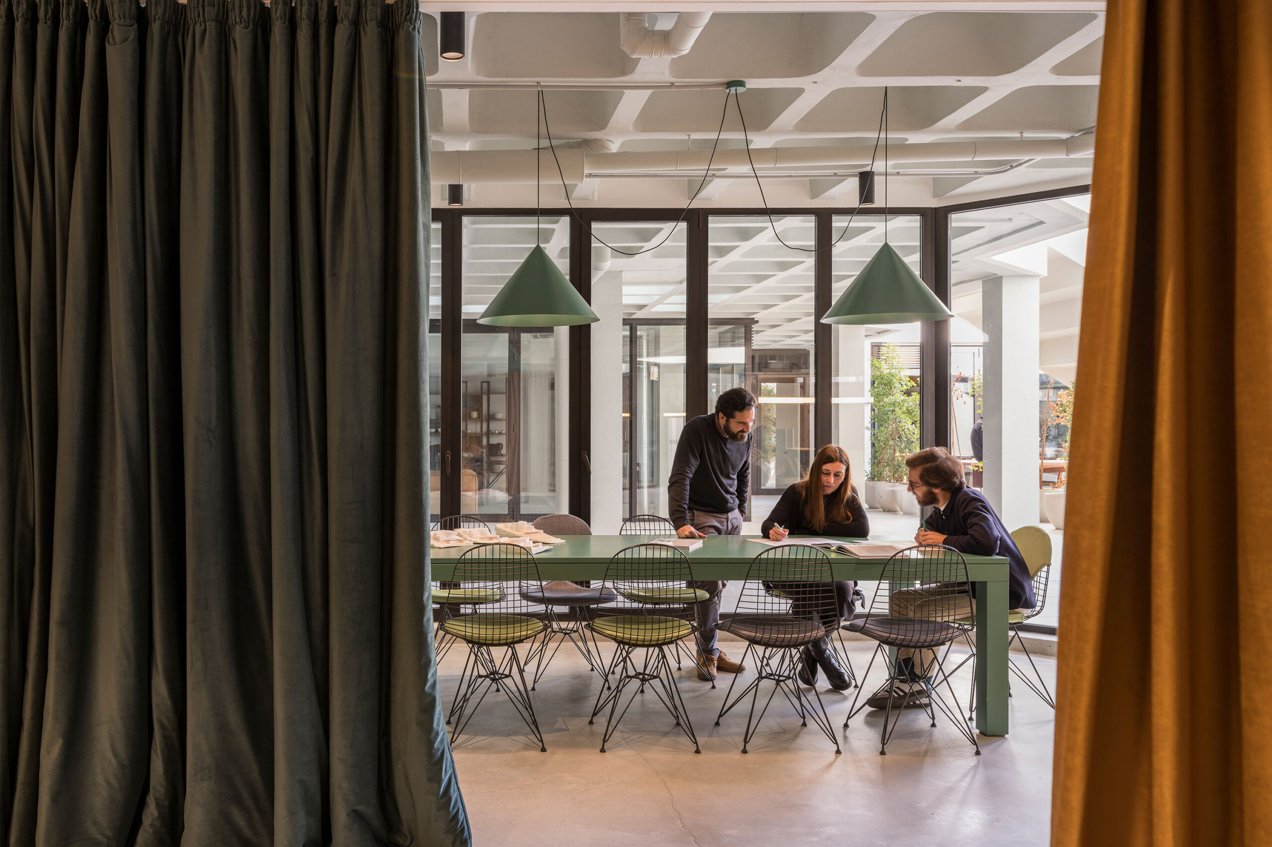
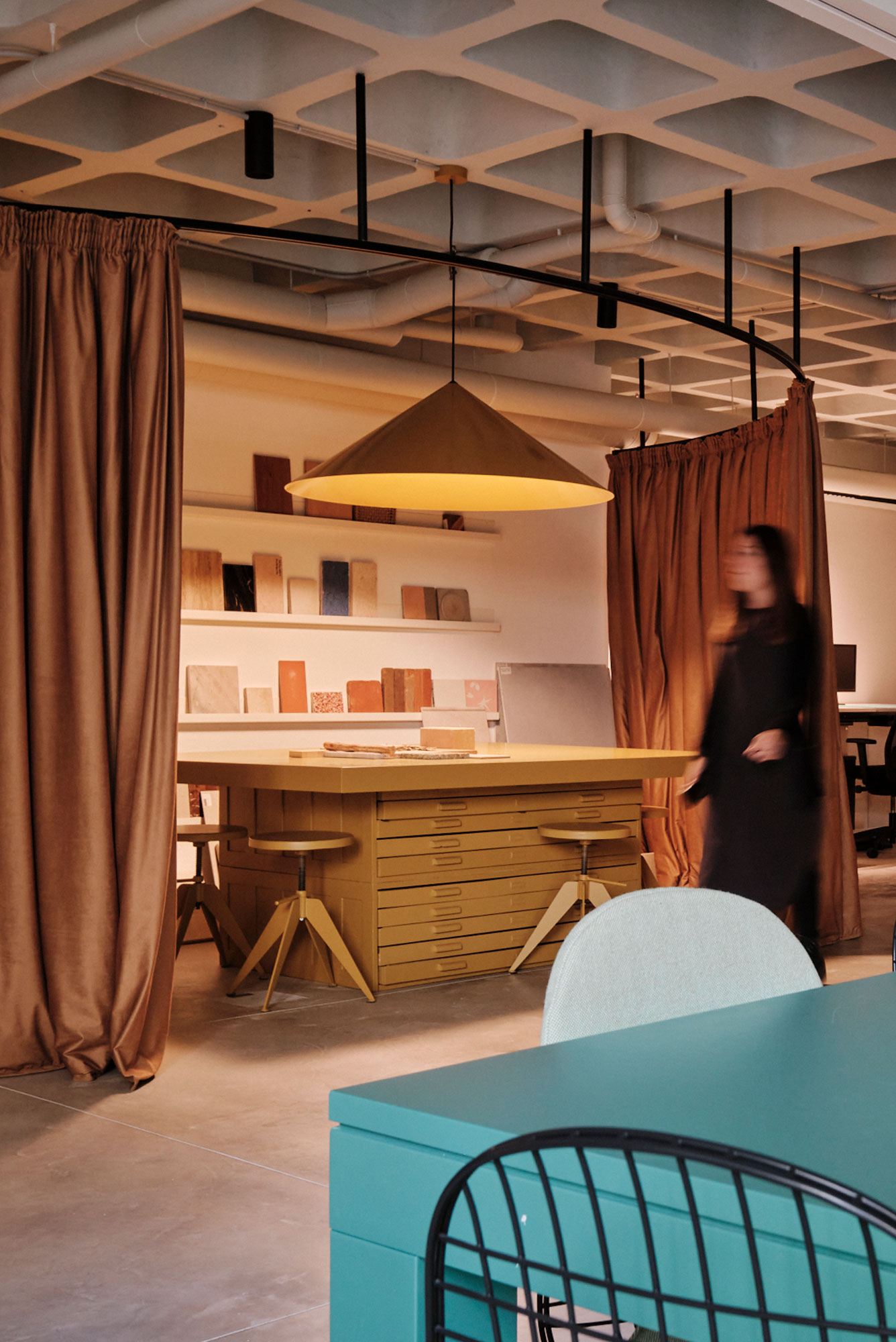
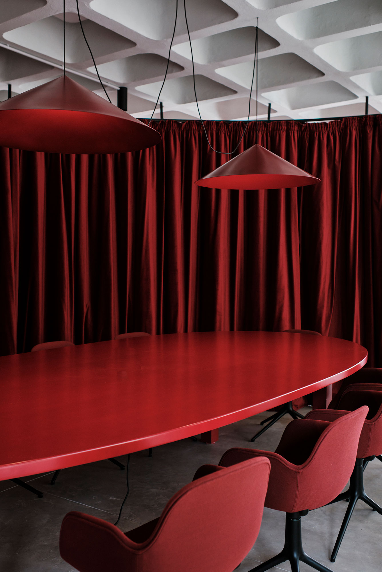
The open space adapts the function as its deeps into the building and is interrupted with “GRAS lounges”, each of a different color following the colors of the Gomila concept. These lounges are integrated into the working area but can become independent by running a thick curtain. To contrast the long, linear space, the lounges have an organic shape emphasized by the curtains.
Meeting Rooms & Privacy
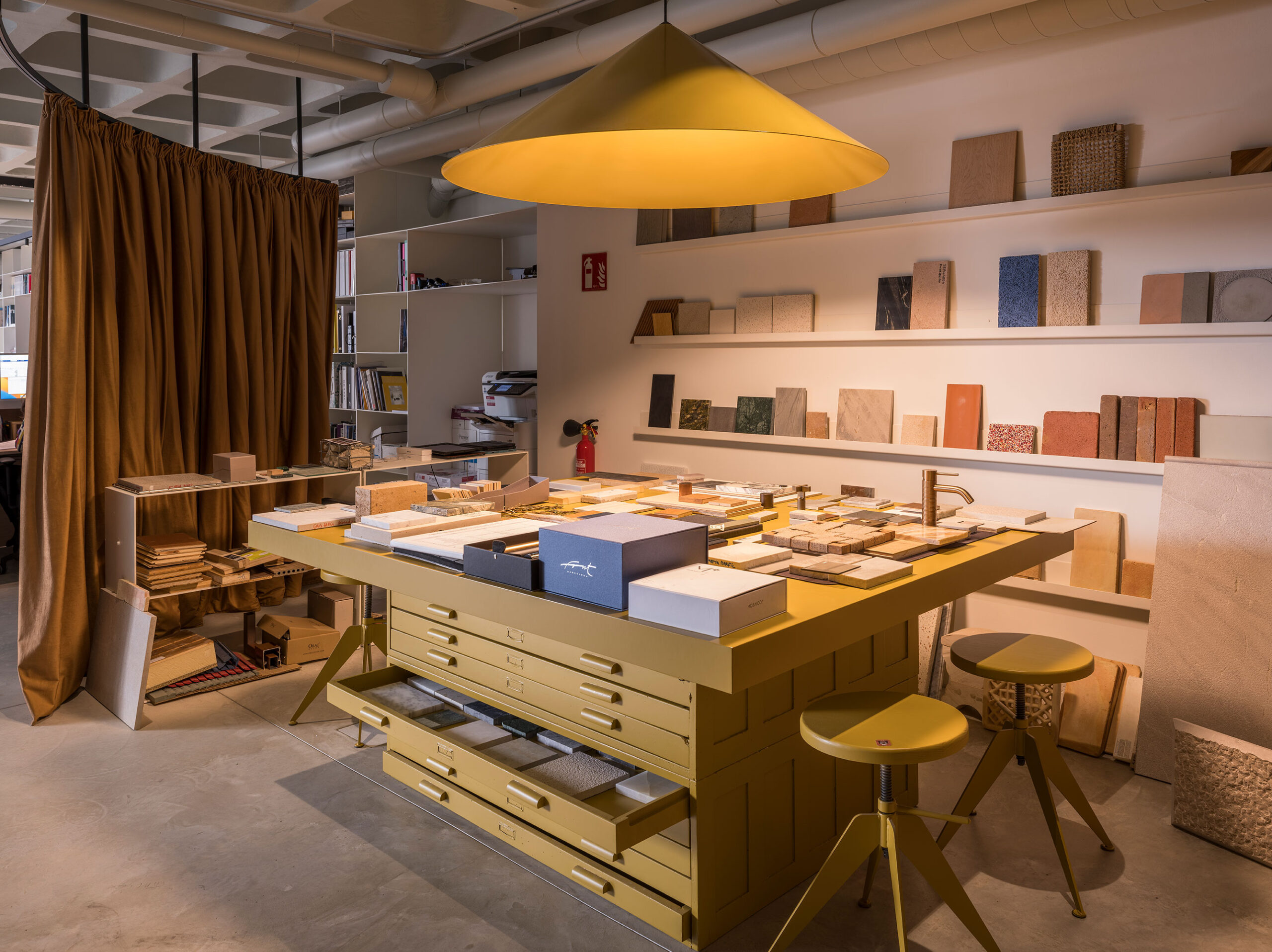
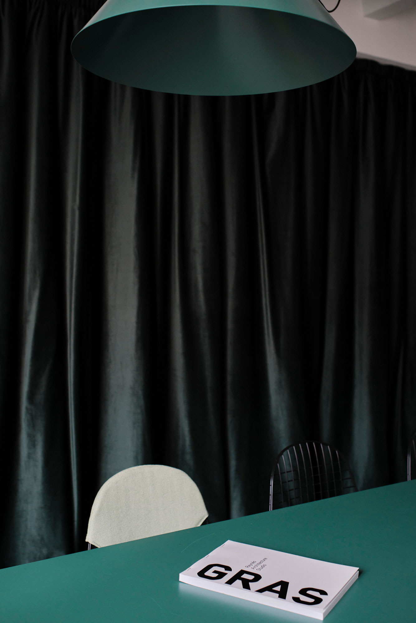
There are the red meeting room at the edge of the space, looking to a private balcony and the street, and with a red kitchenette; the yellow showroom, where all the materials used in the office’s projects are exhibited and studied; and the green room, next to the façade, for informal meetings and lunches.
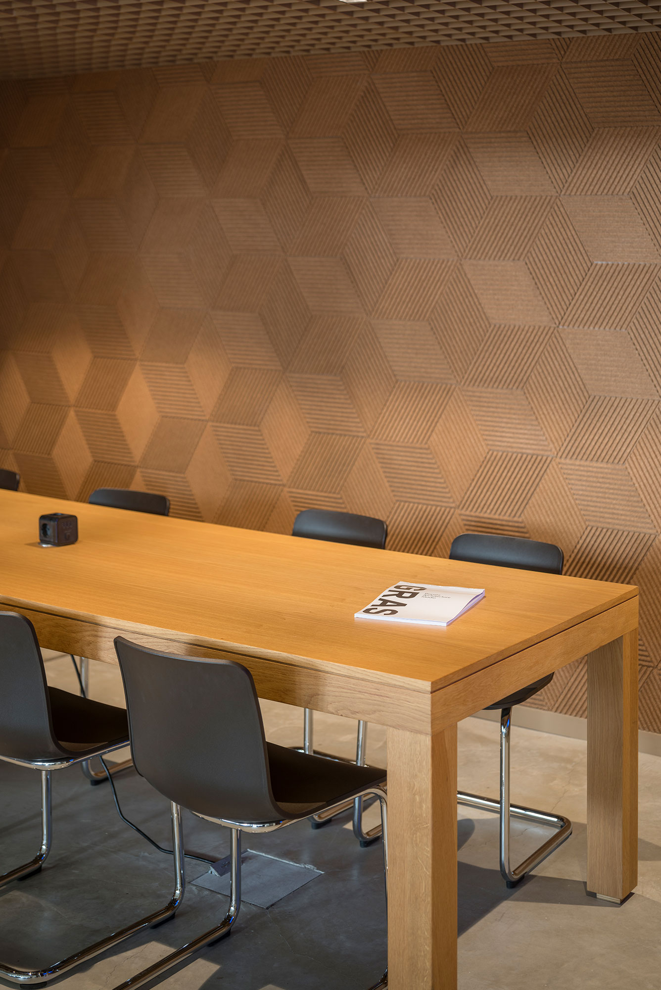
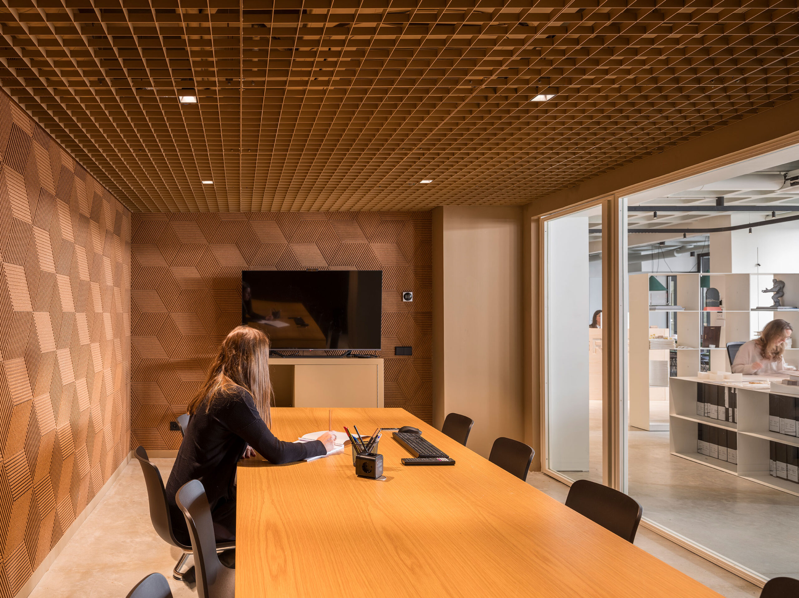
Behind the shelf, three more rooms are organized in beige color and walls covered with natural textured cork, with a metal grid ceiling. These more private spaces are glass-enclosed and are additional meeting rooms.
Materials & Design Elements
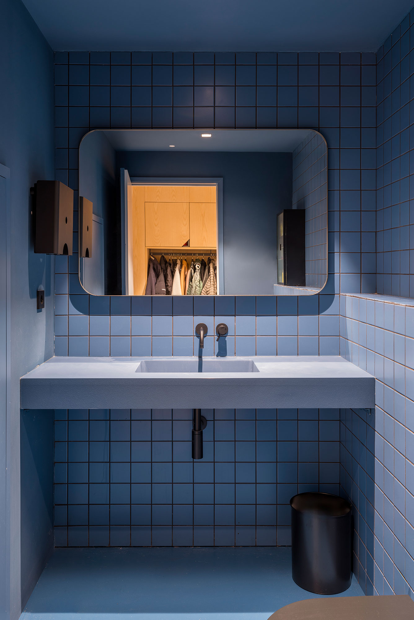
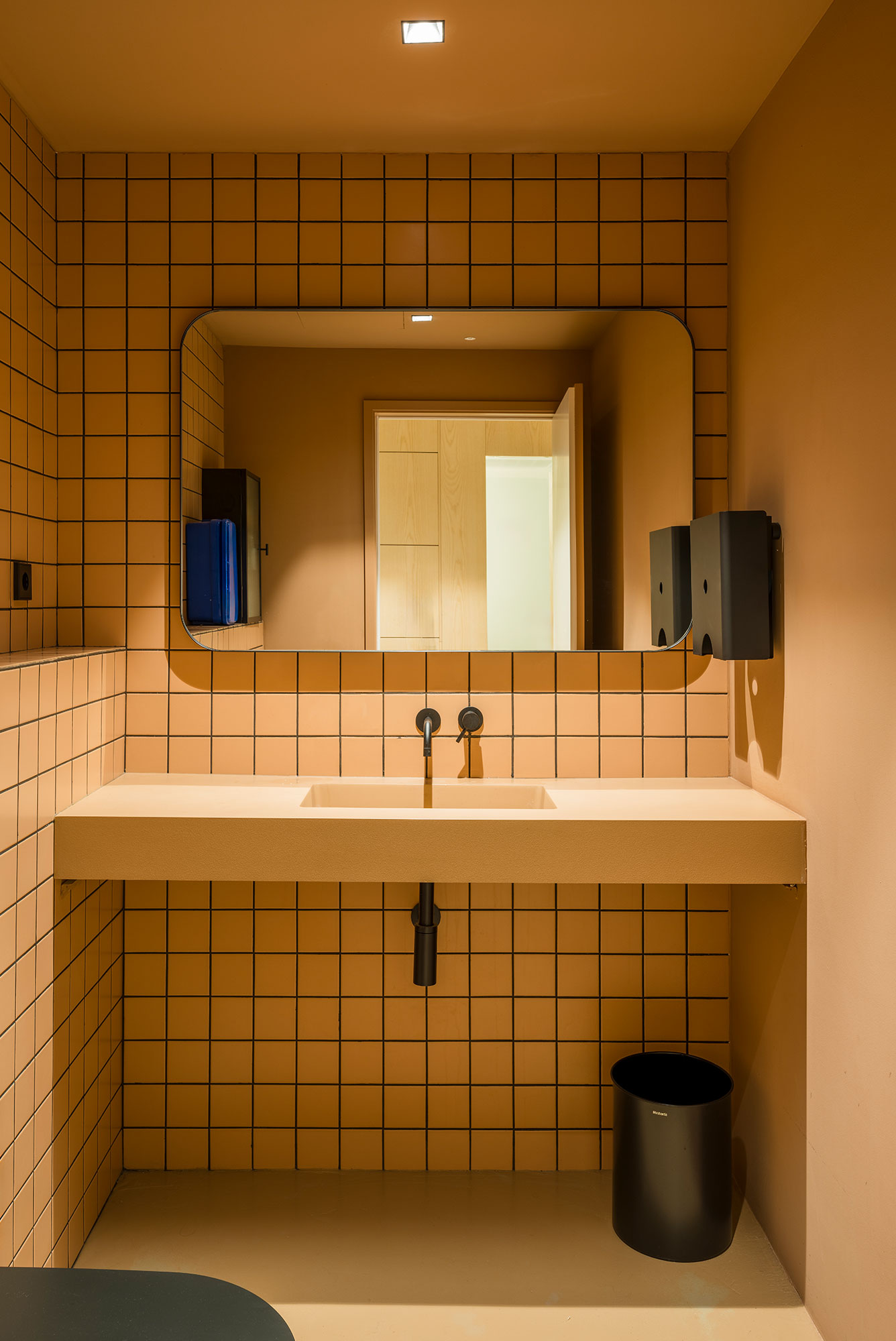
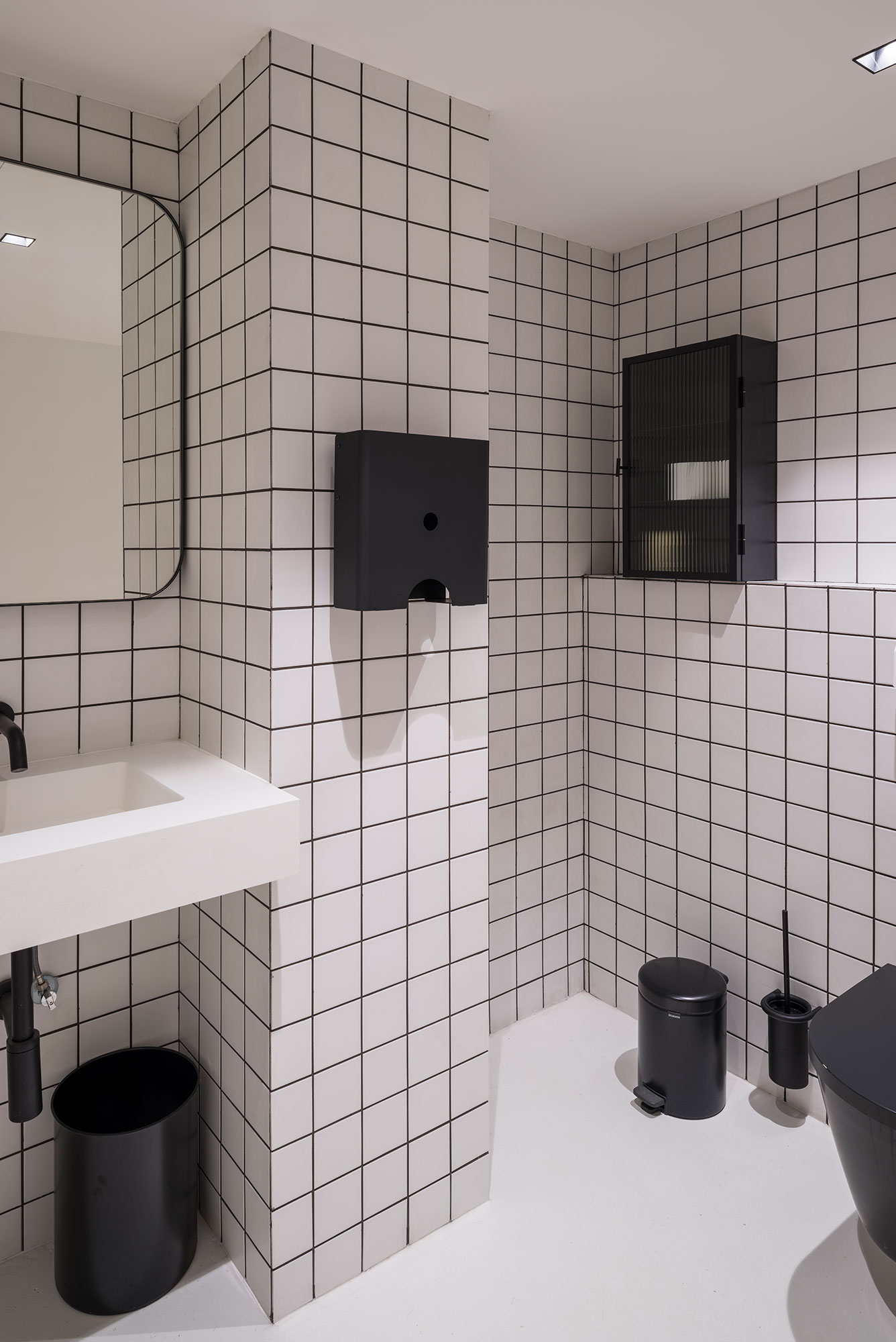
The working stations are located by the north windows with perfect natural light, while the service areas such as a model shop, kitchen, toilets and storage are organized at the back. To complete the 7 matching colors of the Gomila concept, there are three restrooms each of a different color, blue, white and terracotta.
The north façade can be opened to the private garden to bring natural ventilation and enjoy the Mediterranean weather.
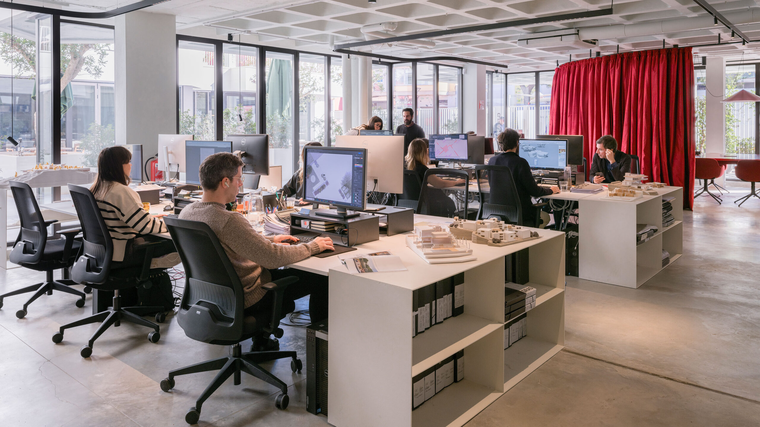
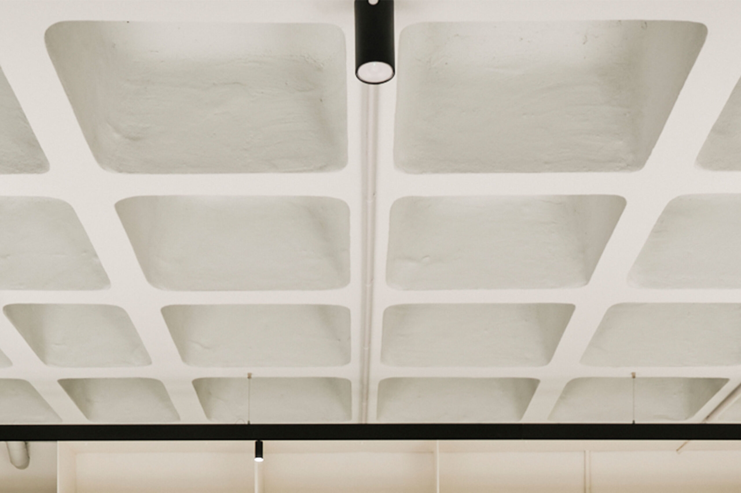
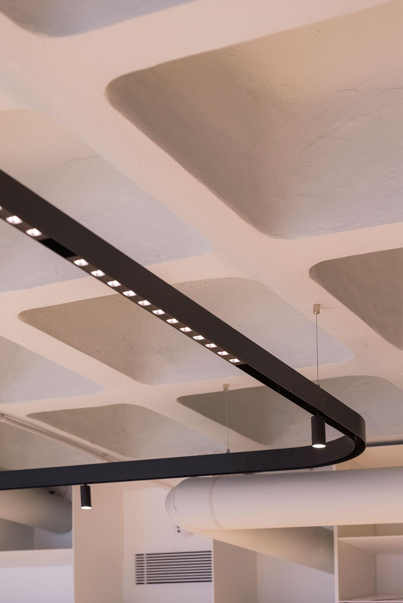
The material strategy for the project is very simple and clear. Most of the space has the original concrete ceiling exposed, a waffle slab of the original 1970´s building, testimony of the brutalist period. The MEP and light fixtures also run exposed. The lightning follows an organic geometry, like the curtains adding curved elements to the otherwise very linear design.
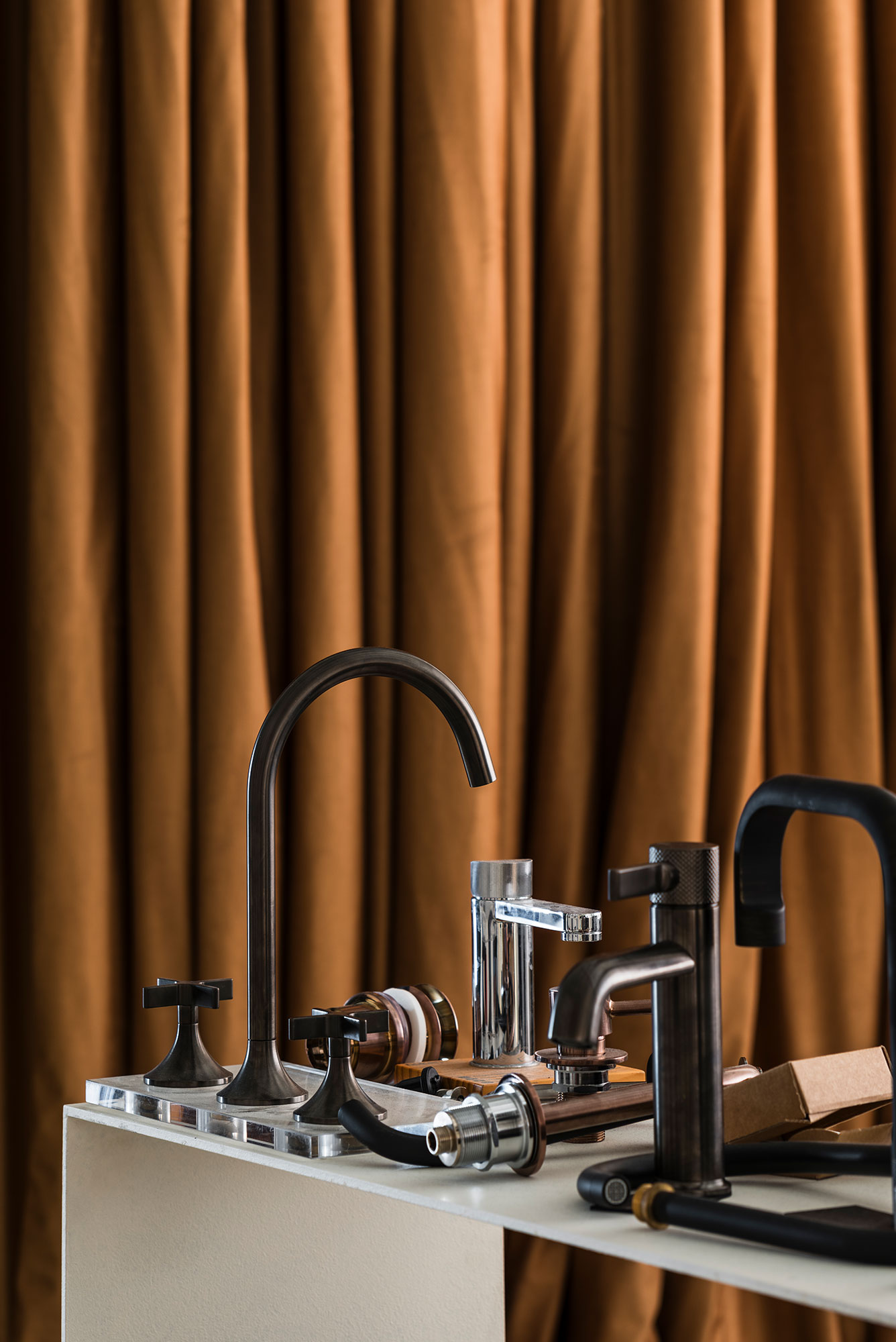
The thick fabric of the curtains besides giving the flexibility to separate certain areas, also add acoustic comfort and a color boost to the office, becoming a very recognisable element of the design.
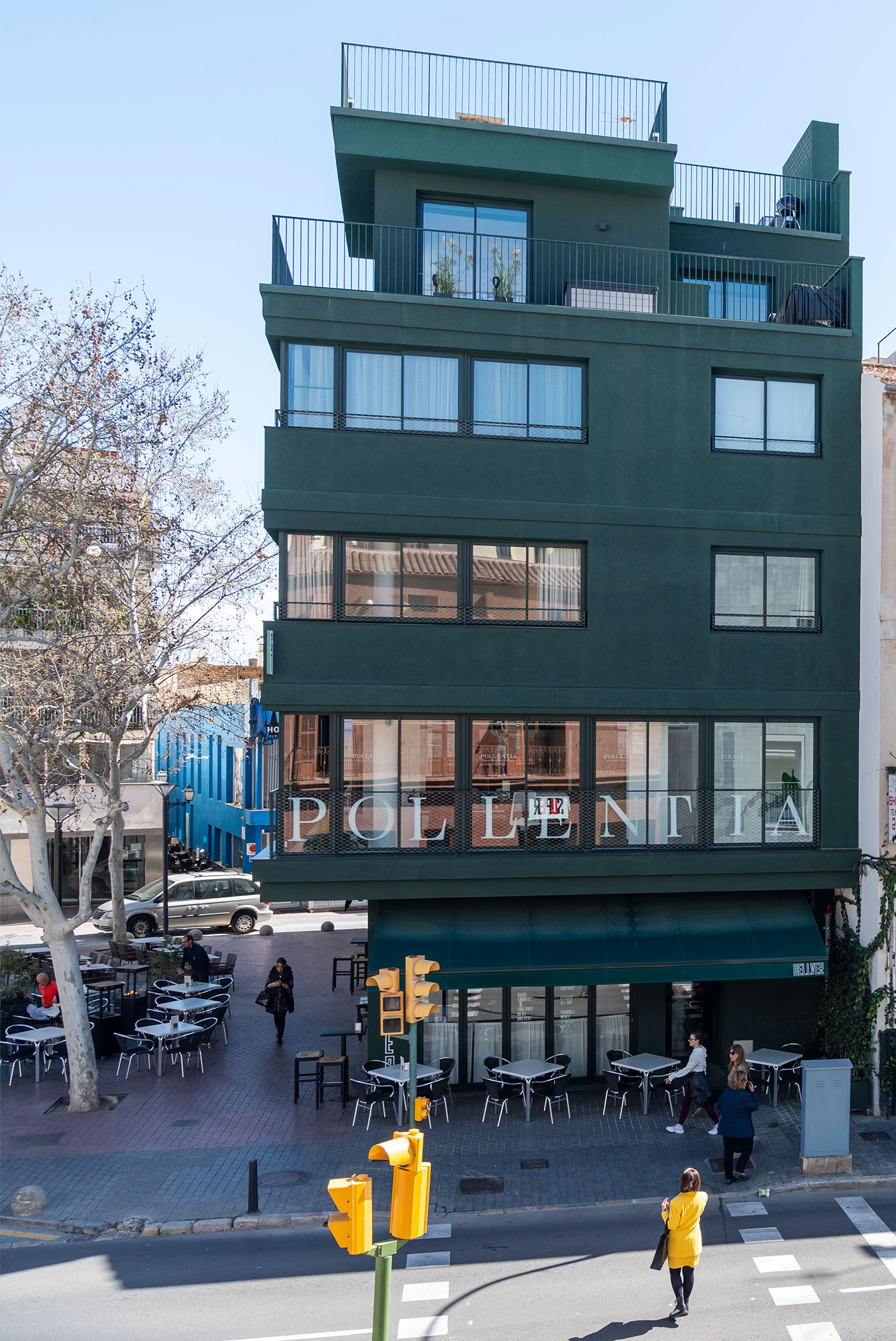
Gomila Mallorca
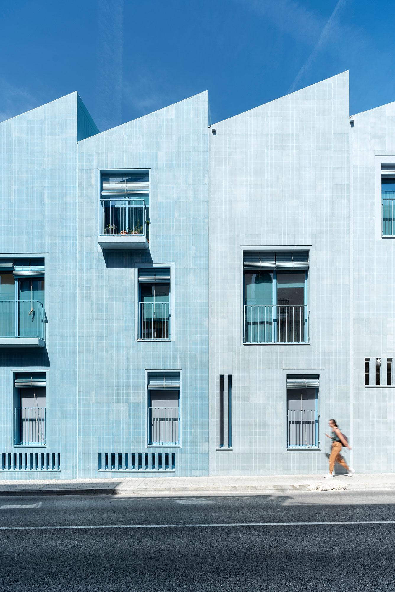
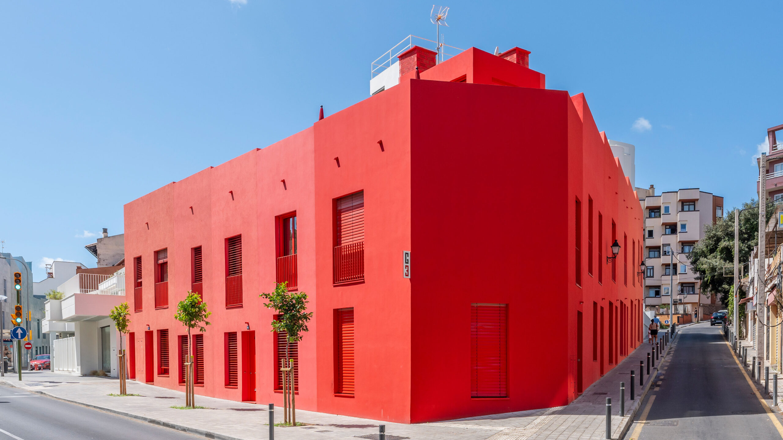
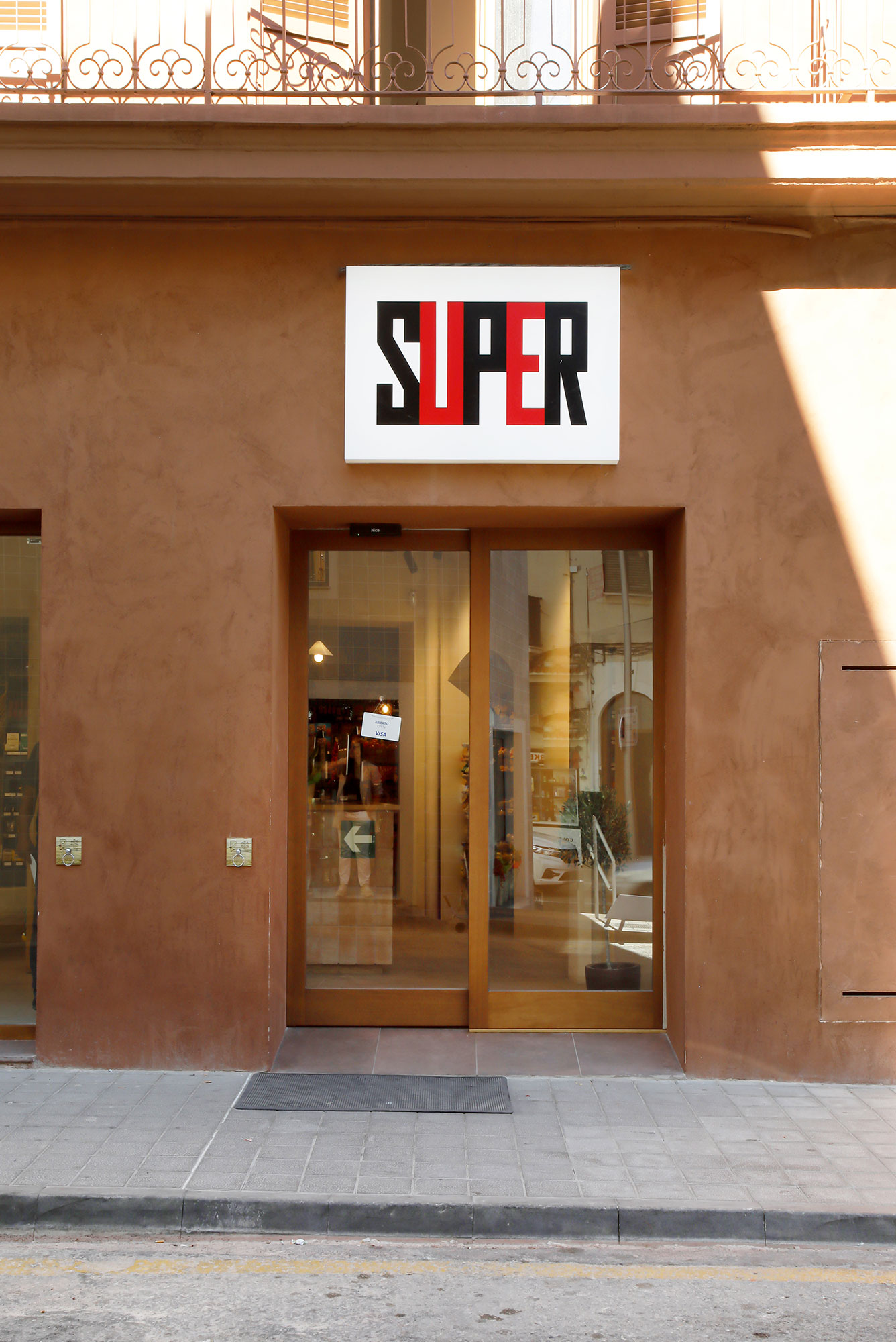
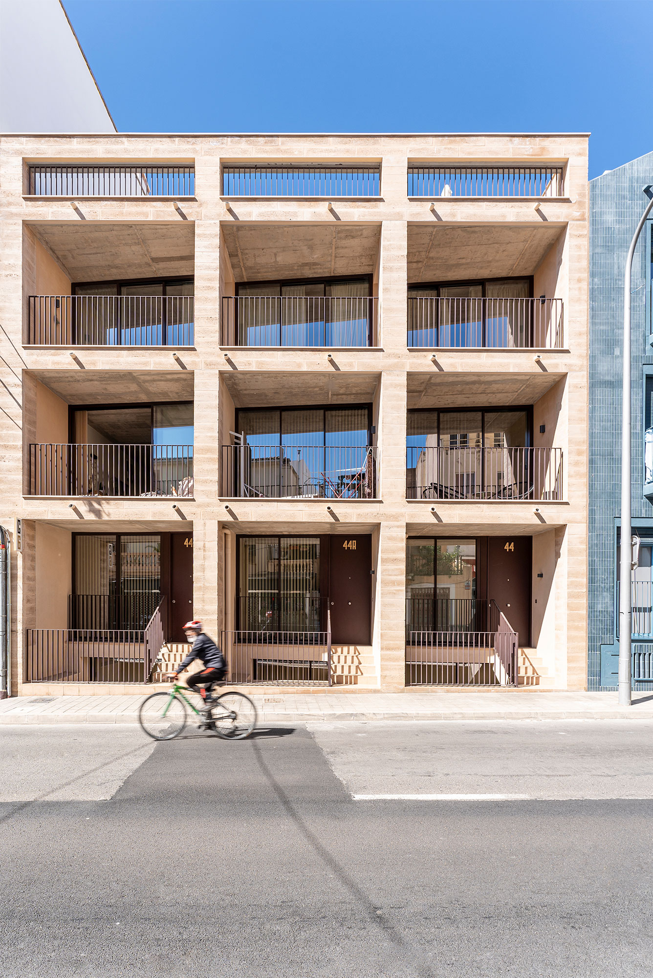
Gomila Mallorca is the result of 5 years of design and construction. An old, abandoned area is turned into a young, thriving and inclusive neighborhood. One of the Gomila Mallorca project’s most recognizable features is its colorful collection of buildings: white, blue, red, yellow, green, beige and terracotta. Seven colors for seven buildings.
